Monthly Archives: May 2016

Does Fracking Cause Earthquakes?


Sixty Minutes sent a reporter to Oklahoma to find out if the significant upswing of earthquakes being experienced there is the result of fracking. He interviewed a number of home owners and a visiting geologist, and they convinced him that, yes, fracking is the cause.

Steven Hayward of “Powerlineblog.com” located a video from Stanford University’s Department of Earth Science that says their study finds that fracking is not the cause.

Before you view the 4 minute video, it probably will be helpful to have a little background on “produced water” which is central to the topic.

When wells are drilled they often encounter water which comes up with the oil or natural gas. This water is usually salty and/or has other contaminates so it can not be used for agriculture. This water is typically reinjected into the well for disposal. But sometimes the quantity is too great and other means of disposal must be found. Underground disposal in sites drilled deeply into the Earth is often used for this purpose. Produced water has long disposed of in this manner.

Other details about produced water will be provided after you see the video. Please note the speaker is very clear that the fracking is not the problem.

More background:

John Veil at the Ground Water Protection Council—Underground Injection Control Conference in February 2015 presented “New Information On Produced Water Volumes and Management Practices”.

There are nearly 1 million oil and gas wells in the US that generate large volumes of Produced Water.

He reported the estimated volume of produce water in 2007 21 billion bbl for the year.

Ninety-eight percent goes into injection wells.

His summary for the period from 2007 to 2012

US oil production increased by 29%.

US gas production increased by 22%

US produced water decreased by 2.4%

Viel notes:

Here is my hypothesis

  • Conventional production generates a small initial volume of water that gradually increases over time. The total lifetime water production from each well can be high
  • Unconventional production from shales and coal seams generates a large amount of produced water initially but the volume drops off, leading to a low lifetime water production from each well
  • Between 2007 and 2012, many new unconventional wells were placed into service and many old conventional wells (with high water cuts) were taken out of service
  • The new wells generated more hydrocarbon for each unit of water than the older wells they replaced.

So the conventional wells with hig levels of produced water were replace by fracked wells that generate less produced water per unit of production.

So, yes oil production, if ceased,  would probably make a big reduction in Oklahoma eartthquates. But fracking per se has not caused the problem. The  energy that is being released little by little will probably benefit someone  in the future.  I suspect if I lived there it would not be a big selling point. But of course,  oil and gas production are  the  big selling points to the people in the “oil patch.”

cbdakota

Nuclear Energy Is The Energy Source Of The Future–So Why Is It Dying Now?


A posting by Michael Shellenberger, “Clean Energy is on the Decline — Here’s Why, and What We Can Do About It”  discusses the demise of nuclear power plants. He notes that while low natural gas prices have undercut the economics of nuclear plants, the real problem they face is the bias against nukes. He notes than many State regulations refuse to class nukes as “renewable” energy thus not getting subsidized as do solar and wind energy. These same state regulations require a mix of solar and wind generated energy be part of the mix sold by utilities but specifically do not include nuclear power as part of the required mix. Why he asks does nuclear, an energy source that emits no carbon dioxide (CO2), get excluded. And further, nukes are base-load plants. Meaning when put on-line they produce power whether the sun shines or the wind blows.  And an added benefit, nukes produce enormous amounts of power while occupying very little space.

Shellenberger says:

“Consider that in the U.S., utilities have either closed or announced premature closures of seven plants in three years. At least eight more are at risk of early closure in the next two years. In 2011, Germany announced it would close all of its nuclear plants. Swedish utility Vattenfall announced late last year that it would be forced to close several reactors prematurely.”

The irony of this, for example in Germany, is that the nukes are being replaced by brown coal fueled power plants. Brown coal is probably the biggest emitter of CO2 per KWh of any normal power source.

“Everywhere the underlying reason is the same: anti-nuclear forces, in tandem with rent-seeking economic interests, have captured government policies. On one extreme lies Germany, which decided to speed up the closure of its nuclear plants following Fukushima. In Sweden the government imposed a special tax on nuclear. In the U.S., solar and wind receive 140 and 17 times higher levels of subsidy than nuclear. And states across the nation have enacted Renewable Portfolio Standards, RPS, that mandate rising wind and solar, and that exclude nuclear.”

Continue reading

6-6-16: The Designated Day of the Climate Tipping Point


Once again the warmers will show they can not produce anything except scare stories. I like the comment that “In climate ‘science’ they get the.money before they provide a result (just in case there is none)”
cbdakota

Watts Up With That?

Will that 400PPM CO2 wilt my Banana tree? Will that 400PPM CO2 threshold wilt my Banana tree?

Guest essay by Eric Worrall

Good news – we’re finally about to hit a tipping point. The only problem is, nobody will be able to tell the difference.

Climate change ‘tipping point’ could be reached in four weeks

6.6.16 is almost the devil’s number, but it might be much more than that if a leading scientist’s prediction on climate change is correct.

CSIRO fellow Dr Paul Fraser has earmarked June 6 (“plus or minus a week”) as the day when carbon dioxide concentration in the atmosphere will hit the point of no return, 400 parts per million (ppm).

The atmospheric measuring station at Cape Grim in Tasmania has recorded the current C02 levels in the atmosphere at 399.9ppm.

Dr Fraser said the difference between 399 and 400ppm was trivial, but when it does hit 400ppm mark it would be a “psychological…

View original post 303 more words

Indian, Japanese and Chinese Scientists Publish Research That Predicts Little Ice Age or Maunder Minimum Coming Soon.


The Times of India posted “Sunspots point to looming “little ice age” quoting scientists and astronomers from Physical Research Laboratory in India and their counterparts in China and Japan have fresh evidence that Earth may be heading for another “little ice age” or maybe even another Maunder Mimimum.

Their findings are very similar to those of our scientists. They report that:

“….our blazing sun has been eerily turning quiet and growing less active over the last two decades.”

Continue reading

Solar Cycle 24 Activity Report- Mid-May 2016


Solar Cycle 24 activity has peaked and it is on its way to a minimum.   Of course the exact date of the minimum and the start of Solar Cycle 25 is not known.  Because normal Cycle life is nominally 11 years,  start of Cycle 25 should be in 2019,   The Sunspot number   (Wolf number 30 day average) for April was 38!!  The chart below shows the rather sharp drop from March’s 54.9.

The black line (Ri) is the 30 day average—if you look carefully you will see it is the sum of the green line (Rsouth) and the red line (Rnorth).   The dashed blue line is the “official Sun Spot number.  It is the smoothed count of a 13 month average monthly Sunspot count divided by 12. The oldest and newest monthly count are reduced to half and the other numbers are given their full count.  And is always 6 months behind the most recent month.  This is the way it has been done for many years; hence it has a history record to use for comparing Solar Cycles.

May is showing an up-tick in the Sunspot count.  This up and down, mostly down, will countinue  for several years.

Activity chartNote the change in the 30 Day Wolf Sunspot number–its about 50 now.

The final chart is a comparison of Solar Cycle 23 and Solar Cycle 24:

Solar irradiance was said to have dropped more than usual.  It will have to fall off for months before it is likely to an event of consider “very interesting”.

cbdakota

All charts  by Solen.info/solar


The smoothed count is a 13-month averaged sunspot count using this Belgium’s formula:
Rs= (0.5 Rm-6 + Rm-5 + Rm-4 + Rm-3 + Rm-2 + Rm-1 + Rm + Rm+1 + Rm+2 + Rm+3 + Rm+4 + Rm+5 + 0.5 Rm+6 ) / 12

Rs = smoothed monthly sunspot count
Rm = One month’s actual sunspot count

The “-6” through “+6” appended to each Rm is the number of months before or after the month whose smoothed count is being calculated. The beginning and ending months in the formula are only given half the value of the others.


Great Lakes’ Weather Becomes Global Warming And Then Reverses


Warmers are eager to see global warming in any weather event that seems to have a negative effect.   We all have seen their contradictory claims that global warming causes dangerous warming, and dangerous cold, and dangerous floods and dangerous droughts, etc. .

Another one of their variable weather happenings that was declared proof of dangerous global warming has  come unglued.  A Breitbart Posing “Great Lakes Go From ‘Climate Change-Induced’ Low Water Levels To Record Highs In Three Yearsillustrates this point:

Between 2010 and 2013, residents of the states surrounding the Great Lakes were told that climate change was permanently altering their environment and the record low water levels being recorded in the lakes may be the new normal. But now, only three years later, news reports are worried about beach erosion because the lakes have rebounded to record high levels of water.  “implications for the environment and the economy.”

This week, throughout the Chicago media landscape, as well as in reports in Michigan and Wisconsin, stories about a loss of swimming areas on public beaches are filling airwaves and newspaper pages. Residents and city officials are warning citizens that water levels in Lake Michigan and the other lakes are so high that the shallow swimming areas have been reduced as the water rises. Reports are also express worry over beach erosion and fears that the rising water is a danger to other infrastructure like roads.

In Chicago, for instance, notes that water levels have risen a whopping four feet since 2013 and the new water is “swallowing up beaches.”

The Chicago Tribune reports that the northern suburb of Evanston is losing beachfront property. “All our beaches are shrinking,” Evanston parks director Lawrence Hemingway said.  For its part, Chicago’s Fox affiliate worries that the city’s lakeshore bike path is being destroyed by the higher water levels. The Detroit Free Press also noted that the high water is erasing beaches and the water is at highs not seen since the 1990s.

These report are starkly different than those from the 2011 to 2013 timeframe. Then the news reports were warning that the:

lakes were irreversibly shrinking and that climate change was desolating both commerce and the environment“.

In 2013, for instance, Chicago’s Public Television WTTW bemoaned a “dramatic” change in the climate that was warming the lakes, lowering water levels, and threatening to destroy commerce and the environment.

The local PBS story also went national as the PBS Newshour ran stories on the environmental disaster the lakes were experiencing. In 2012 National Geographic sonorously warned that the “climate-related trend” was on the verge of laying waste to the region. Crain’s Detroit was also writing in 2013 that communities living on the edges of the region’s monumental bodies of water were going to have to “adapt” to the new normal of climate change.

 Naturally, far left sources were absolutely sure that global warming was drying up the lakes. In 2013 far left website Think Progress worried its readers with claims that climate change was “damaging” the lakes and would present. The Natural Resource Defense Council even contemplated lawsuits to prevent cities on the lakes from tapping into them as a source of water.

Still, it is amazing to see the difference in coverage. Today, with water levels hitting record highs, news reporters and city officials worry over their loss of beachfront property and not a word is mentioned of climate change. Yet only three years ago the same officials and news reporters were sure that climate change was here to stay and we’d better get used to the shrunken Great Lakes.

What a difference a few years makes.

I will bet that in a year or two, all the stories about low water levels being a definite indicator of catastrophic global warming will be forgotten and the narrative will be that the rising waters are a definite indicator of catastrophic global warming.

cbdakota


Denying The Climate Catastrophe: 5A Argument For Attributing Past Warming To Man (Warren Meyers Essay)


This posting is a continuation of  the Warren Meyers Essay debunking the Climate Catastrophe theory.   Here he takes the reader though the warmerist’s reasoning of why CO2 emitted from fossil fuels will result in a climate catastrophe.

cbdakota

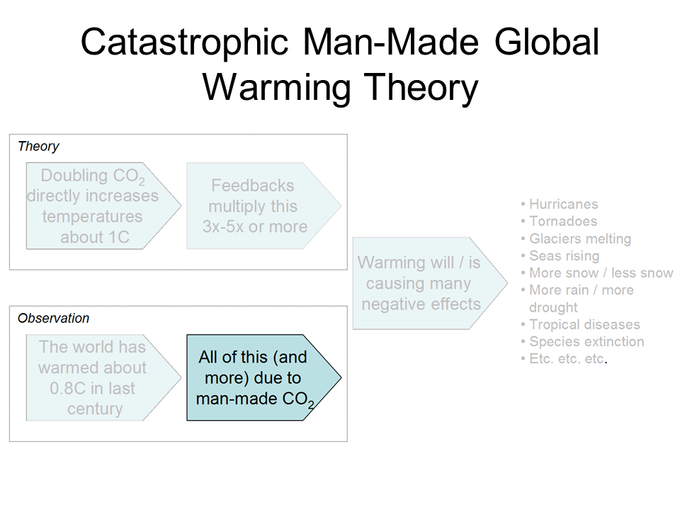
Having established that the Earth has warmed over the past century or so (though with some dispute over how much), we turn to the more interesting — and certainly more difficult — question of finding causes for past warming.  Specifically, for the global warming debate, we would like to know how much of the warming was due to natural variations and how much was man-made.   Obviously this is hard to do, because no one has two thermometers that show the temperature with and without man’s influence.

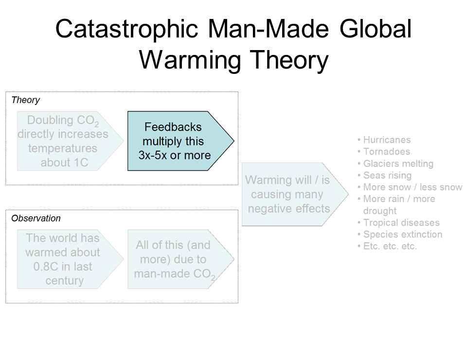
I like to begin each chapter with the IPCC’s official position, but this is a bit hard in this case because they use a lot of soft words rather than exact numbers.  They don’t say 0.5 of the 0.8C is due to man, or anything so specific.   They use phrases like “much of the warming” to describe man’s affect.  However, it is safe to say that most advocates of catastrophic man-made global warming theory will claim that most or all of the last century’s warming is due to man, and that is how we have put it in our framework below:


click to enlarge


By the way, the “and more” is not a typo — there are a number of folks who will argue that the world would have actually cooled without manmade CO2 and thus manmade CO2 has contributed more than the total measured warming.  This actually turns out to be an important argument, since the totality of past warming is not enough to be consistent with high sensitivity, high feedback warming forecasts.  But we will return to this in part C of this chapter

Past, Mostly Abandoned Arguments for Attribution to Man

There have been and still are many different approaches to the attributions problem.  In a moment, we will discuss the current preferred approach.  However, it is worth reviewing two other approaches that have mostly been abandoned but which had a lot of currency in the media for some time, in part because both were in Al Gore’s film An Inconvenient Truth.

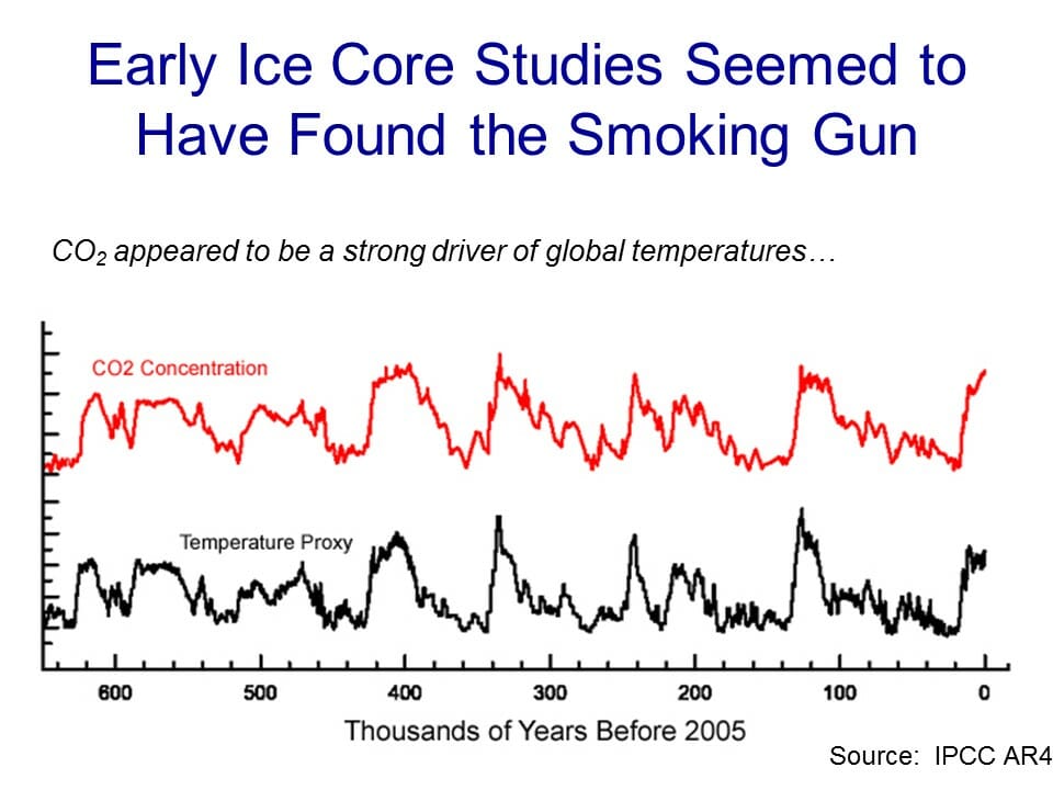
Before we get into them, I want to take a step back and briefly discuss what is called paleo-climatology, which is essentially the study of past climate before the time when we had measurement instruments and systematic record-keeping for weather.   Because we don’t have direct measurements, say, of the temperature in the year 1352, scientists must look for some alternate measure, called a “proxy,”  that might be correlated with a certain climate variable and thus useful in estimating past climate metrics.   For example, one might look at the width of tree rings, and hypothesize that varying widths in different years might correlate to temperature or precipitation in those years.  Most proxies take advantage of such annual layering, as we have in tree rings.

One such methodology uses ice cores.  Ice in certain places like Antarctica and Greenland is laid down in annual layers.  By taking a core sample, characteristics of the ice can be measured at different layers and matched to approximate years.  CO2 concentrations can actually be measured in air bubbles in the ice, and atmospheric temperatures at the time the ice was laid down can be estimated from certain oxygen isotope ratios in the ice.  The result is that one can plot a chart going back hundreds of thousands of years that estimates atmospheric CO2 and temperature.  Al Gore showed this chart in his movie, in a really cool presentation where the chart wrapped around three screens:

click to enlarge


As Gore points out, this looks to be a smoking gun for attribution of temperature changes to CO2.  From this chart, temperature and CO2 concentrations appear to be moving in lockstep.  From this, CO2 doesn’t seem to be a driver of temperatures, it seems to be THE driver, which is why Gore often called it the global thermostat.

But there turned out to be a problem, which is why this analysis no longer is treated as a smoking gun, at least for the attribution issue.  Over time, scientists got better at taking finer and finer cuts of the ice cores, and what they found is that when they looked on a tighter scale, the temperature was rising (in the black spikes of the chart) on average 800 years before the CO2 levels (in red) rose.

This obviously throws a monkey wrench in the causality argument.  Rising CO2 can hardly be the cause of rising temperatures if the CO2 levels are rising after temperatures.

It is now mostly thought that what this chart represents is the liberation of dissolved CO2 from oceans as temperatures rise.  Oceans have a lot of dissolved CO2, and as the oceans get hotter, they will give up some of this CO2 to the atmosphere.

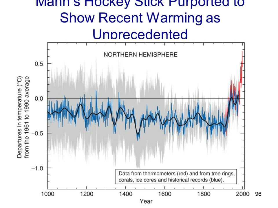
The second outdated attribution analysis we will discuss is perhaps the most famous:  The Hockey Stick.  Based on a research paper by Michael Mann when he was still a grad student, it was made famous in Al Gore’s movie as well as numerous other press articles.  It became the poster child, for a few years, of the global warming movement.

So what is it?  Like the ice core chart, it is a proxy analysis attempting to reconstruct temperature history, in this case over the last 1000 years or so.  Mann originally used tree rings, though in later versions he has added other proxies, such as from organic matter laid down in sediment layers.

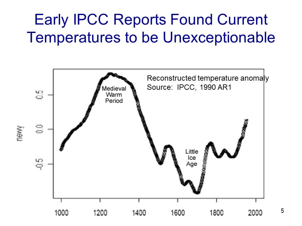
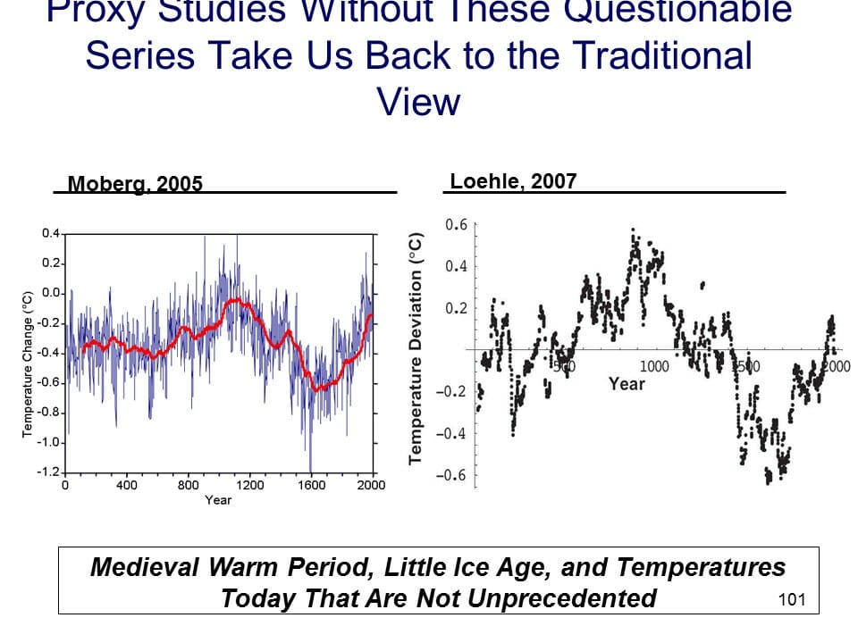
Before the Mann hockey stick, scientists (and the IPCC) believed the temperature history of the last 1000 years looked something like this


click to enlarge

Generally accepted history had a warm period from about 1100-1300 called the Medieval Warm Period which was warmer than it is today, with a cold period in the 17th and 18th centuries called the “Little Ice Age”.  Temperature increases since the little ice age could in part be thought of as a recovery from this colder period.  Strong anecdotal evidence existed from European sources supporting the existence of both the Medieval Warm Period and the Little Ice Age.  For example, I have taken several history courses on the high Middle Ages and every single professor has described the warm period from 1100-1300 as creating a demographic boom which defined the era (yes, warmth was a good thing back then).  In fact, many will point to the famines in the early 14th century that resulted from the end of this warm period as having weakened the population and set the stage for the Black Death.

However, this sort of natural variation before the age where man burned substantial amounts of fossil fuels created something of a problem for catastrophic man-made global warming theory.  How does one convince the population of catastrophe if current warming is within the limits of natural variation?  Doesn’t this push the default attribution of warming towards natural factors and away from man?

The answer came from Michael Mann (now Dr. Mann but actually produced originally before he finished grad school).  It has been dubbed the hockey stick for its shape:

click to enlarge

The reconstructed temperatures are shown in blue, and gone are the Medieval Warm Period and the Little Ice Age, which Mann argued were local to Europe and not global phenomena.  The story that emerged from this chart is that before industrialization, global temperatures were virtually flat, oscillating within a very narrow band of a few tenths of a degree.  However, since 1900, something entirely new seems to be happening, breaking the historical pattern.  From this chart, it looks like modern man has perhaps changed the climate.  This shape, with the long flat historical trend and the sharp uptick at the end, is why it gets the name “hockey stick.”

Oceans of ink and electrons have been spilled over the last 10+ years around the hockey stick, including a myriad of published books.  In general, except for a few hard core paleoclimatologists and perhaps Dr. Mann himself, most folks have moved on from the hockey stick as a useful argument in the attribution debate.  After all, even if the chart is correct, it provides only indirect evidence of the effect of man-made CO2.

Here are a few of the critiques:

  • Note that the real visual impact of the hockey stick comes from the orange data on the far right — the blue data alone doesn’t form much of a hockey stick.  But the orange data is from an entirely different source, in fact an entirely different measurement technology — the blue data is from tree rings, and the orange is form thermometers.  Dr. Mann bristles at the accusation that he “grafted” one data set onto the other, but by drawing the chart this way, that is exactly what he did, at least visually.  Why does this matter?  Well, we have to be very careful with inflections in data that occur exactly at the point that where we change measurement technologies — we are left with the suspicion that the change in slope is due to differences in the measurement technology, rather than in the underlying phenomenon being measured.
  • In fact, well after this chart was published, we discovered that Mann and other like Keith Briffa actually truncated the tree ring temperature reconstructions (the blue line) early.  Note that the blue data ends around 1950.  Why?  Well, it turns out that many tree ring reconstructions showed temperatures declining after 1950.  Does this mean that thermometers were wrong?  No, but it does provide good evidence that the trees are not accurately following current temperature increases, and so probably did not accurately portray temperatures in the past.
  • If one looks at the graphs of all of Mann’s individual proxy series that are averaged into this chart, astonishingly few actually look like hockey sticks.  So how do they average into one?  McIntyre and McKitrick in 2005 showed that Mann used some highly unusual and unprecedented-to-all-but-himself statistical methods that could create hockey sticks out of thin air.  The duo fed random data into Mann’s algorithm and got hockey sticks.
  • At the end of the day, most of the hockey stick (again due to Mann’s averaging methods) was due to samples from just a handful of bristle-cone pine trees in one spot in California, trees whose growth is likely driven by a number of non-temperature factors like precipitation levels and atmospheric CO2 fertilization.   Without these few trees, most of the hockey stick disappears.  In later years he added in non-tree-ring series, but the results still often relied on just a few series, including the Tiljander sediments where Mann essentially flipped the data upside down to get the results he wanted.  Taking out the bristlecone pines and the abused Tiljander series made the hockey stick go away again.There have been plenty of other efforts at proxy series that continue to show the Medieval Warm Period and Little Ice Age as we know them from the historical record:


click to enlarge

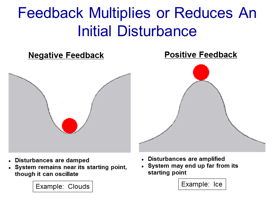
As an aside, Mann’s hockey stick was always problematic for supporters of catastrophic man-made global warming theory for another reason.  The hockey stick implies that the world’s temperatures are, in absence of man, almost dead-flat stable.   But this is hardly consistent with the basic hypothesis, discussed earlier, that the climate is dominated by strong positive feedbacks that take small temperature variations and multiply them many times.   If Mann’s hockey stick is correct, it could also be taken as evidence against high climate sensitivities that are demanded by the catastrophe theory.


The Current Lead Argument for Attribution of Past Warming to Man

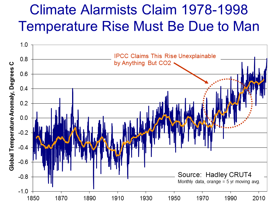
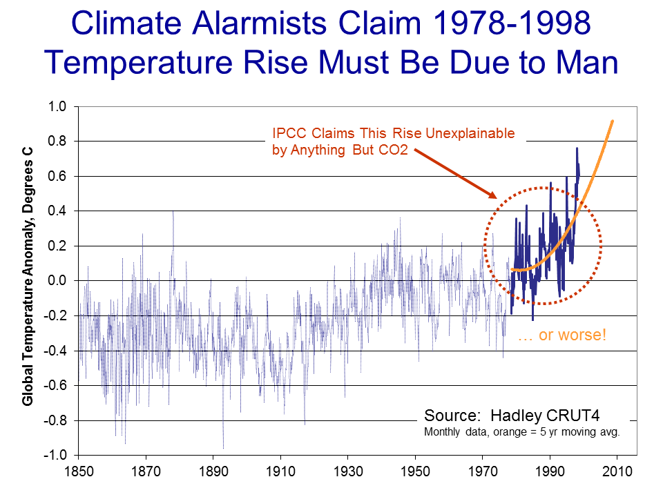
So we are still left wondering, how do climate scientists attribute past warming to man?  Well, to begin, in doing so they tend to focus on the period after 1940, when large-scale fossil fuel combustion really began in earnest.   Temperatures have risen since 1940, but in fact nearly all of this rise occurred in the 20 year period from 1978 to 1998:

click to enlarge

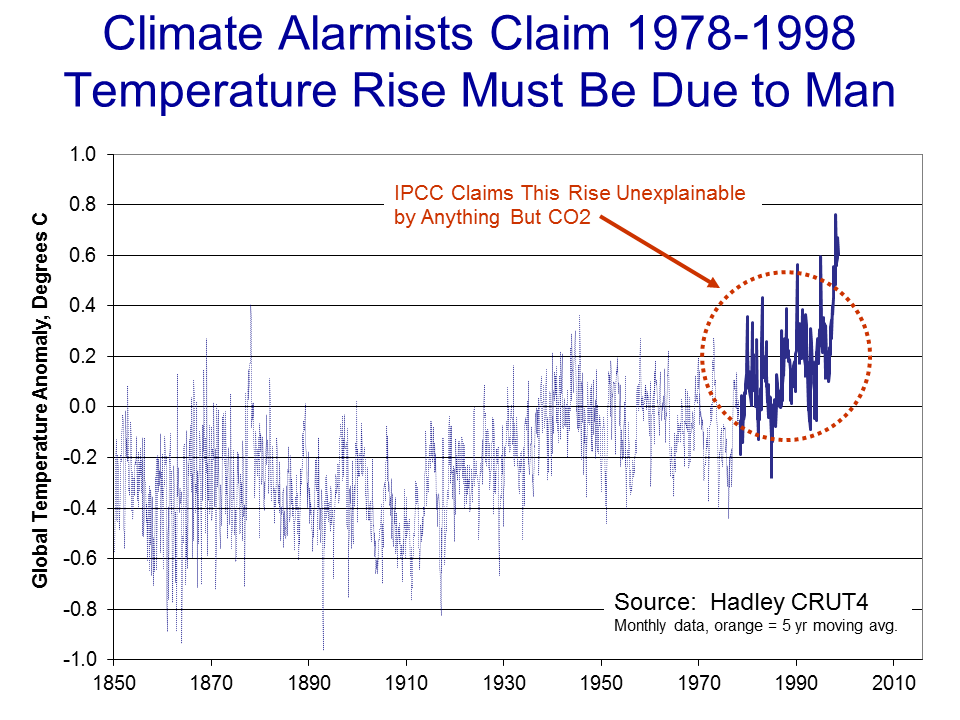
To be fair, and better understand the thinking at the time, let’s put ourselves in the shoes of scientists around the turn of the century and throw out what we know happened after that date.  Scientists then would have been looking at this picture:

click to enlarge

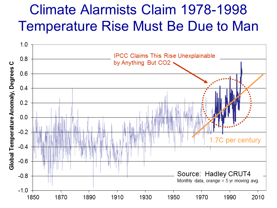
Sitting in the year 2000, the recent warming rate might have looked dire .. nearly 2C per century…

click to enlarge

Or possibly worse if we were on an accelerating course…

click to enlarge


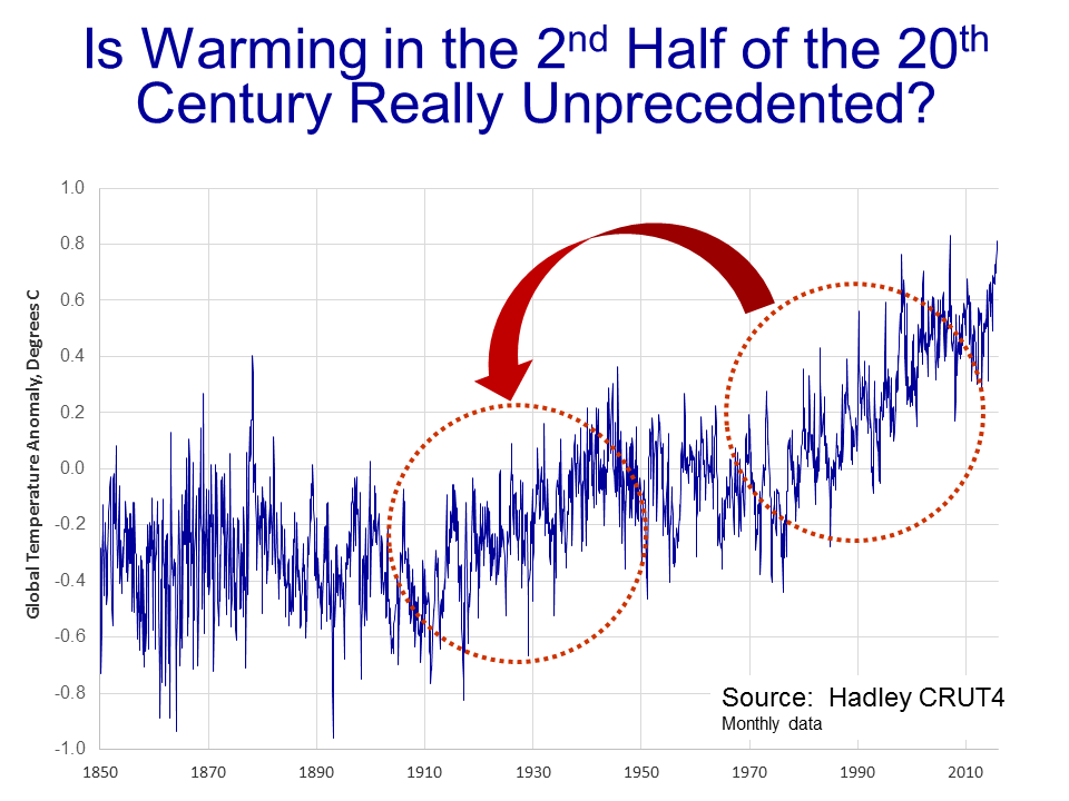
Scientists began to develop a hypothesis that this temperature rise was occurring too rapidly to be natural, that it had to be at least partially man-made.  I have always thought this a slightly odd conclusion, since the slope from this 20-year period looks almost identical to the slope centered around the 1930’s, which was very unlikely to have much human influence.

click to enlarge

But never-the-less, the hypothesis that the 1978-1998 temperature rise was too fast to be natural gained great currency.  But how does one prove it?

What scientists did was to build computer models to simulate the climate.  They then ran the computer models twice.  The first time they ran them with only natural factors, or at least only the natural factors they knew about or were able to model (they left a lot out, but we will get to that in time).  These models were not able to produce the 1978-1998 warming rates.  Then, they re-ran the models with manmade CO2, and particularly with a high climate sensitivity to CO2 based on the high feedback assumptions we discussed in an earlier chapter.   With these models, they were able to recreate the 1978-1998 temperature rise.   As Dr. Richard Lindzen of MIT described the process:

What was done, was to take a large number of models that could not reasonably simulate known patterns of natural behavior (such as ENSO, the Pacific Decadal Oscillation, the Atlantic Multidecadal Oscillation), claim that such models nonetheless accurately depicted natural internal climate variability, and use the fact that these models could not replicate the warming episode from the mid seventies through the mid nineties, to argue that forcing was necessary and that the forcing must have been due to man.

Another way to put this argument is “we can’t think of anything natural that could be causing this warming, so by default it must be man-made.  With various increases in sophistication, this remains the lead argument in favor of attribution of past warming to man.

In part B of this chapter, we will discuss what natural factors were left out of these models, and I will take my own shot at a simple attribution analysis.

Denying The Climate Catastrophe:4A Actual Temperature Data (Warren Meyers Essay)


I am rebloging Warren Meyers essay that says we should deny the climate catastrophe that the warmers predict.  This is a long chapter showing what the actual global temperature data really is.  There has been a lot of adjusting the data on the part of the warmers who, with the exception of the UAH satellite data, control the system.  This is the 4th chapter of his essay.   He titles this one as 4A and has a 4B which reviews the troubles with the surface temperature record.  He says the reader can skip 4B, so I may give just a reference to those who want read it can do so.

cbdakota


In our last chapter, we ended a discussion on theoretical future warming rates by saying that no amount of computer modelling was going to help us choose between various temperature sensitivities and thus warming rates.  Only observational data was going to help us determine how the Earth actually responds to increasing CO2 in the atmosphere.  So in this chapter we turn to the next part of our framework, which is our observations of Earth’s temperatures, which is among the data we might use to support or falsify the theory of catastrophic man-made global warming.

Continue reading

Climate Hustle – The Movie


The new movie produced by Marc Morano, “Climate Hustle” was in theaters on May 2 all over the country. The movie shows the skeptics side of the argument about CO2 and global warming,  aka Climate Change.  Many notable skeptics are in the cast.

The target audience, as I see it, was for the relatively low information people that get their global warming news from the main stream media.   If you are into this topic daily or often,  most of it will be review.   I think Morano did a very good job in assembling the topics and the players.  So I recommend it.    If there was something I would like to see expanded was the part where warmer predictions were examined.  About 10  predictions were discussed briefly. I would like to have seen more emphasis.

As part of the film and as an “extra” was a panel  that discussed current issues especially those of the current attempt to criminalize discussion of skeptic views. Bill Nye is feature in it and comes off looking pretty small minded.  The panel moderator was Brett Bozell and the panel consisted of Sarah Palin, David Legates and Marc Morano.   David Legates stood out.

Looking at Morano’s blog, “Climate Depot”,  the attendance was good, nation-wide.   I went over to  Delaware and my estimate was that about 50 people were in the theater.

This was a one night showing and I am not sure what the plans are for this movie.  It may see a general release or perhaps be available in places like Netflix.

cbdakota

Denying The Climate Catastrophe: Feedbacks (Warren Meyers Essay)


This is the third of six “chapters” of my reblog of Warren Meyers essay on catastrophic climate change.  In the previous posting he discussed greenhouse gases warming potential using just CO2.  Now he looks at the multiplier that the warmers uses to get their scary global temperature forecasts.  This chapter is pretty long but it is vital to understand how the warmers get those elevated, scary global temperature predictions.  Once you understand what they are doing, you will be much more at ease about the global’s future.

cbdakota

We ended the last chapter on the greenhouse gas theory with this:

So whence comes the catastrophe?  As mentioned in the introduction, the catastrophe comes from a second, independent theory that the Earth’s climate system is dominated by strong positive feedbacks that multiply greenhouse warming many times into a catastrophe.

Slide15

In this chapter, we will discuss this second, independent theory:  that the Earth’s climate system is dominated by positive feedbacks.  I suppose the first question is, “What do we mean by feedback?”

Slide16

In a strict sense, feedback is the connection of the output of a system to its input, creating a process that is circular:  A system creates an output based on some initial input, that output changes the system’s input, which then changes its output, which then in turn changes its input, etc.

Typically, there are two types of feedback:  negative and positive.  Negative feedback is a bit like the ball in the trough in the illustration above.  If we tap the ball, it moves, but that movement creates new forces (e.g. gravity and the walls of the trough) that tend to send the ball back where it started.  Negative feedback tends to attenuate any input to a system — meaning that for any given push on the system, the output will end up being less than one might have expected from the push.

Continue reading