Category Archives: CO2 positive feedback

Secrets That Global Warming Alarmists Don’t Want You to Know—Part 5—Global Greening.


This is the fifth posting of a series listing things that the alarmists and the mainstream media do not want made public.  At the top of this posting is a link to the preceding postings.

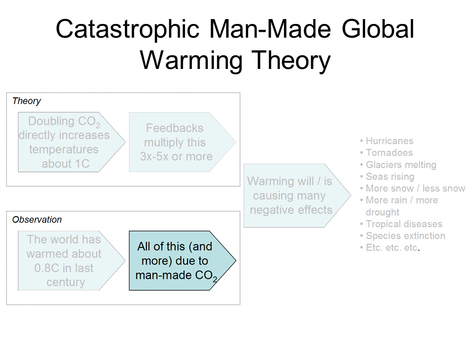
To hear the global warming alarmists, carbon dioxide (CO2) is poison.  It is on a mission to destroy the Earth.  It is a pollutant that must be stopped.  There are some people convinced that if fossil fuels burning was completely stopped, there would be no more CO2 anywhere.  The alarmists do not want you to know how beneficial CO2 is.    

Carbon is the backbone of life on Earth. We are made of carbon, we eat carbon, and our civilizations—our economies, our homes, our means of transport—are built on carbon”.  That is a quote from NASA’s posting, the Carbon Cycle.

POISON

Let us begin by disposing of the myth that CO2 is a poison.   Do you know that every time you exhale, your breath contains about 40,000 parts per million (ppm) CO2.  That contrasts with air you breathe that has a concentration of about 415ppm.    

MAN-MADE CO2 IS A SMALL FRACTION OF THE CARBON CYCLE

The NASA chart below tells the story of the CO2 from manmade sources, and natural source. The natural sources are in white and the man-made sources are in red.  The numbers are gigatons of carbon presumably because the form that carbon assumes in this chart might not always be in the form of carbon dioxide **.  

According to this chart, five of the nine manmade gigatonnes of carbon are removed from the atmosphere.  The “greening” of the Earth’s surface is attributable to an increase in atmospheric CO2, that would explain the “Net terrestrial uptake shown on the chart.

\

 Into Atmosphere Man MadeFossil Fuels, Concrete etc.    9-5    GtC/Y
           inPlantsRespiration   60
           inSoilRespir & Decomp    60
           inOceanRespir & Decomp    90
Out of AtmospherePlantsPhotosynthesis &Biomass    120 + 3
           outOceanPhotosynthesis      90+ 2
 Atmosphere Net          In214 G tC/Y

 
Atmosphere NetOut210 GtC/Y 

GtC/Y is gigatonnes of carbon per year.   (1 gigatonne =billion tonnes.) (1 tonne =2205 pounds)

** CO2’s  molecular weight is 44 because it is made up of 12 from carbon and 32 from two oxygens.   Thus, the gigatonnes of CO2 are larger than the fraction of carbon (C)  numbers shown on the chart. 

The most accurate number on the chart is probably the net increase in the atmosphere as it is considered well mixed.  Measurements of atmospheric CO2 concentration are made frequently and in several places around the globe. 

It is likely, that the fossil fuel, etc.  number is the next most accurate number on this chart. Emission sources are reasonably known so a fairly good estimate can be made.  The other numbers may be swags (Scientific Wild Ass Guess).

The amount of manmade CO2 relative to the amount of natural CO2 is quite small.  It is about 4% of the total.

 CROP PRODUCTION SETS RECORDS DUE TO INCREASED ATMOSPHERIC CONCENTRATION OF C02.

                                  Trend in Annual Average Leaf Area   2000 to 2017

Satellite images show that plant cover has become lush all over the world. This increase in green biomass worldwide is equivalent to a new green continent twice the size of the US.

Gregory Wrightstone provides us with a summary of the greening.

 It has been long known that increasing CO2 benefits plant growth through the CO2 fertilization effect. Recognizing the benefits of this, greenhouses often increase CO2 to 1,500 ppm. Research from laboratory studies by the Center for the Study of CO2 and Global Change has documented that a 300 ppm rise in CO2 levels would increase plant biomass by 25 to 50%. This significant boost in plant productivity, along with a boost from lengthening growing seasons, means that we are better able to feed a hungry planet.

An additional significant benefit from this increasing CO2 fertilization is that the plants have smaller stomata (pores) and have lessened water needs. Less water used means that more stays in the ground and is leading to increased soil moisture across much of the planet and a “greening” of the Earth. According to NASA, up to 50% of the Earth is “greening,” in part due to higher CO2 levels. This increased soil moisture is a primary cause for the long-term decrease in forest fires and droughts worldwide.

A group of scientists from Australia,  focusing on the southwestern corner of North America, Australia’s outback, the Middle East, and some parts of Africa studied satellite imagery by teasing out the influence of carbon dioxide on greening from other factors such as precipitation, air temperature, the amount of light, and land-use changes. The team’s model predicted that foliage would increase by some 5 to 10 percent given the 14 percent increase in atmospheric CO2 concentration during the study period. The satellite data agreed, showing an 11 percent increase in foliage after adjusting the data for precipitation, yielding “strong support for our hypothesis,” the team reports.

In addition to greening dry regions, the CO2 fertilization effect could switch the types of vegetation that dominate in those regions. “Trees are re-invading grass lands, and this could quite possibly be related to the CO2 effect,” Donohue said. “Long lived woody plants are deep rooted and are likely to benefit more than grasses from an increase in CO2.”

And food crops are setting new records in addition to its record forecast for global wheat production in 2021, the FAO said it’s expecting a new and higher estimate for world cereal production in 2020, now seen at 2.76 billion tonnes, a 1.9% increase from the previous year, lifted by higher-than-expected outturns reported for maize in West Africa, for rice in India, and wheat harvests in the European Union, Kazakhstan, and the Russian Federation.

“ … the global wheat out turn is seen at a record, while maize is placed at the second largest ever and barley at the highest in a decade,” the report said.


The leader in studying CO2 effects on plant growth is the CO2 Science Organization. One of their studies is as follows:

The Positive Externalities of Carbon Dioxide: Estimating the Monetary Benefits of Rising Atmospheric CO2 Concentrations on Global Food Production.”

I have picked out one page of the study, titled

“Historic Monetary Benefit Calculations and Results

 The first step in determining the monetary benefit of historical atmospheric CO2 enrichment on historic crop production begins by calculating what portion of each crop’s annual yield over the period 1961-2011 was due to each year’s increase in atmospheric CO2 concentration above the baseline value of 280 ppm that existed at the beginning of the Industrial Revolution.

 To summarize what they did was begin with the wheat body mass and yield that occurred in 1961 and what it would be 50 years later using the CO2 growth factor.  The atmospheric CO2 concentration went up during those 50 years by 37.4 ppm.  They did account for the factors such as new improvements in the wheat seed, the amount of planting of during those years for example. This was to make sure that only the CO2 enhancement part would be used to determine the money benefits.  The resultant value of 4.35% indicates the degree by which the 1961 yield was enhanced above the baseline yield value corresponding to an atmospheric CO2 concentration of 280 ppm. They also used constant dollars for the study.

Table 3. The total monetary benefit of Earth’s rising atmospheric CO2 concentration on each of the forty-five crops listed in Table 1 for the 50-year period 1961-2011. Values are in constant 2004-2006 U.S. dollars.

 . 

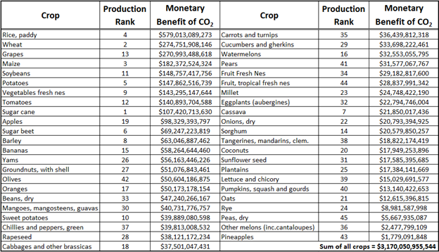
As can be seen from Table 3, the financial benefit of Earth’s rising atmospheric CO2 concentration on global food production is enormous. Such benefits over the period 1961-2011 have amounted to at least $1 billion for each of the 45 crops examined; and for nine of the crops the monetary increase due to CO2 over this period is well over $100 billion. The largest of these benefits is noted for rice, wheat, and grapes, which saw increases of $579 billion, $274 billion and $270 billion, respective.

Yes, the monetary benefit of all the crops, is $3,170,050,955,544.  $3+trillion.

This report also calculates what the benefit would be by 2050.  That sums up to $9.765 trillion.  The full report can be seen by clicking this link. 

These results will be rehashed when this series discusses the Social Cost of Carbon.

The following, recent study found that the greening was playing a “beneficial role of the land carbon sinks……”

A new study finds rising CO2 concentrations (and warming) have driven the rapid increase in Earth’s photosynthesis processes, or greening.

CO2-induced planetary greening leads to an enormous expansion of Earth’s carbon sink.

By 2100 this greening-sink effect will offset 17 years of equivalent human CO2 emissions.

This easily supersedes the effect of the Paris Agreement’s CO2-mitigation policies.

In a break from the deflating global news of viral infections and rising death rates, a groundbreaking new study (Haverd et al., 2020) affirms the “beneficial role of the land carbon sink in modulating future excess anthropogenic CO2 consistent with the target of the Paris Agreement” via the fertilization effect of rising CO2.

There has been a 30% rise in global greening since 1900. CO2 fertilization is the “dominant driver” of these greening trends, with an additional positive contribution from climate warming.

When CO2 levels double (to 560 ppm), this CO2-fertilization-greening effect is expected to increase to 47%.

Growth in the land’s carbon sink – absorbing excess CO2 emissions – will reach 174 PgC by the end of the century.”

This is the equivalent of eliminating 17 full years of human CO2 emissions.”

There are still some government groups and alarmists that are denigrating the crops produced by the CO2 greening effect.    

“In their Summary for Policymakers issued in 2014, the UN intergovernmental Panel on Climate Change acknowledges that the planet has greened, but they say that major crops that 1C above preindustrial levels will negatively impact yields, further they say that thereafter median yields will be reduced by 0 to 2% per decade”.

We are 7 years down the road, and the greening and crop records just keep rolling in despite this forecast by the IPCC.

 “We analyzed the impact of elevated CO2 concentrations on the sufficiency of dietary intake of iron, zinc and protein for the populations of 151 countries using a model of per-capita food availability stratified by age and sex, assuming constant diets and excluding other climate impacts on food production. We estimate that elevated CO2 could cause an additional 175 million people to be zinc deficient and an additional 122 million people to be protein deficient (assuming 2050 population and CO2 projections). For iron, 1.4 billion women of childbearing age and children under 5 are in countries with greater than 20% anaemia prevalence and would lose >4% of dietary iron.”

Don’t you like how these experts think they can detail the numbers of people that will be harmed. They are not good at this.  Never do these IPCC types ever find anything but doom for any theory but theirs.

Now for a quote from the distinguished skeptic, Judith Curry

And Prof Judith Curry, the former chair of Earth and atmospheric sciences at the Georgia Institute of Technology, added: “It is inappropriate to dismiss the arguments of the so-called contrarians, since their disagreement with the consensus reflects conflicts of values and a preference for the empirical (i.e., what has been observed) versus the hypothetical (i.e., what is projected from climate models).

“These disagreements are at the heart of the public debate on climate change, and these issues should be debated, not dismissed.”

NASA has not hidden this information, but the alarmists and the mainstream media have done their best to prevent you from seeing it. 

No matter how they try to eliminate CO2 it just keeps making life more livable.   It is part of the energy making process in plants and animals. without which we would all die.  The mass starvation predicted by the alarmists as the world’s population ballooned, did not happen because CO2 increased the food supply.

From a recent Dr. Roy Spencer blog:

Seldom is the public ever informed of these glaring discrepancies between basic science and what politicians and pop-scientists tell us.
Why does it matter?
It matters because there is no Climate Crisis. There is no Climate Emergency.
Yes, irregular warming is occurring. Yes, it is at least partly due to human greenhouse gas emissions. But seldom are the benefits of a somewhat warmer climate system mentioned, or the 
benefits of more CO2 in the atmosphere (which is required for life on Earth to exist).
But if we waste trillions of dollars (that’s just here in the U.S. — meanwhile, China will always do what is in the best interests of China) then that is trillions of dollars not available for the real necessities of life.

Prosperity will suffer, and for no good reason.

Now take this to your children to read.

cbdakota

Does The Green House Gas Effect Really Exist?–Part 2


The previous posting,  “Does the Greenhouse gas effect really exist–Part 1”,  looked at measured radiation of longwave infrared (IR)  that demonstrated the greenhouse gas effect.

There is another way to demonstrate the  greenhouse gas effect using the SURFRAD data.  I have selected SURFRAD data for the year 2016 for the Sioux Falls, South Dakota and Desert Rock, Nevada sites

Some thoughts about the following charts 1B and 3B.  These charts plot  the radiation data—both solar short wave and the Earth’s longwave IR plus the net Solar and net longwave IR.

Charts 2B and 4B show air temperature, wind speed, relative humidity and albedo.  These data are not used in the analysis but might prove valuable to someone interested in deriving a better understanding of the energy balance.

Figure 1B Monthly Means Sioux Falls SD:  Radiation Chart For 2016

Different from the earlier chart in Part 1 which showed a 24 hour continuous plot of data, the following 4 charts are the daily data in a given month combined and  the mean extracted for each data set.

Continue reading

$535 Trillion To Remove CO2 From The Atmosphere


James Hansen, et al have issued a study titled “Young people’s burden: requirement of negative CO2 emissions.  The authors say that unless CO2 reduction begins right away and aggressively the next generation and the one after that will have to spend a $535 trillion to make Earth habitable.  This $535 trillion is not the $trillions that the warmers want to spend to bring CO2 emissions to a net zero by 2050 or 2100 (depending on which warmer group is talking).  The $535 trillion is for removing atmospheric CO2.

The Hansen et al study says the global temperature will melt glaciers and consequently sea level will rise 6 to 9 meters (approximately 20 to 30 feet). Using models, the study determined a temperature rise due to a rise in atmospheric CO2 and then determined that the glaciers will melt which is the big threat. The authors conclude that the current interglacial period would match the Eemian interglacial period which occurred about 125,000 years ago.   That period is believed to have experienced a 6 to 9-meter sea level rise.  The chart below, from Wikipedia shows the current interglacial period, the Holocene and the Eemian and other interglacial periods. Note that the scale is more or less logarithmic and not linear.

A tangential observation—this chart shows that the Globe’s temperature has been much hotter than at present. Also, the Pleistocene running from about 1 million years ago to about 20 thousand years ago shows glacial and interglacial periods.  The peak temperatures are the time of the interglacial and the rest are the times when some part of Earth was covered by advancing glaciers.  Were there SUVs and fossil fuel powered plants putting out CO2 that caused the glaciers to melt?

Continue reading

Will The Global Temperature Begin To Cool Down In The Near Future?  


The numbers of scientist predicting a drop in global temperature  are becoming a large group— ready to challenge the mythical 97%.  This blog has posted some of the predictions.  The postings have demonstrated that there is not total unanimity as to reason why the temperature will drop.  Maybe it is a combination of different things. That is refreshing in light of the warmer’s one size fits all theory that CO2 is essentially raising or will raise global temperature all by itself.

First some discussion that suggests that CO2 is not what the warmers claim.

The warmer’s theory says that atmospheric CO2 molecules intercept low-frequency IR waves radiated from Earth on their way back into space.  The exchange warms the atmosphere a little and this causes water to evaporate and move into the atmosphere. Water vapor is a much more significant “greenhouse gas” than CO2. They say that the result is a 3 fold increase in temperature as a result.  This is their so-called “climate sensitivity”.  This is part of the GIGO that is put into the climate models that the warmers use to predict catastrophic in the future.  Let us look and see how well this has turned out for them in the real world versus the computer world.

The chart above was made in June 2013 so it is a little out of date.  Next chart will be the latest update.

The important things to know are the following

  • All those little hair-like lines represent the output from one of the 73 warmer computers. They are all over the place.
  • The heavy black line aggregates all of the 73 outputs into a single line which represents the “official forecast”.
  • The blue squares are the actual recorded global temperatures as measured by satellites.
  • The actual temperature as measured by the weather balloons  are shown as black dots.
  • The balloons and the satellites essentially confirm each other and they are, again, actual measurements.
  • Every 4 or 5 years, the UN’s Intergovernmental Panel on Climate Change (IPCC) gathers and produces an analysis of the state of the climate. They then issue a technical report and a summary that is primarily for the politicians of the world.  One of the features of the IPCC report is how confident they are that their predictions are spot on.
  • The red arrows show their level of confidence, at the time of the report, as to how sure they are that the forecasts are correct.
  • The first report said that they were “confident”. As each new report was issued, they got more confident of their forecasts.  The last one being 95% certain.  This is all happening as the spread between their forecast temperature readings and the actual  temperature readings continued to diverge.

Continue reading

CERN CLOUD Study Says IPCC Climate Sensitivity Is Too High.  Svensmark Vindicated Some What.


Water vapor is acknowledged to be the primary “greenhouse gas”.  In the warmer’s theory, any increase of global temperature due to atmospheric CO2, results in a corresponding increase of water vapor.  The impact on temperature is a tripling of that which would occur from CO2 alone. This feedback loop is called Climate Sensitivity.

Climate Sensitivity

clouds-reflecting-sun-rays

Actual temperature records show that this is not happening.  There has been only a slight rise in global temperatures over the past 20 years and that rise may have been from natural causes rather than CO2. See this argument in this posting. The most recent IPCC global warming report was ambiguous on this issue, apparently recognizing that their long held standard 3X increase was in trouble. Studies by many groups have demonstrated the multiplier is not 3X and at least 2X at best.  See the following chart:

Continue reading

Administrator cbdakota Issues EPA Mission Statement


°If cbdakota were appointed the EPA Administrator, he might begin his work issuing this statement:

I thank President Trump for my nomination and the vote approving the nomination.

Our mission will be that the EPA continues to protect the environment and at the same time does not stifle our Nation’s productivity.

secret-epa-scienceOur initial review of the EPA has found some activities, regulations and guidance documents that need to be critically assessed, cancelled or expanded.  The following are several of the items that illustrate the issues we uncovered and our plan to deal with these issues:

Endangerment Finding:

The Endangerment Finding (EF) needs to be re-evaluated, revised and updated using current science.  The EF is largely based upon the IPCC pre-2007 climate science, making it more than 10 years old.  Furthermore, the projections of temperature, sea level and other variables do not match the actual measured temperature and sea level data. These EF projections greatly overstate the size of the changes thus putting into question the amount of endangerment.

Continue reading

Making It Criminal To Be A Skeptic—The First Amendment Is Under Siege


Senator Whitehouse (D-RI) is calling for RICO investigations of skeptics and fossil fuel companies. California legislators writing a bill allowing for the prosecution of climate change dissent—fortunately it died this past  Thursday. Seventeen  State Attorney Generals investigating Exxon. Calls to silence skeptical views are becoming more frequent. A number of major US newspapers are prohibiting discussion of Skeptical views.  This theme parallels the Social Justice Warriors efforts to impose their view of politically correct and thus allowable speech. The First Amendment to the Constitution is under siege by the media and the government itself. The Amendment was designed to prevent the Government from squashing dissenting views and is often considered the medias first line of defense from the government crackdowns such as are common in socialist, communist and dictatorial governments (e.g. Venezuela, China and Iran.)

From an earlier Climate Change Sanity blog:

”Climate science acts like it is fighting a holy war. There are only those who are just and those who must be silenced and stopped at all costs. Anyone who mounts reasonable logical, empirical, or skeptical challenges to the orthodoxy must be ruined, not by counterfactual evidence, but by vicious attack”.

Obviously the warmers are not winning the hearts and minds of free people. One reason for this is that the disinformation primarily comes from the warmers. The predictions of catastrophe are many and they have not come true. And you do not need to be a climate scientist to understand how the warmers continue to get it wrong. The mainstream media is complicit in the distribution of this disinformation.


Look at these postings where you can get some idea of how poor their predictions are:

CAGW Predictions –Zombie And Others

Quotes from the Founders Of the Global Warming Movement

More Green Predictions Are Way Off Base

5 IPCC Assessments Don’t Show Correlation Of Temperature and Severe Weather

How Reliable Are Climate Models?

And some stories of manipulation of Data to get the results they want

Can We Trust the EPA Secrete Science

Doctor Brown and Temperature Tampering

Research Papers Show IPCC Climate Sensitivity Are Too High

And Bjon Lomborg shows how just a fraction of the money wasted on these erroneous green studies could really make a difference in people’s lives:

Bjorn Lomborg Say Global Warming Poor Place to Spend Money

These are just a few of postings on Climate Change Sanity that show you need to be a skeptic.

And please contact you legislators and tell them to protect the public from those who want to take away our First Amendment rights.

cbdakota

Denying The Climate Catastrophe: 5A Argument For Attributing Past Warming To Man (Warren Meyers Essay)


This posting is a continuation of  the Warren Meyers Essay debunking the Climate Catastrophe theory.   Here he takes the reader though the warmerist’s reasoning of why CO2 emitted from fossil fuels will result in a climate catastrophe.

cbdakota

Having established that the Earth has warmed over the past century or so (though with some dispute over how much), we turn to the more interesting — and certainly more difficult — question of finding causes for past warming.  Specifically, for the global warming debate, we would like to know how much of the warming was due to natural variations and how much was man-made.   Obviously this is hard to do, because no one has two thermometers that show the temperature with and without man’s influence.

I like to begin each chapter with the IPCC’s official position, but this is a bit hard in this case because they use a lot of soft words rather than exact numbers.  They don’t say 0.5 of the 0.8C is due to man, or anything so specific.   They use phrases like “much of the warming” to describe man’s affect.  However, it is safe to say that most advocates of catastrophic man-made global warming theory will claim that most or all of the last century’s warming is due to man, and that is how we have put it in our framework below:


click to enlarge


By the way, the “and more” is not a typo — there are a number of folks who will argue that the world would have actually cooled without manmade CO2 and thus manmade CO2 has contributed more than the total measured warming.  This actually turns out to be an important argument, since the totality of past warming is not enough to be consistent with high sensitivity, high feedback warming forecasts.  But we will return to this in part C of this chapter

Past, Mostly Abandoned Arguments for Attribution to Man

There have been and still are many different approaches to the attributions problem.  In a moment, we will discuss the current preferred approach.  However, it is worth reviewing two other approaches that have mostly been abandoned but which had a lot of currency in the media for some time, in part because both were in Al Gore’s film An Inconvenient Truth.

Before we get into them, I want to take a step back and briefly discuss what is called paleo-climatology, which is essentially the study of past climate before the time when we had measurement instruments and systematic record-keeping for weather.   Because we don’t have direct measurements, say, of the temperature in the year 1352, scientists must look for some alternate measure, called a “proxy,”  that might be correlated with a certain climate variable and thus useful in estimating past climate metrics.   For example, one might look at the width of tree rings, and hypothesize that varying widths in different years might correlate to temperature or precipitation in those years.  Most proxies take advantage of such annual layering, as we have in tree rings.

One such methodology uses ice cores.  Ice in certain places like Antarctica and Greenland is laid down in annual layers.  By taking a core sample, characteristics of the ice can be measured at different layers and matched to approximate years.  CO2 concentrations can actually be measured in air bubbles in the ice, and atmospheric temperatures at the time the ice was laid down can be estimated from certain oxygen isotope ratios in the ice.  The result is that one can plot a chart going back hundreds of thousands of years that estimates atmospheric CO2 and temperature.  Al Gore showed this chart in his movie, in a really cool presentation where the chart wrapped around three screens:

click to enlarge


As Gore points out, this looks to be a smoking gun for attribution of temperature changes to CO2.  From this chart, temperature and CO2 concentrations appear to be moving in lockstep.  From this, CO2 doesn’t seem to be a driver of temperatures, it seems to be THE driver, which is why Gore often called it the global thermostat.

But there turned out to be a problem, which is why this analysis no longer is treated as a smoking gun, at least for the attribution issue.  Over time, scientists got better at taking finer and finer cuts of the ice cores, and what they found is that when they looked on a tighter scale, the temperature was rising (in the black spikes of the chart) on average 800 years before the CO2 levels (in red) rose.

This obviously throws a monkey wrench in the causality argument.  Rising CO2 can hardly be the cause of rising temperatures if the CO2 levels are rising after temperatures.

It is now mostly thought that what this chart represents is the liberation of dissolved CO2 from oceans as temperatures rise.  Oceans have a lot of dissolved CO2, and as the oceans get hotter, they will give up some of this CO2 to the atmosphere.

The second outdated attribution analysis we will discuss is perhaps the most famous:  The Hockey Stick.  Based on a research paper by Michael Mann when he was still a grad student, it was made famous in Al Gore’s movie as well as numerous other press articles.  It became the poster child, for a few years, of the global warming movement.

So what is it?  Like the ice core chart, it is a proxy analysis attempting to reconstruct temperature history, in this case over the last 1000 years or so.  Mann originally used tree rings, though in later versions he has added other proxies, such as from organic matter laid down in sediment layers.

Before the Mann hockey stick, scientists (and the IPCC) believed the temperature history of the last 1000 years looked something like this


click to enlarge

Generally accepted history had a warm period from about 1100-1300 called the Medieval Warm Period which was warmer than it is today, with a cold period in the 17th and 18th centuries called the “Little Ice Age”.  Temperature increases since the little ice age could in part be thought of as a recovery from this colder period.  Strong anecdotal evidence existed from European sources supporting the existence of both the Medieval Warm Period and the Little Ice Age.  For example, I have taken several history courses on the high Middle Ages and every single professor has described the warm period from 1100-1300 as creating a demographic boom which defined the era (yes, warmth was a good thing back then).  In fact, many will point to the famines in the early 14th century that resulted from the end of this warm period as having weakened the population and set the stage for the Black Death.

However, this sort of natural variation before the age where man burned substantial amounts of fossil fuels created something of a problem for catastrophic man-made global warming theory.  How does one convince the population of catastrophe if current warming is within the limits of natural variation?  Doesn’t this push the default attribution of warming towards natural factors and away from man?

The answer came from Michael Mann (now Dr. Mann but actually produced originally before he finished grad school).  It has been dubbed the hockey stick for its shape:

click to enlarge

The reconstructed temperatures are shown in blue, and gone are the Medieval Warm Period and the Little Ice Age, which Mann argued were local to Europe and not global phenomena.  The story that emerged from this chart is that before industrialization, global temperatures were virtually flat, oscillating within a very narrow band of a few tenths of a degree.  However, since 1900, something entirely new seems to be happening, breaking the historical pattern.  From this chart, it looks like modern man has perhaps changed the climate.  This shape, with the long flat historical trend and the sharp uptick at the end, is why it gets the name “hockey stick.”

Oceans of ink and electrons have been spilled over the last 10+ years around the hockey stick, including a myriad of published books.  In general, except for a few hard core paleoclimatologists and perhaps Dr. Mann himself, most folks have moved on from the hockey stick as a useful argument in the attribution debate.  After all, even if the chart is correct, it provides only indirect evidence of the effect of man-made CO2.

Here are a few of the critiques:

  • Note that the real visual impact of the hockey stick comes from the orange data on the far right — the blue data alone doesn’t form much of a hockey stick.  But the orange data is from an entirely different source, in fact an entirely different measurement technology — the blue data is from tree rings, and the orange is form thermometers.  Dr. Mann bristles at the accusation that he “grafted” one data set onto the other, but by drawing the chart this way, that is exactly what he did, at least visually.  Why does this matter?  Well, we have to be very careful with inflections in data that occur exactly at the point that where we change measurement technologies — we are left with the suspicion that the change in slope is due to differences in the measurement technology, rather than in the underlying phenomenon being measured.
  • In fact, well after this chart was published, we discovered that Mann and other like Keith Briffa actually truncated the tree ring temperature reconstructions (the blue line) early.  Note that the blue data ends around 1950.  Why?  Well, it turns out that many tree ring reconstructions showed temperatures declining after 1950.  Does this mean that thermometers were wrong?  No, but it does provide good evidence that the trees are not accurately following current temperature increases, and so probably did not accurately portray temperatures in the past.
  • If one looks at the graphs of all of Mann’s individual proxy series that are averaged into this chart, astonishingly few actually look like hockey sticks.  So how do they average into one?  McIntyre and McKitrick in 2005 showed that Mann used some highly unusual and unprecedented-to-all-but-himself statistical methods that could create hockey sticks out of thin air.  The duo fed random data into Mann’s algorithm and got hockey sticks.
  • At the end of the day, most of the hockey stick (again due to Mann’s averaging methods) was due to samples from just a handful of bristle-cone pine trees in one spot in California, trees whose growth is likely driven by a number of non-temperature factors like precipitation levels and atmospheric CO2 fertilization.   Without these few trees, most of the hockey stick disappears.  In later years he added in non-tree-ring series, but the results still often relied on just a few series, including the Tiljander sediments where Mann essentially flipped the data upside down to get the results he wanted.  Taking out the bristlecone pines and the abused Tiljander series made the hockey stick go away again.There have been plenty of other efforts at proxy series that continue to show the Medieval Warm Period and Little Ice Age as we know them from the historical record:


click to enlarge

As an aside, Mann’s hockey stick was always problematic for supporters of catastrophic man-made global warming theory for another reason.  The hockey stick implies that the world’s temperatures are, in absence of man, almost dead-flat stable.   But this is hardly consistent with the basic hypothesis, discussed earlier, that the climate is dominated by strong positive feedbacks that take small temperature variations and multiply them many times.   If Mann’s hockey stick is correct, it could also be taken as evidence against high climate sensitivities that are demanded by the catastrophe theory.


The Current Lead Argument for Attribution of Past Warming to Man

So we are still left wondering, how do climate scientists attribute past warming to man?  Well, to begin, in doing so they tend to focus on the period after 1940, when large-scale fossil fuel combustion really began in earnest.   Temperatures have risen since 1940, but in fact nearly all of this rise occurred in the 20 year period from 1978 to 1998:

click to enlarge

To be fair, and better understand the thinking at the time, let’s put ourselves in the shoes of scientists around the turn of the century and throw out what we know happened after that date.  Scientists then would have been looking at this picture:

click to enlarge

Sitting in the year 2000, the recent warming rate might have looked dire .. nearly 2C per century…

click to enlarge

Or possibly worse if we were on an accelerating course…

click to enlarge


Scientists began to develop a hypothesis that this temperature rise was occurring too rapidly to be natural, that it had to be at least partially man-made.  I have always thought this a slightly odd conclusion, since the slope from this 20-year period looks almost identical to the slope centered around the 1930’s, which was very unlikely to have much human influence.

click to enlarge

But never-the-less, the hypothesis that the 1978-1998 temperature rise was too fast to be natural gained great currency.  But how does one prove it?

What scientists did was to build computer models to simulate the climate.  They then ran the computer models twice.  The first time they ran them with only natural factors, or at least only the natural factors they knew about or were able to model (they left a lot out, but we will get to that in time).  These models were not able to produce the 1978-1998 warming rates.  Then, they re-ran the models with manmade CO2, and particularly with a high climate sensitivity to CO2 based on the high feedback assumptions we discussed in an earlier chapter.   With these models, they were able to recreate the 1978-1998 temperature rise.   As Dr. Richard Lindzen of MIT described the process:

What was done, was to take a large number of models that could not reasonably simulate known patterns of natural behavior (such as ENSO, the Pacific Decadal Oscillation, the Atlantic Multidecadal Oscillation), claim that such models nonetheless accurately depicted natural internal climate variability, and use the fact that these models could not replicate the warming episode from the mid seventies through the mid nineties, to argue that forcing was necessary and that the forcing must have been due to man.

Another way to put this argument is “we can’t think of anything natural that could be causing this warming, so by default it must be man-made.  With various increases in sophistication, this remains the lead argument in favor of attribution of past warming to man.

In part B of this chapter, we will discuss what natural factors were left out of these models, and I will take my own shot at a simple attribution analysis.

Denying The Climate Catastrophe:4A Actual Temperature Data (Warren Meyers Essay)


I am rebloging Warren Meyers essay that says we should deny the climate catastrophe that the warmers predict.  This is a long chapter showing what the actual global temperature data really is.  There has been a lot of adjusting the data on the part of the warmers who, with the exception of the UAH satellite data, control the system.  This is the 4th chapter of his essay.   He titles this one as 4A and has a 4B which reviews the troubles with the surface temperature record.  He says the reader can skip 4B, so I may give just a reference to those who want read it can do so.

cbdakota


In our last chapter, we ended a discussion on theoretical future warming rates by saying that no amount of computer modelling was going to help us choose between various temperature sensitivities and thus warming rates.  Only observational data was going to help us determine how the Earth actually responds to increasing CO2 in the atmosphere.  So in this chapter we turn to the next part of our framework, which is our observations of Earth’s temperatures, which is among the data we might use to support or falsify the theory of catastrophic man-made global warming.

Continue reading

Denying The Climate Catastrophe: Feedbacks (Warren Meyers Essay)


This is the third of six “chapters” of my reblog of Warren Meyers essay on catastrophic climate change.  In the previous posting he discussed greenhouse gases warming potential using just CO2.  Now he looks at the multiplier that the warmers uses to get their scary global temperature forecasts.  This chapter is pretty long but it is vital to understand how the warmers get those elevated, scary global temperature predictions.  Once you understand what they are doing, you will be much more at ease about the global’s future.

cbdakota

We ended the last chapter on the greenhouse gas theory with this:

So whence comes the catastrophe?  As mentioned in the introduction, the catastrophe comes from a second, independent theory that the Earth’s climate system is dominated by strong positive feedbacks that multiply greenhouse warming many times into a catastrophe.

Slide15

In this chapter, we will discuss this second, independent theory:  that the Earth’s climate system is dominated by positive feedbacks.  I suppose the first question is, “What do we mean by feedback?”

Slide16

In a strict sense, feedback is the connection of the output of a system to its input, creating a process that is circular:  A system creates an output based on some initial input, that output changes the system’s input, which then changes its output, which then in turn changes its input, etc.

Typically, there are two types of feedback:  negative and positive.  Negative feedback is a bit like the ball in the trough in the illustration above.  If we tap the ball, it moves, but that movement creates new forces (e.g. gravity and the walls of the trough) that tend to send the ball back where it started.  Negative feedback tends to attenuate any input to a system — meaning that for any given push on the system, the output will end up being less than one might have expected from the push.

Continue reading