Monthly Archives: August 2017

Tesla Model 3 Sales Will Be Make Or Break For The Company


Is Tesla a major player in the transportation market?  The answer is no.  But will Tesla be?  We read that automobile engineers at the major vehicle producers begin shaking all over when they think of the threat Tesla poses.  So maybe they have magic.

Have not seen it yet and I could be wrong not being an auto engineer.

How is a stock market analyzing firm ranking Tesla versus competition?

Company TTM Sales $million $/Share Recommended Buy Price $/Share
Tesla    10,069 345 99
VW adr  267,350   31 29
Toyota adr  256,791 113 68
Damlier adr  189,396   74 56
Ford  153,596   11   8
General Motors  170,231   36 31

A casual glance says that Tesla share price is not based on actual sales but on investors belief that the company is something special.  Note that the firm that provided the above data ventured that the actual Tesla share price was about 3.5 times their recommended buy price.  The actual prices were greater than the recommend buy price for each of the companies shown in the table. But the relationship was in most cases about 1.3 or so.  Some analysts believe that Tesla is looked at more of a Tech stock than and stock of a company making vehicles.

In August 2016, Elon Musk,  the force behind the Tesla  said that he plans to sell 500,000 vehicles by 2018 and one million by 2020. From my readings, I would guess the majority of analysts don’t think he will accomplish that goal.

Several years ago, Consumer Reports (CR)  said theTesla was the best car ever.  They still believe it to have superior performance but no longer rate it an unqualified success because of reports of lack of reliability. (The Toyota in my garage was purchased based upon CR’s reliability rating of the car—and CR got it right.

The lowest priced  Tesla vehicle is the Model S.  The S’s price starts at $69,500 and grows based upon the options the buyer elects to add. The new Model 3 is said to have a base price of $35,000.

CR posted some info on the likely cost of the new Model 3 which may disappoint some potential purchasers of Model 3. In an updated (8 August 17)  posting CR said this

The base model will be black, with a Tesla-estimated range of 220 miles and 0-60 mph acceleration of 5.6 seconds. (If you want a color other than black, it’ll add $1,000.) Notable standard equipment counts WiFi and LTE internet connectivity, navigation, and the hardware to enable active safety systems, including eight cameras, forward radar, and a dozen ultrasonic sensors.

Initial Model 3 cars will feature the long-range battery (a $9,000 option) and the Premium Upgrades package (a $5,000 option), which adds heated, 12-way adjustable front seats; premium audio system; glass roof; folding/heated side mirrors; fog lamps; and a center console with covered storage and docking for two smartphones.

Enhanced Autopilot (a $5,000 option) bundles futuristic capabilities such as active cruise control, lane-keep assist, automatic lane changing and freeway exiting, and self parking. Tesla advises more such features will be added via software updates.

In the future, Tesla will offer an addition to Enhanced Autopilot that claims “full self-driving capability” for $3,000. The company says, “Model 3 will be capable of conducting trips with no action required by the person in the driver’s seat.” We are concerned that such a claim encourages distracted driving.

We expect typically equipped (early-delivery) cars will cost $57,700, which includes long-range battery, choice of color, Premium Upgrades package, Enhanced Autopilot, and 19-inch wheels.

A typically equipped model with the standard battery is expected to cost about $42,200, and comes with your choice of color and Enhanced Autopilot.

The free charging of the battery at Tesla stations will not extend to the Model 3

Car and Driver rated the new Model 3 the best of all the EV on the market.  However that rating was based on a prototype.  How valid is a prototype rating?

The US government tax credit of $7,500 has been helping Tesla sell its cars.  This tax credit ends when a manufacturer reaches sales of 200.000 vehicles.  It has been estimated that there have been over 100,000 Tesla sold using the tax credit.  The impact of the subsides provided by governmental bodies on the sale of EVs is examined in the next posting.

How successful the Model 3 is,  will define the future of the Tesla company.

cbdakota

President Trump Dumps Alarmist Panel-Draining The Swamp Continues


The climate alarmists tell the public that the sea level is going rise 7 to 15 feet by the end of this century.  The crops are going to fail.  There will be mass extinctions.  The extent of the horrors awaiting us in the future are almost unlimited.  The basis for all these catastrophes is the predicted rise in temperature based upon the computer models they have programed. For example, the sea level rise is predicated on a rise of temperature in the range of 4 to 7° C  or greater by the year 2100.  Without the big rise in global temperature, all these supposed disasters will not come to pass.

These computers have been forecasting temperature for many years.  How are they doing?  If a company had their operations run by these computers, they would be out of business by now.  Look at some of the recent revelations. The New American posted “Top Climate Alarmist: Computer Models Wrong, Skeptics Right on “Pause”.  From that posting we get this:

“Count on the Fake News media to ignore a huge admission by a Climategate scientist that there has been no measurable global warming over the past 20 years — something he has previously vociferously denied. The admission by Dr. Benjamin Santer, a top global-warming alarmist, should have made headlines — but, of course it didn’t.

Continue reading

Why Are We Told The Globe Is Heating Up If The US Is Not?


Joe D’Aleo posted, on his website Ice Cap, “Heat has been declining for decades despite government reports”.   D’Aleo uses temperature data collected in the USA from 1895 to 2017 to show that the US has cooled. Yes, the data is just for the US and not the globe.  But the US has no rival for the most measuring stations, and quality of the raw data and except for the UK, the longest record.  One has to wonder why the rest of the globe would be warming if the US is not.

From D’Aleo’s posting:

“The trend towards heat in the real world is clearly DOWN not up. The number of state all time record highs peaked in the 1930s (23 states), 38 occurred before 1960. The number of days exceeding 100, 95 and 90 degrees in 1200 US stations have declined since the 1930s”

“The headlines from the mainstream media and Soros funded alarmist science organizations want you to believe heat is increasing and has become or will soon become deadly”.

“I asked Tony Heller to plot the number of 90, 95 and 100F days for the nation’s USHCN stations year to date. He did it for January through July.”

Tony Heller provided three charts for D’Aleo, all labeled

January-July Percent of Days Above (90; 95; 100F) VS year 1895 -2017 At All US Historical Climatology Monitoring Station

The chart below is for days ABOVE 90°F


Continue reading

The Ocean’s CO2 Sink Enlarges And Plankton Breaks CO2 Down And Adds Oxygen To The Atmosphere


It is amazing how some of the smallest things on Earth are very important.   Phytoplankton capture CO2 in the ocean and use the carbon to produce mass and release the oxygen.  Wikipedia says between 50% to 80 % of our atmospheric oxygen is produced by the phytoplankton. Other reference use about 50%.  Phytoplankton have chlorophyll to capture sunlight, and they use photosynthesis to turn it into chemical energy.  Really no difference from that of terrestrial plants.

EarthobservatoryNASA, gov describes phytoplankton as follows:

Derived from the Greek words phyto (plant) and plankton (made to wander or drift), phytoplankton are microscopic organisms that live in watery environments, both salty and fresh.

Some phytoplankton are bacteria, some are protists*, and most are single-celled plants. Among the common kinds are cyanobacteria, silica-encased diatoms, dinoflagellates, green algae, and chalk-coated coccolithophores.


*Protists are not animal, nor plant nor fungus.  An Amoeba is classified as a protist, for example.

Equally as important to the replenishing of the oxygen is the following:

“Phytoplankton are the foundation of the aquatic food web, the primary producers, feeding everything from microscopic, animal-like zooplankton to multi-ton whales. Small fish and invertebrates also graze on the plant-like organisms, and then those smaller animals are eaten by bigger ones.”

Phytoplankton can also be the harbingers of death or disease. Certain species of phytoplankton produce powerful biotoxins, making them responsible for so-called “red tides,” or harmful algal blooms.

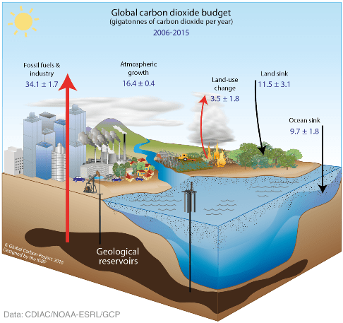
All this brings me to the latest Global CO2 Budget graphic  shown below:

This graphic does not look like the one you have probably examined before. Those graphics were normally global CARBON budget.  This one is global CARBON DIOXIDE budget. CO2 weight ratio to C is 44 to 12.   To convert, multiply the C number by 3.67 to convert to CO2.

This chart would suggest that most of the O2 comes from the “land sink” rather than from the “ocean sink”.  Error bars on the land sink are big. No big deal, as I suppose most of this is supposition anyway.

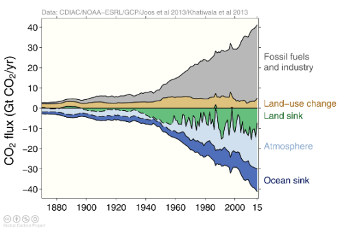
The followingxxxxxchart is interesting:

The chart balances emissions—fossil fuels and industry plus land use changes against sinks –land sink, ocean sink and the atmosphere.  The ocean is absorbing more CO2.  The land sink, since about 1950, has really increased, reflecting the “greening of the planet”.

cbdakota


  1. It is said that the plankton to krill to Blue whale is about as close a food chain connection as one can find. The Krill eat phytoplankton and the Blue whales eat krill. The blue whale can eat as many as 40 million krill per day or around 8,000 lbs. daily in order to power its massive body.
  2. “Plankton” is Sponge Bob SquarePants’ big enemy. Just another form of harmful species.


Greenland Ice Loss Has Contributed A Negligble 1.5cm To Sea Level Since 1900


 This is a reblog of a posting on No Tricks Zone.
 The topic is how the warmers and their cohorts in the media exaggerate the effect of melting glaciers  are having on sea level rise.  This posting is one more confirmation that the US media do not understand the metric numbers.
 ================================================
NO TRICKS ZONE

Since 1993, Greenland’s Ice Sheet Melt Has Added Just 0.39 Of A Centimeter To Global Sea Levels

Exposing ‘Staggering’ Ice Sheet Melt Deceptions

In recent months, two new papers published in The Cryosphere have provided a condensed summary of the ice-melt and sea-level-rise consequences of global warming for the Arctic region.

1.  Between 1900 and 2010, the Greenland Ice Sheet (GIS) has melted so extensively and so rapidly that the GIS ice-melt contribution to global sea level rise has amounted to 1.5 centimeters for the entire 110-year period.   One-and-a-half centimeters.  That’s 0.59 of an inch!

2. It gets worse.  Between 1993 and 2010, the contribution to global sea level rise has been a disturbing 0.39 of a centimeter.  Almost 4/10ths of a centimeter.  That’s 0.15 of an inch!


Leeson et al, 2017

Melt water from the Greenland ice sheet contributed 1.7–6.12 mm [median 3.9 mm, or 0.39 of a centimeter] to global sea level between 1993 and 2010


Fettweis et al ., 2017

SMB [surface mass balance, Greenland Ice Sheet] during the 1920–1930 warm period over Greenland was comparable to the SMB of the 2000s, due to both higher melt and lower precipitation than normal.”

“Finally, with respect to the 1961–1990 period, the integrated contribution of the GrIS SMB [Greenland Ice Sheet Surface Mass Balance] anomalies over 1900–2010 is a sea level rise of about 15 ± 5 mm [1.5 centimeters], with a null contribution from the 1940s to the 2000s


Breakdown: 1900-2010 GIS Sea Level Rise Contribution

1920s-1930s: GIS contribution to sea level rise: 1.1 cm

1993-2010: GIS contribution to sea level rise: 0.39 cm

1940s-2000s: a null contribution” [to sea level rise]


Washington Post Peddles Alarmism With Deceptive ‘Trillion Tons’ Of Lost Ice Pronouncements


It’s scary to learn that the Greenland Ice Sheet has lost a “staggering” 9 trillion tons of ice since 1900.

It’s not scary to learn that 9 trillion tons of ice losses actually amounts to less than 1 inch (0.6 of an inch, or 1.5 centimeters) of sea level rise contribution from Greenland meltwater since 1900.

So what does a world-renown news organization like the Washington Post do with this contextually-weighted scientific information?   Of course, like most other media organizations in the modern era,  the Post attempts to frighten the public with disturbing trillions of tons of lost ice exclamations without emphasizing the modest and nearly imperceptible sea level impact such “staggering” ice losses produce.

In December, 2015, the Post‘s Chris Mooney summarized “Greenland’s massive, centennial contribution to sea level rise”.


Washington Post  (December, 2015)


It is apparent from reading the article that Mooney is either (a) unaware that less than 1 inch of long-term sea level impact is not “massive”, and therefore using that descriptor in conjunction with  trillions-of-tons of ice loss can be misleading, or (b) he is aware that less than 1 inch of sea level impact in 110 years is not especially alarming, so he buries this inconvenient detail in the body of the article and instead he focuses on employing terms like “staggering” and “massive” and “trillions” and “disturbing” and “alarming” in an effort to conceal.

It would appear that (b) is more likely.

Notice above how Mooney cursorily acknowledges that 1 inch of global-scale sea level rise from 9 trillion tons of melted GIS ice “may not sound like much”.  But then, to recover, he misleadingly pivots to hypothetical scenarios, equating what one inch of sea level rise would do if this water equivalent from across the world ocean was only dumped on the United States’ interstate highway system.  (How does fantasy writing like this make it into a serious science article?)

And then, to pile on another thought experiment, Mooney adds the obligatory “if the entire ice sheet were to melt” conjuring so he can mention that “20 feet of sea level rise” is what’s at stake here.

One inch in 110 years isn’t enough to garner attention, but 98 feet (times 63) of submerged U.S. roads and global coastal areas is quite the scary scenario.

The Washington Post employed this same misleading and diversionary strategy about 8 months later, again relying on the “9 trillion tons of ice” lost study to scare readers.


Washington Post (July, 2016)


If Misleading Readers Wasn’t Allowed, What Would The ‘Honest’ Headlines Look Like?


If news organizations weren’t allowed to mislead readers about climate science, what would the headlines say?

With regard to the long-term (and recent) ice melt records for the Greenland Ice Sheet, a non-deceptive, non-misleading headline might look something like this.

Please check in to this posting on NoTricksZone by clicking here.

Continue reading

Fire Ice–Biggest Source Of Natural Gas On The Planet


The US Geological Survey (USGS) cited estimates of the methane (CH4) trapped in global methane hydrate (aka methane clathrate, Fire Ice, etc.) deposits are 3600 times more than the 2016 US consumption of natural gas. The 2016 US   consumption of natural gas (natural gas is mostly methane), according to Donn Dears, was 27.5×10^12 cubic feet.

The estimate of trapped gas in the deposits ranges from 10^17 to 5×10^18 cubic feet*.  Those are estimates and further those estimates probably include some amount of methane hydrate that will never be economical to produce. Even so, oil reserves that were supposed to have peaked many years ago, keep growing because of new technology. eg. Fracking.  So, who knows?

*(For the non-engineer or scientist that might not know how much that is, it can be restated as 1 followed by 17 zeros to 5 followed by 18 zeros cubic feet of natural gas.)

Where are the hydrate deposits found?

Methane hydrate deposits are found (or predicted) to be associated with continental margins and onshore permafrost areas. The chart below global areas where deposits are to be found.


First, let’s discuss where the methane originates. Methane is largely produced by micro-organisms that act on the plankton that has accumulated deep in the ocean floor sediments.  In the upper layers of the sediment where the temperature and pressure are suitable, the rising CH4 bubbles are captured in very cold water and the hydrate is formed. While methane produced biogenically is considered the most widespread source, there is another source.  Thermogenic methane is produced where high pressures and high temperatures cook organic matter.

Continue reading

Global Weather Disasters Are Down Despite The Increase In Atmospheric CO2


The world is presently in an era of unusually low weather disasters. This holds for the weather phenomena that have historically caused the most damage: tropical cyclones, floods, tornadoes and drought. Given how weather events have become politicized in debates over climate change, some find this hard to believe. Fortunately, government and IPCC (Intergovernmental Panel on Climate Change) analyses allow such claims to be adjudicated based on science, and not politics.”      

The above is a statement by Roger Pielke, jr.  It is important to note that he cites the IPCC’s  bible of catastrophic man-made global warming. Their bible says there is no proven connection between severe weather events and global warming.  Pielke, jr. is not a skeptic—he is a warmer.

Pielke, Jr. points out the gap between facts and what the alarmists tell the public.

As a skeptic, I am continually frustrated by how successful the alarmist and their cohort, the media, have been in selling the public with bombast.  The media, because they know crisis sells newspapers or because they are, by and large pro big government, have done wonders squelching the actual data.

Continue reading

An Inconvenient Truth: Al Gore’s Nashville House Electric Use Per Year Is 21 Times The Average American’s Use.


Over the years, Al Gore’s Nashville house has been a topic of discussion because of the enormous amount of electricity it uses. Frequently it is mentioned as evidence when calling Mr. Gore a hypocrite. According to a posting on TheLid.com titled “How Al Gore Fooled The World Into Paying For His Giant Carbon Footprint” new data shows little has changed over the years.

The new data about his Nashville house includes:

  • The past year, Gore’s home energy use averaged 19,241 kilowatt hours (kWh) every month, compared to the U.S. household average of 901 kWh per month.
  • Gore guzzles more electricity in one year than the average American family uses in 21 years.
  • In September of 2016, Gore’s home consumed 30,993 kWh in just one month – as much energy as a typical American family burns in 34 months.
  • During the last 12 months, Gore devoured 66,159 kWh of electricity just heating his pool. That is enough energy to power six average U.S. households for a year.
  • From August 2016 through July 2017, Gore spent almost $22,000 on electricity bills.

For appearance’s sake, the former VP with an unreleased chakra paid an estimated $60,000 to install 33 solar panels. Those solar panels produce an average of 1,092 kWh per month, only 5.7% of Gore’s typical monthly energy consumption. So, Gore is using tons of fossil fuels–by himself.

 Al Gore owned 4 homes but since his divorce, one of them may now belong to his ex-wife. 

The posting on TheLid.com goes on to discuss how much money Gore has amassed since his term as the Veep was over. 

Gore and all the Hollywood types that tell us how to live in order to save the planet, have a motto, “do as I say, not as I do”.

cbdakota

REBLOG: 4,300 Days Since Last U.S. Major Hurricane Strike–By Dr. Spencer.


Rebloging Dr. Roy Spencer’s posting which can be reached by clicking here.

The season is starting slowly; however,  it may surprise us.   I was in Tampa, Florida on 24 October 2005.  For a day or so, it looked like Tampa might be the landfall.  In the end,  it made landfall south of Tampa, fortunately for my son whose house we were fixing up to sell.

cbdakota

July 31st, 2017 by Roy W. Spencer, Ph. D.

Wednesday of this week will mark 4,300 days since the last major hurricane (Category 3 or stronger, 111-129 mph maximum sustained winds) made landfall in the U.S.

That’s almost 12 years.

The last major hurricane to make landfall in the U.S. was Wilma striking Florida on October 24, 2005, one of several strong hurricanes to hit the U.S. that year. The unusual hurricane activity in 2005 was a central focus of Al Gore’s 2006 movie, An Inconvenient Truth, in which Mr. Gore suggested 2005 was going to be the new normal. As you might recall, Gore went on to receive a Nobel Peace Prize for helping to raise awareness of the severe weather dangers from global warming.

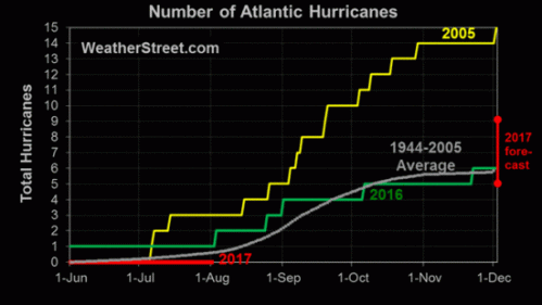
Instead, the bottom dropped out of Atlantic hurricane activity after 2005. The “drought” of landfalling U.S. major hurricanes continues, and as seen in this graphic from WeatherStreet.com, no hurricanes have yet formed anywhere in the Atlantic basin in 2017, despite the forecast for an above-normal hurricane season:

July 2017 Gobal Average Temperature –UAH Satellite


The Global Average Temperature (GAT) anomaly rose 0.07°C  in July. The  GAT anomaly now stands at +0.28°C.

The table below shows that the Southern Hemisphere and the Tropics rose from their readings in June.   NOAA says:

“The most recent model forecasts indicate a high probability that the sea surface temperature in the Niño3.4 region will remain at least slightly above average through winter of 2017-18. “

The above is a model prediction, after all.    I note a slight  drop in the ENSO Meter so I suspect that the GAT will continue its downward trend, though maybe not as fast as I had anticipated

YEAR MO GLOBE NHEM. SHEM. TROPICS
2016 01 +0.55 +0.73 +0.38 +0.84
2016 02 +0.86 +1.19 +0.52 +0.99
2016 03 +0.76 +0.99 +0.54 +1.10
2016 04 +0.72 +0.86 +0.58 +0.93
2016 05 +0.53 +0.61 +0.45 +0.71
2016 06 +0.32 +0.47 +0.17 +0.38
2016 07 +0.37 +0.43 +0.30 +0.48
2016 08 +0.43 +0.53 +0.32 +0.50
2016 09 +0.45 +0.50 +0.39 +0.38
2016 10 +0.42 +0.42 +0.41 +0.46
2016 11 +0.46 +0.43 +0.49 +0.36
2016 12 +0.26 +0.26 +0.27 +0.23
2017 01 +0.33 +0.32 +0.33 +0.09
2017 02 +0.39 +0.58 +0.19 +0.07
2017 03 +0.23 +0.37 +0.09 +0.06
2017 04 +0.27 +0.29 +0.26 +0.22
2017 05 +0.44 +0.39 +0.49 +0.41
2017 06 +0.21 +0.32 +0.09 +0.39
2017 07 +0.28 +0.29 +0.27 +0.51

Chart and Tables are from Dr, Roy Spencer’s blog  which you can access by clicking here.

cbdakota