Category Archives: UAH Satellite Temps

Global Warming Temperature Predictions are Biased and Wrong.


The forecast global temperatures are the basis of the catastrophic global warming theory.  The alarmists use temperature as the goal post when they tell us that the global temperature since 1890 must not rise more than 1.5 degrees Celsius.  They say if the temperature exceeds that number, it could mean Armageddon. Surely you have heard them tell us that we have about 10 more years to live if we don’t act now.  And telling our young people learning in schools that their life span is going to be very short.

So shouldn’t everyone be versed in how the forecasts of global temperatures are derived by the alarmists.

The alarmists have a bunch of computers with various settings that proport to be able to capture the vast number of variables that produce the Earth’s temperature.  In fact, almost none of them provide a comparable forecast into the future. When plotted out the projections by the many computers looks like bed of spaghetti.

All the squiggly lines are individual computer forecasts. The Red line is the average global warming temperatures predicted by the computers.  The lower Green straight line is the mean of the actual measured temperature for this same period.  Note that as the years go by, the computer forecast gets further away from the actual measured temperature. 

As aside observation, can you imagine what each line would look like if not mixed in with all the others.  Can you imagine how much confidence you would have for a computer that predicted temperatures that would rise and drop so precipitously over very short times.  Real temperatures don’t do that.

In science, it is said that if you have a theory and you make predictions from it and it does not match actual results, your theory is WRONG, So the alarmist’s temperature forecasts are wrong and should NOT be used to make public policy.

I have worked at this topic a number of times. Pretty much the same narrative.  Secrets That Global Warming Alarmists Don’t Want You To Know https://wordpress.com/post/cb-dakota.com/108-Part 3 Biased Computers is a posting that shows how the computer programmers can make the temperature forecast hotter. 

Cbdakota

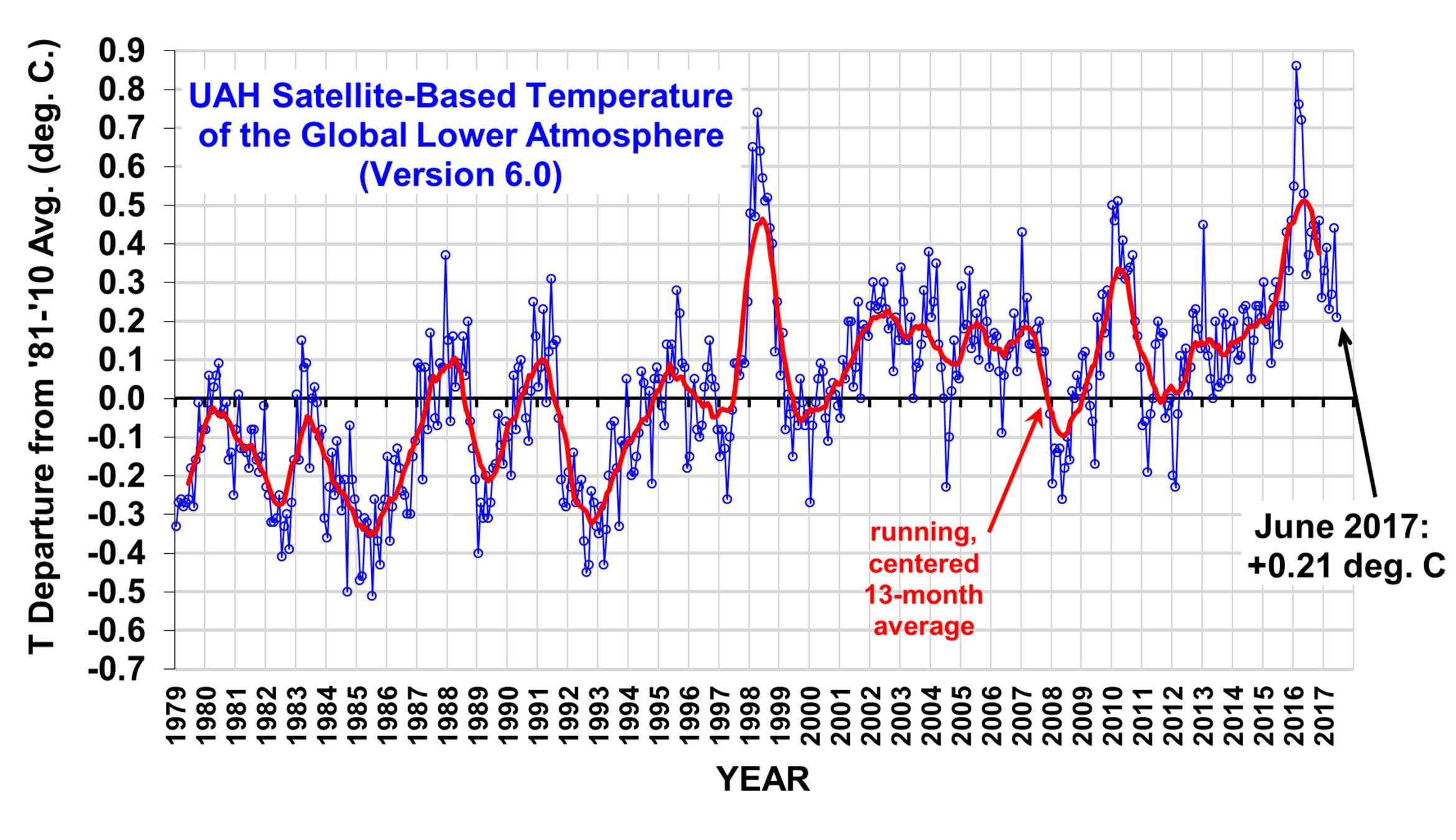
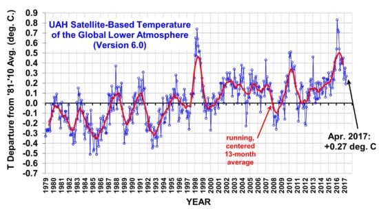
The chart was made by Dr. John Christy.  On many occasions he has given testimony before Congress.   

Natural Causes for The Declining Global Temperature Part 1.


The global temperature anomaly, as read by the UAH satellite system, dropped in January about 0.03 C to + 0.12C.  This follows a drop of 0.25C to +0.15C in December of last year.  Since the last El Nino, when the anomaly peaked out at +0.50C in February 2020, the anomaly has dropped by 0.38C.

NOTE: We have changed the 30-year averaging period from which we compute anomalies to 1991-2020, from the old period 1981-2010. This change does not affect the temperature trends.

Dr Spencer’s note above, alerts the reader that the anomaly chart was change beginning in January 2021. I believe the scientific organization are all remaking their charts to comply with the new averaging period.   I suspect that it is to make more room above the averaging period.  

Why is the global temperature falling? Has something happened to the Green House gases?  Let us take a quick tour of the natural forces and see what part they are playing.

El Nino-Southern Oscillation

Currently the La Nina is dominating the Tropical Pacific Ocean.  NOAA published an advisory saying:

La Niña—the cool phase of the El Niño-Southern Oscillation climate pattern—was firmly in place across the tropical Pacific in December 2020. Forecasters estimate a 95% chance La Niña will last through Northern Hemisphere winter. La Niña can influence seasonal climate in the United States. Conditions so far have not looked especially La Niña-like, but winter is far from over.

El Nino -La Nina is a naturally occurring phenomena in that it has been observed much longer than the industrial era of fossil fuel C02 emissions. 

Solar Cycle 25

Solar Cycle 25 has been underway since December 2019.   The forecasts comparing SC 25 to SC24 were mostly that they would be comparable. Cycle 24 was the least active SC in 100 years. 

The more active the sun is, the more solar wind and conversely a less active sun produces less solar wind. The Sun’s magnetic field carried by the solar wind regulates the number of cosmic rays that enter the atmosphere.   The less active the sun, more cosmic rays enter the atmosphere.  Thus, low activity should form more cloud cover, thus increasing the albedo. A briefing on how this works is briefly described by a posting on GWPF titled “Force Majeure, The Sun’s role in climate control”, written by Henrik Svensmark:     

“The fundamental idea is that cosmic ray ionisation in the atmosphere is important for the formation and growth of small aerosols into CCN, which are necessary for the formation of cloud droplets and thereby clouds. Changing the number density of CCN changes the cloud microphysics, which in turn changes both the radiative properties and the lifetime of clouds.” (CNC is an acronym for Cloud Condensation Nuclei)

 This would reduce the amount of solar radiation that reaches the Earth’s surface, thus reducing global temperature.

Currently, the solar activity is at a low.

 So, where are we?

The El Nino is a natural phenomenon, that raises the global temperature, and it is usually followed by a La Nina that results in a lowering the global temperature.  We are experiencing a La Nina now.

Solar Cycle 25 in underway and it is forecast to be of low activity.  Time delays are often suggested for the impact of Solar Cycles activity.  This may be the case here and that the impact of Solar Cycle 24 is just now beginning to be felt.

Part two will look briefly at two other natural phenomena that many believe are important in effecting the global temperature.   They are the Atlantic Multidecadal Oscillation (AMO) and the Pacific Decadal Oscillation (PDO).

cbdakota

Will Solar Cycle 25 Bring On A Period of Global Warming?


I have been wondering if the very quiet Solar Cycle (SC)24 would result in a slowing down of the rise of global temperatures.  And that it might even halt the rise or perhaps even result in a downward trend.  Certainly, the prognostications by many of my compadres, the skeptics, have been for that to happen.   I look at my go-to anomaly temperature chart, the satellite measuring system know as UAH, (University of Alabama at Huntsville) and I see that the temperature continues to rise.   The Watts Up With That site’s ENSO meter (below) had not gone into the la nina area, but in fact, seems to be indicating more el nino.  However, for several months, now,

it is in the neutral zone.


Courtesy of WattsUpWithThat

And the UAH temperature anomaly has taken a significant two month drop.
Dr Spencer’s site posted “UAH Global Temperature U pdate for April 2020:+0.38 deg. C. Spencer says:

“In April, 2020, the Northern Hemisphere experienced its 2nd largest 2-month drop in temperature in the 497-month satellite record.”

The UAH temperature anomaly is shown below.

One can see the last two El Ninos on this chart.  The El Nino that peaked in 2010 followed by a La Nina brought the anomaly down to the zero line.  Then the temperature anomaly began to rise and peaked out during the 2016 -2017 El Nino. But after a drop, it turned into a rather depressing climb.

More on Solar Cycle 24.  It began in December 2008. It has been the least active SC  for over 100 years.  The SCs activity beginning with SC17 through SC 23 is unprecedented and this period is often called the “Modern Maximum”.

Sunspots are considered a proxy for solar activity. The more sunspots the more activity.  Sunspots were first recorded by Galiello  in 1610. Formal recording of sunspots began about 1750.  The naming of SCs began from that time. SC nominally are 11 years long.

So, does mean that low solar activity may not have a significant, if any effect on global temperature.  But maybe there is a time delay.   I guess we will have to wait and see.

When you look at the following chart, there is one very notable dip in the number of sunspots attributed to SC5 and 6 beginning about about 1800.  The temperatures recorded during this time dropped significantly.  For example the Thames River is said to have frozen over in the winter during that period.  This period is known as the Maunder Minimum.  Chart is courtesy of Solan In fo


SC 21, 22, 23 and 24 are plotted on the following chart.  Comparing SCs 21, 22, 23 to SC 24  makes evident the low activity of SC24.  The Chart is courtesy of Solan Info.

Because SC 24 is reasonably a match to SC5 and 6, one can see why many of our scientists considered history would repeat itself by experiencing low global temperature

This is probably the time to see what some experts are prediction for SC 25. What will SC25 turn out to be.  The next posting will provide expert solar scientist predictions for SC25’s likely activity. 


Solar Cycle 24 is Nearing Completion.


Sometime ago, every month I blogged a brief report on the activity of the Sun.  I have the urge to do that again, so here goes.

Solar Cycle (SC) 24 has just about run its course. It is forecast to give over to SC 25 in late 2019/early 2020 and when it does, that’s call the 24SC minimum.

Sunspots are a proxy for Solar activity.  The chart below shows the average number of sunspots in each month.  The blue dashed line is a 13-month averaged sunspot count.  It is the official sunspot number.  (The formula for the count is shown at the end of this posting.)  The official number of sunspots peaked in April of 2014 thus the solar maximum happened then.

The chart below  illustrates how recent SCs compare to SC 24:


All three of the preceding SCs were much more active than SC24.

As side note,  the SCs on average last for 11 years, or saying another way, 132 months.  At one time, it was believed that if the SC was over before 11 years it was generally an active SC.  More than 11 years, less active.


The chart below shows the 24 SCs and the chart makers attempt at a SC25.  The X axis is in years from 1749 to an estimated 2040.  The Y axis is sunspots

One can see that SCs 23, 22, 21, 19, and 18 represent a very active sun.  The maker of the chart calls this the “modern warm period”.   Looking back the chart maker has noted the time of the “Dalton Minimum” and the “little ice age”.  These periods of low solar activity coincide with the periods of low global temperatures. Perhaps you can see why many scientists are forecasting that global temperatures will soon be dropping.  Also one can speculate that  the global warming  we have experienced may be a product of the past 60 years of a very active sun.    Ok, now one more reading of the chart might suggest that we are due for a period of low solar activity thus a drop in global temperatures.   The chart maker’s projection of SC 25 to  be lowest in recorded history is very likely to be wrong.  However the batting average of the predictors of future SCs is not too stellar  so who knows.

Throughout the recent past, claims were made that the global temperature was going to drop because SC 24 was relatively inactive.  I do not think that the temperature did drop.  I believe I read  one article where the claim was that SC 24 was the reason that the increased CO2 in the atmosphere did not raise the temperature as much as it should  have.  I don’t believe that one.

Was SC 24 definitely an uniquely quiet SC?  I think so.

The sunspot activity of the cycles in comparison. The numbers in the diagram are obtained by summing the monthly differences between the observed SSN and the mean (blue in Fig.1) up to the current cycle month 125. ( I am not sure whom to attribute this chart but I got it from Prof. Fritz Vahrenholt and Frank Bosse who write the diekaltesonne  blog.)

This shows that at just about 10-1/2 years,  SC 24  has had 4464 fewer sunspots than the average  SC.  It also shows that SCs 5 and 6, had the  fewest sunspot and those two SC are coincident with the Dalton Minimum.   SC 12, 13, 14, 15, and 16 were way low on sunspots and they coincided with the little ice age.

It is clear that the sun was much less active as demonstrated by the sunspot record.  I expected a clear sign by the end of its cycle, which we have not yet seen,  of a cooling global temperature  trend. Some think we have that, but I do not see what I expected from the UAH satellite global temperature readings.  The temperature  has declined since the last El Nino but it has not been lowered to the temperature before that El Nino.

Next a look at Solar Cycle 25.

Cbdakota

Sunspot Counting–Woolf Number

The smoothed count is a 13-month averaged sunspot count using this Belgium’s formula:
Rs= (0.5 Rm-6 + Rm-5 + Rm-4 + Rm-3 + Rm-2 + Rm-1 + Rm + Rm+1 + Rm+2 + Rm+3 + Rm+4 + Rm+5 + 0.5 Rm+6 ) / 12
Rs = smoothed monthly sunspot count
Rm = One month’s actual sunspot count
The “-6” through “+6” appended to each Rm is the number of months before or after the month whose smoothed count is being calculated. The beginning and ending months in the formula are only given half the value of the others.*


“EPA Endangerment Finding Endangers The USA”


My previous posting discussed the need to eliminate the endangerment finding (EF) and to do it quickly.   This posting will be a reposting of an essay by Dennis Avery from WattsUpWithThat, titled “The EPA CO2 endangerment finding endangers the USA”.   Avery  really captures the danger that the ER imposes and an overview of how wrong it is. 

My next posting will look at the “lines of evidence” upon which the EPA based the ER and how these “lines” have been invalidated.

cbdakota

======================================================

WATTS UP WITH THAT

The EPA CO2 endangerment finding endangers the USA

By Dennis T Avery with a foreword by Paul Driessen

October 2 2017

President Trump must reverse EPA’s climate change “Endangerment Finding”

Foreword by Paul Driessen:

The Obama EPA’s infamous “Endangerment Finding” declared that carbon dioxide and methane from fossil fuel operations cause global warming and climate change that pose imminent dangers to the health and wellbeing of every American. In this insightful article, climate history author Dennis Avery explains why this finding is based on bad science and should not be the basis for bureaucratic regulations or court decisions.

As Avery notes, computer climate models have predicted far more warming than has actually occurred in the Real World. Contrary to EPA claims, hurricanes, tornadoes, floods and droughts have not become more frequent or severe. Natural forces and phenomena explain the various climate and weather fluctuations we have observed over the centuries – and demonstrate that CO2 is only a “bit player” in determining these changes. Moreover, new research convincingly shows that solar activity determines the number of cosmic rays hitting the Earth, and thus the extent of low-lying clouds that periodically cool the planet … and at the other end of the cycle bring sunnier skies that warm it.


Guest opinion by Dennis T. Avery

Nine years ago, the Obama Environmental Protection Agency issued an “Endangerment Finding.” It claimed that methane leaks from natural gas production and pipelines, and manmade carbon dioxide emissions from burning fossil fuels, cause dangerous global warming that poses an imminent danger to the health and wellbeing of Americans. However, the Finding was based on computerized climate models that couldn’t even successfully hind-cast the weather we’d had over the past century – much less forecast Earth’s climate 100 years into the future. In fact, Earth’s climate has changed frequently, often abruptly.

EPA essentially asserted that the 80% of our energy that comes from coal, oil and natural gas caused all our planet’s recent warming and any more warming is a long-term threat. Obama’s team thus bet in 2009 that Earth’s warming from 1976–98 would continue. But it didn’t. Never mind all those recent NOAA and NASA claims that 2016 was our “hottest year” ever. Satellites are our most honest indicator, and they say our planet’s temperature has risen an insignificant 0.02 degrees C (0.04 degrees F) since 1998.

That 20-year non-warming clearly shows that the models are worthless for prediction. But the Federal Appeals Court in Washington nevertheless recently cited methane emissions to block regulatory approval for a new natural gas pipeline. The ruling will encourage radical greens to keep thinking they can regulate gas and oil production and transport into oblivion. Alarmists across the country are already citing the new precedent in other cases, in effect demanding re-hearings on Trump’s entire energy plan. Continue reading

President Trump Dumps Alarmist Panel-Draining The Swamp Continues


The climate alarmists tell the public that the sea level is going rise 7 to 15 feet by the end of this century.  The crops are going to fail.  There will be mass extinctions.  The extent of the horrors awaiting us in the future are almost unlimited.  The basis for all these catastrophes is the predicted rise in temperature based upon the computer models they have programed. For example, the sea level rise is predicated on a rise of temperature in the range of 4 to 7° C  or greater by the year 2100.  Without the big rise in global temperature, all these supposed disasters will not come to pass.

These computers have been forecasting temperature for many years.  How are they doing?  If a company had their operations run by these computers, they would be out of business by now.  Look at some of the recent revelations. The New American posted “Top Climate Alarmist: Computer Models Wrong, Skeptics Right on “Pause”.  From that posting we get this:

“Count on the Fake News media to ignore a huge admission by a Climategate scientist that there has been no measurable global warming over the past 20 years — something he has previously vociferously denied. The admission by Dr. Benjamin Santer, a top global-warming alarmist, should have made headlines — but, of course it didn’t.

Continue reading

Global Temperature Update– June 2017


The UAH satellite global temperature measurement cooled off to an anomaly of +0.21C in the month of June.  The peak global temperature resulting from the El Nino, is now on its way to normal.  The May global temperature reversed the downward trend by increasing but this was more than offset by the 0.23 C drop in the month of June.  Many postings are arguing that the PAUSE has resumed.   I will leave that alone for several months before commenting.

This anomaly is the lowest since July 2015.

I believe we are in for some global cooling, but it may still be several years away.   I have mixed feelings  about this.  The world will become a harder place for many people if this results in reduced food crops and much higher costs for keeping warm.  Ask those people in Europe that can no longer afford the high cost electricity in the winter  that has resulted from imposing wind and solar energy on them. Cold weather is the real climate killer, not the fantasy of higher temperatures that the warmers spout.  But the good part would be  is it should put a stake in the heart of the catastrophic man-made global warming theory.


YEAR MO GLOBE NHEM. SHEM. TROPICS
2016 01 +0.55 +0.73 +0.38 +0.84
2016 02 +0.86 +1.19 +0.52 +0.99
2016 03 +0.76 +0.99 +0.54 +1.10
2016 04 +0.72 +0.86 +0.58 +0.93
2016 05 +0.53 +0.61 +0.45 +0.71
2016 06 +0.32 +0.47 +0.17 +0.38
2016 07 +0.37 +0.43 +0.30 +0.48
2016 08 +0.43 +0.53 +0.32 +0.50
2016 09 +0.45 +0.50 +0.39 +0.38
2016 10 +0.42 +0.42 +0.41 +0.46
2016 11 +0.46 +0.43 +0.49 +0.36
2016 12 +0.26 +0.26 +0.27 +0.23
2017 01 +0.33 +0.32 +0.33 +0.09
2017 02 +0.39 +0.58 +0.19 +0.07
2017 03 +0.23 +0.37 +0.09 +0.06
2017 04 +0.27 +0.29 +0.26 +0.22
2017 05 +0.44 +0.39 +0.49 +0.41
2017 06 +0.21 +0.32 +0.09 +0.39

“Solar Minimum Is Coming” Video


Solar Cycle 24 is on its way to a “minimum” .  That Minimum will probably be in late 2019 or early 2020.  The video  illustrates several issues that are newsworthy.

  • Global Temperature measurements made by satellites are often consider the “gold standard”.  Two organizations make and report their interpretation of these measurements.  The UAH and RSS organizations have typically reported very nearly the same temperatures but separation of the values occurred with RSS now giving higher readings.  A major part of the separation is based how to  correct for the drag that these satellites encounter as the circle above the Earth.
  • And a small point. When the narrator says that Cycle 24 Sunspots were “relatively high”  he is comparing the Sunspot  level now.  However, it might cause some people to think that he means as opposed to other Solar Cycles–which by and large is not true.


cbdakota

April 2017 Global Temperature Anomaly Up 0.08C


The UAH satellite  global average temperature anomaly went up moderately in April from March’s +0.19° C to +0.27°C.   The Southern Hemisphere and the Tropics led the way, but both are well below the same month’s anomalies in 2016. How low will the anomaly go?

The chart and data are from Dr. Roy Spencers blog.


YEAR MO GLOBE NHEM. SHEM. TROPICS
2016 01 +0.54 +0.69 +0.39 +0.84
2016 02 +0.83 +1.16 +0.50 +0.98
2016 03 +0.73 +0.94 +0.52 +1.08
2016 04 +0.71 +0.85 +0.58 +0.93
2016 05 +0.54 +0.64 +0.44 +0.71
2016 06 +0.33 +0.50 +0.17 +0.37
2016 07 +0.39 +0.48 +0.29 +0.47
2016 08 +0.43 +0.55 +0.31 +0.49
2016 09 +0.44 +0.49 +0.38 +0.37
2016 10 +0.40 +0.42 +0.39 +0.46
2016 11 +0.45 +0.40 +0.50 +0.37
2016 12 +0.24 +0.18 +0.30 +0.21
2017 01 +0.30 +0.26 +0.33 +0.07
2017 02 +0.35 +0.54 +0.15 +0.05
2017 03 +0.19 +0.30 +0.07 +0.03
2017 04 +0.27 +0.27 +0.26 +0.21

cbdakota

UAH Global Tropospheric Temperatures–February 2017


The February global temperature anomaly came in at +0.35C which was up +0.05C from January 2017.  The primary contributor to the rise was the warm spell in the Northern Hemisphere.  The UAH global tropospheric temperatures are shown below:

 This chart is a running centered 13-month average which smooths the “red” line in the chart.  The peak at the time of the El Nino was +0.85C.  The La Nina that often follows an El Nino was hardly significant this cycle. The history of the anomalies since January 2015 through February 2017 is shown below.


YEAR MO GLOBE NHEM. SHEM. TROPICS
2015 01 +0.30 +0.44 +0.15 +0.13
2015 02 +0.19 +0.34 +0.04 -0.07
2015 03 +0.18 +0.28 +0.07 +0.04
2015 04 +0.09 +0.19 -0.01 +0.08
2015 05 +0.27 +0.34 +0.20 +0.27
2015 06 +0.31 +0.38 +0.25 +0.46
2015 07 +0.16 +0.29 +0.03 +0.48
2015 08 +0.25 +0.20 +0.30 +0.53
2015 09 +0.23 +0.30 +0.16 +0.55
2015 10 +0.41 +0.63 +0.20 +0.53
2015 11 +0.33 +0.44 +0.22 +0.52
2015 12 +0.45 +0.53 +0.37 +0.61
2016 01 +0.54 +0.69 +0.39 +0.84
2016 02 +0.83 +1.16 +0.50 +0.99
2016 03 +0.73 +0.94 +0.52 +1.09
2016 04 +0.71 +0.85 +0.58 +0.93
2016 05 +0.54 +0.65 +0.44 +0.71
2016 06 +0.34 +0.51 +0.17 +0.37
2016 07 +0.39 +0.48 +0.30 +0.48
2016 08 +0.43 +0.55 +0.32 +0.49
2016 09 +0.44 +0.49 +0.39 +0.37
2016 10 +0.41 +0.42 +0.39 +0.46
2016 11 +0.45 +0.40 +0.50 +0.37
2016 12 +0.24 +0.18 +0.30 +0.21
2017 01 +0.30 +0.27 +0.33 +0.07
2017 02 +0.35 +0.54 +0.15 +0.05

cbdakota