Category Archives: NOAA

Secrets That Global Warming Alarmists Don’t Want You To Know- Part 2 -Current Temperatures Are Not Alarming


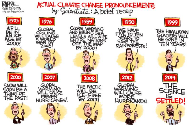
Recent global temperatures are said to be all time records.  Without any doubt, they say, a degree more will cause severe damage and perhaps be existential.  That is just another salvo of “we are all going to die” misinformation.   Unfortunately there seems to be no member of the media willing to publish a list of the many times we have been told we only have X number of years left before it is too late. The media people are too lazy to do so, or they are politically motivated to keep the scam alive.  Part 1 Secrets that Global Warming Alarmist Don’t Want You To Know Shows the inaccuracy of the Climate models.

Are global temperatures rising?

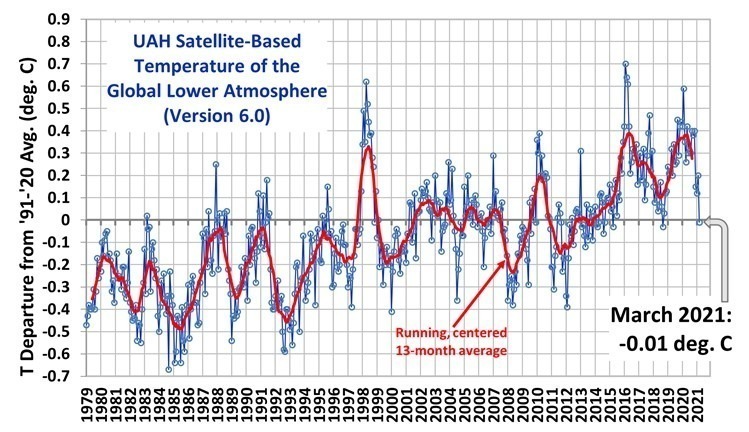
Not significantly.  And recently they are falling.

Look at the new satellite temperature measurement chart and notice that the March 2021 anomaly is similar to those in 2014-2015 time frame.  March anomaly dropped 0.2C.   And this is after two El Ninos that really boosted the temperature anomalies.  Will April and following months continue a cooling phase?  We can’t be sure, but odds are that it will.  Latest Global Temps « Roy Spencer, PhD (drroyspencer.com)

These satellite measurements are not an outliner.  And they are consistent with weather balloon temperature readings.  Chart Courtsey of Dr.Roy Spencer

The National Oceanic and Atmospheric Administration (NOAA) is a scientific agency within the United States Department of Commerce that focuses on the conditions of the oceans, major waterways, and the atmosphere.

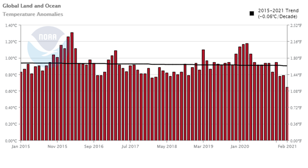
The following NOAA chart shows that the combined global land and ocean temperature has not been rising for the last 5 years, in fact it shows a slight decline.  During this period, atmospheric CO2 has been rising.   They confirm the cooling trend.

Then there is the global warming hiatus.   From 1998 until 2013 there was almost no increase in global temperatures. 

See the NOAA chart below

This caused a lot of agony among the alarmists. Fifteen years, rising atmospheric CO2, four El Ninos with hardly any rise in temperature. The 4 El Ninos raised the temperature and then fell when a La Nina occurred.   NOAA charts from  Climate at a Glance | National Centers for Environmental Information (NCEI) (noaa.gov)

According to Wikipedia:

“It is believed that El Niño has occurred for thousands of years”  and  “There is no consensus whether climate change will have any influence on the occurrence, strength or duration of El Niño events, as research supports El Niño events becoming stronger, longer, shorter and weaker.” 

So, the observed rise in global temperature following an El Nino-La Nina is as likely to be caused by natural causes as by man-made causes. And the trend in the period of the hiatus was only +0.09/Decade.  At that rate, after 100 years, the global temperature rise would be less than 1C— hardly worth all the alarm.

Even at the +0.14c /decade rise of the satellite observed temperatures since 1979, it would take 70 years to raise it 1C.

The warmest ever and the most CO2 ever are claimed, seemingly, monthly by the alarmists.  You are to believe that the current period is the” perfect” climate and any change is perilous.

The alarmists want all the scientific work establishing previous climate condition shoved down the memory hole, never to be seen again.   The globe has seen higher CO2 concentrations in the atmosphere and higher temperatures than those being experienced today.  The chart below illustrates this.

Berner RA, Kothavala Z (2001)GEOCARBlll: CO2 over Phanerozoic time.

And we know that the globe has also been much colder.

So now you know that the global temperature is not rising, in fact for the last 5 years the temperature has been falling.  Further, you know that the Alarmists forecasts of rapidly increasing global warming are not happening.   Their computer programs are biased to predict increasingly warming temperatures in order to scare people into going along with their bogus science.  It is also clear that the rise in global temperatures might be just natural changes.  Do not discount natural changes.  What do you think began melting the glaciers that covered much of North America some 12 to 15 thousand years ago?  It was not CO2 from SUV exhaust pipes.   

I am going to use Dr. Roy Spencer’s comment in one of his recent blogs.  It goes like this:

Seldom is the public ever informed of these glaring discrepancies between basic science and what politicians and pop-scientists tell us.

Why does it matter?

It matters because there is no Climate Crisis. There is no Climate Emergency.

Yes, irregular warming is occurring. Yes, it is at least partly due to human greenhouse gas emissions. But seldom are the benefits of a somewhat warmer climate system mentioned, or the benefits of more CO2 in the atmosphere (which is required for life on Earth to exist).

But if we waste trillions of dollars (that’s just here in the U.S. — meanwhile, China will always do what is in the best interests of China) then that is trillions of dollars not available for the real necessities of life.

Prosperity will suffer, and for no good reason.

Go have your kids read this.

cbdakota

Natural Causes for The Declining Global Temperature Part 1.


The global temperature anomaly, as read by the UAH satellite system, dropped in January about 0.03 C to + 0.12C.  This follows a drop of 0.25C to +0.15C in December of last year.  Since the last El Nino, when the anomaly peaked out at +0.50C in February 2020, the anomaly has dropped by 0.38C.

NOTE: We have changed the 30-year averaging period from which we compute anomalies to 1991-2020, from the old period 1981-2010. This change does not affect the temperature trends.

Dr Spencer’s note above, alerts the reader that the anomaly chart was change beginning in January 2021. I believe the scientific organization are all remaking their charts to comply with the new averaging period.   I suspect that it is to make more room above the averaging period.  

Why is the global temperature falling? Has something happened to the Green House gases?  Let us take a quick tour of the natural forces and see what part they are playing.

El Nino-Southern Oscillation

Currently the La Nina is dominating the Tropical Pacific Ocean.  NOAA published an advisory saying:

La Niña—the cool phase of the El Niño-Southern Oscillation climate pattern—was firmly in place across the tropical Pacific in December 2020. Forecasters estimate a 95% chance La Niña will last through Northern Hemisphere winter. La Niña can influence seasonal climate in the United States. Conditions so far have not looked especially La Niña-like, but winter is far from over.

El Nino -La Nina is a naturally occurring phenomena in that it has been observed much longer than the industrial era of fossil fuel C02 emissions. 

Solar Cycle 25

Solar Cycle 25 has been underway since December 2019.   The forecasts comparing SC 25 to SC24 were mostly that they would be comparable. Cycle 24 was the least active SC in 100 years. 

The more active the sun is, the more solar wind and conversely a less active sun produces less solar wind. The Sun’s magnetic field carried by the solar wind regulates the number of cosmic rays that enter the atmosphere.   The less active the sun, more cosmic rays enter the atmosphere.  Thus, low activity should form more cloud cover, thus increasing the albedo. A briefing on how this works is briefly described by a posting on GWPF titled “Force Majeure, The Sun’s role in climate control”, written by Henrik Svensmark:     

“The fundamental idea is that cosmic ray ionisation in the atmosphere is important for the formation and growth of small aerosols into CCN, which are necessary for the formation of cloud droplets and thereby clouds. Changing the number density of CCN changes the cloud microphysics, which in turn changes both the radiative properties and the lifetime of clouds.” (CNC is an acronym for Cloud Condensation Nuclei)

 This would reduce the amount of solar radiation that reaches the Earth’s surface, thus reducing global temperature.

Currently, the solar activity is at a low.

 So, where are we?

The El Nino is a natural phenomenon, that raises the global temperature, and it is usually followed by a La Nina that results in a lowering the global temperature.  We are experiencing a La Nina now.

Solar Cycle 25 in underway and it is forecast to be of low activity.  Time delays are often suggested for the impact of Solar Cycles activity.  This may be the case here and that the impact of Solar Cycle 24 is just now beginning to be felt.

Part two will look briefly at two other natural phenomena that many believe are important in effecting the global temperature.   They are the Atlantic Multidecadal Oscillation (AMO) and the Pacific Decadal Oscillation (PDO).

cbdakota

Solar Cycle 24 Ends-Solar Cycle 25 Begins


The government science agencies, NOAA and NASA determined that Solar Cycle 24 ended November 17, 2019 and Solar Cycle 25 began.  Solar Cycle 24 was the least active cycle in 100 years. There are several ways to express solar activity, but sunspot counting is the most frequently used method.  Solar Cycle 24 smoothed maximum count was 116.4 in April 2014.  The highest unsmoothed count was 146.1 in February 2014.  The smoothed count is the official number.  It is smoothed over 13 months. Six months before and six months after.  The smoothed count method is detailed at the end of this posting if you are curious.

The consensus of the experts regarding the predicted count of Cycle 25, at maximum, will be 115.  This prediction came from the Solar Cycle 25 Prediction  Panel made up international experts  according to PhysOrg posting .  In my May 2020 posting of a summary of expert’s predictions, NASA predicted that Cycle 25 would be the least active Cycle for 200 years.  NOAA however, predicted it would be more active than Solar Cycle 24.

The following chart compares Cycles 23, 24 and the predicted Cycle 25:

Some say that you can tell how active a cycle will be by the early formation of sunspots.  Lots of sunspots right away would mean an active cycle.  And conversely, slow development of sunspots would likely be the opposite. If that is true, perhaps you can make a prediction from the following chart courtesy of Solen info solar :


Virtually everything on this chart is Cycle 24.  This chart’s info box is probably very hard to read.  So let me describe the lines to you.  The dashed lines are the smoothed sunspot numbers.  The blue dashed line is the sum of the smoothed sunspots in the Northern and Southern solar polar fields. You can probably see that the blue dashed line crosses the solar max (the vertical red line) where the smoothed sunspots are at about 116.  But to make our predictions, we need to actually unsmoothed monthly sunspot reading.  That is the brown line. Here again this line is the sum of the Northern and Southern solar polar field sunspots.  In February, 2014, the monthly max of 146 was registered. Those numbers, 116 and 146, are the ones noted in the opening of this posting.

Comparing the brown line peak at 9 months after Solar Cycle 24 began, it looks like it is about a monthly 7 sunspots.  Doing the same for Cycle 25, at 9 months it looks like a monthly sunspot count of 7.  That would suggest to me that perhaps those that say 24 and 25 are going to be the same, may be right. But I would not make a bet on that.

As Yogi Berra, the Hall of Fame Baseball player, was alleged to have said, “It’s tough to make predictions, especially about the future.

cbdakota

Smoothed Count Method.

The smoothed count is a 13-month averaged sunspot count using this Belgium’s formula:
Rs= (0.5 Rm-6 + Rm-5 + Rm-4 + Rm-3 + Rm-2 + Rm-1 + Rm + Rm+1 + Rm+2 + Rm+3 + Rm+4 + Rm+5 + 0.5 Rm+6 ) / 12
Rs = smoothed monthly sunspot count
Rm = One month’s actual sunspot count
The “-6” through “+6” appended to each Rm is the number of months before or after the month whose smoothed count is being calculated. The beginning and ending months in the formula are only given half the value of the others.*

What Are The Experts Predicting For Solar Cycle 25?


The  Global Warming Policy Forum on 15 May 2020 posted   “The Sun Has Entered “Very Deep” Solar Minimum” /authored by David Whitehouse.    It provided a list of predictions of SC 25’s maximum sunspots.   I have rearranged the chart to show the predictions that suggest it will be less active than SC 24, those that expect SC24 and SC25 to be nearly identical and those that predict it will more active.

As a benchmark, SC 24 sunspots at maximum were 116.4

       Less Active

PREDICTOR SUNSPOT RANGE At Maximum
Labonville 89+29/ -14
Ahluwalia 7
Singh 89+/-9
NASA 58 to 81 (30% to 50% less than SC24)


          Nearly Identical Activity

PREDICTOR SUNSPOT RANGE At Maximum
Pishkalo 116+/-2
Komitov Same or slightly larger
Bhrowmik Same or slightly larger
NOAA 95 to 130


   More Active

PREDICTOR SUNSPOT RANGE At Maximum
Miao 121+/-32.9
Svalgaard 116.4 to 156.6
Han 228+/-40.5
Li 168+/-6.3
Dani 159+/-22.3

Continue reading

Europe Has Been Better Than The US At Predicting Weather For At Least 6 Years.


The National Weather Service (NWS) and the National Oceanic and Atmospheric Administration (NOAA) are complaining that the current government shutdown is really endangering US citizens because it has stopped some research.   The organizations posting titled “The government shutdown is putting the US further behind in a weather-forecasting race with Europe” however suggests that the issue is a race with Europe more than saving us from serious problems. 

The shutdown is in its 26th day and it has the potential to make poor predictions about the 2019 tornado and hurricane seasons, alleges NSW and NOAA.  Their predictions were way off for both tornados and hurricanes in 2018.   But one wonders about how much this shutdown has impacted their work.  Being that the 26 days have contained 6 Saturdays and Sundays and more to the point the entire Christmas week as well as the following New Years week.  Probably not much would have been done in that period of time. This sounds like a CYA or a political statement about the stakes in the shutdown.

Speaking of lost time, they tell us that in 2012, the European weather forecast system predicted that Tropical Storm Sandy would make US land fall and our system said it would not.  So this is 6 plus years later and our agencies have not caught up with the European system.  What is some small part of 26 days got to do will the fact the European system has been better than ours for at least 6 years? 

The posting tells us:

“Atmospheric scientists and meteorologists tend to agree about one thing: Europe is better than the US (and arguably the rest of the world) at predicting weather.

The NWS has been falling behind the European Centre for Medium Range- Weather Forecasting for some time.”

 My suggestion is to start using the European system. Looks like that would have saved the US a lot of money by not spending 6 year’s worth of research money and we are still falling behind.    

The complete NWS and NOAA posting can be read by clicking here


cbdakota

Does The Green House Gas Effect Really Exist?–Part 2


The previous posting,  “Does the Greenhouse gas effect really exist–Part 1”,  looked at measured radiation of longwave infrared (IR)  that demonstrated the greenhouse gas effect.

There is another way to demonstrate the  greenhouse gas effect using the SURFRAD data.  I have selected SURFRAD data for the year 2016 for the Sioux Falls, South Dakota and Desert Rock, Nevada sites

Some thoughts about the following charts 1B and 3B.  These charts plot  the radiation data—both solar short wave and the Earth’s longwave IR plus the net Solar and net longwave IR.

Charts 2B and 4B show air temperature, wind speed, relative humidity and albedo.  These data are not used in the analysis but might prove valuable to someone interested in deriving a better understanding of the energy balance.

Figure 1B Monthly Means Sioux Falls SD:  Radiation Chart For 2016

Different from the earlier chart in Part 1 which showed a 24 hour continuous plot of data, the following 4 charts are the daily data in a given month combined and  the mean extracted for each data set.

Continue reading

Does The Green House Gas Effect Really Exist?–Part 1


Does one have to deny that the so-called green house gases (GHG)s have an effect on global temperatures to be a skeptic?  Many of the big-league skeptics believe that the GHGs do play a part in global temperature.  So maybe not.

The following is a quote from Climate Change Reconsidered II** :

“ As carbon dioxide concentrations increase so too does the intensity of back radiation at the surface across the active wavebands of CO2, and because this radiation emanates from a lower and warmer layer of the atmosphere, the magnitude of the back radiation increases. Consequently, the net infrared radiation emanating from the surface is reduced, causing a rise in temperature that generates increased heat exchange and evaporation. This surface warming also contributes to an increase in convective instability”.

So, hold on and let me explain why I believe this.

First, a look at the big picture.   The Sun’s surface is somewhere about 5500 C.  Radiation goes out in all directions with some of it directed toward Earth.  This is Earth’s principal source of energy.  This radiation travels 93 million miles in about 8 minutes to reach Earth.  It loses much of its strength in the journey, but at the top of our atmosphere, its strength is nominally 1365 watts per square meter.  The Sun’s radiation mainly consists of photons of visible light, ultraviolet and infrared.  The full force of the Sun’s radiation seldom reaches the Earth surface because of clouds, reflection off snow and ice, scattering in the atmosphere for example and the angle that the Sun’s rays strike the surface.  Further complicating this topic is the fact on average, the Sun only shines on any place on Earth for more than 12 hours per day.

Many charts showing the Earth’s average energy budget use 340 w/m²  because when you factor in the length of the day and the spherical geometry of the Earth the effect is about ¼ the energy at the top of the atmosphere at noon.  While the Energy budget charts are useful, I believe they get in the way of understanding the GHG effect.  So, the following will uses actual measured radiation data and not the hypothetical 340w/m².

To get an idea of what happens at the surface, lets take a look at the data collected by the Surface Radiation Project. The Surface Radiation Budget Network (SURFRAD) was established in 1993 through the support of NOAA’s Office of Global Programs. The SURFRAD mission is clear:

“its primary objective is to support climate research with accurate, continuous, long-term measurements of the surface radiation budget over the United States”. 

SURFRAD currently has 7 operating stations.  These stations are very well equipped. They can measure upwelling and downwelling solar, upwelling and downwelling IR, temperature, RH, wind speed, cloud cover, UVb  and several others.   The SURFRAD website allows you to make charts of the collected day.  For starters I have plotted some data from the Desert Rock, Nevada SURFRAD site.

Figure 1A

Continue reading

Major Hurricane Landfalls In Florida—1900 To 2017


This posting is a reblog of Dr Roy Spencer’s posting “Inevitable Disaster: Why Hurricanes Can’t Be Blamed On Global Warming“.   It is part a pitch for his new book that is a “putdown”  to those the would-be prophets of global doom. 

cbdakota

=====================================================

September 18th, 2017 by Roy W. Spencer, Ph. D.

Partly in response to the crazy claims of the usual global warming experts (Stevie Wonder, Beyoncé, Jennifer Lawrence, Mark Ruffalo, Bill Nye the Science Guy, Neil deGrasse Tyson, Pope Francis), I decided to write another Kindle e-book. This one is entitled, Inevitable Disaster: Why Hurricanes Can’t Be Blamed On Global Warming.


In it I review the many fascinating examples of major hurricane landfalls in the United States, even going back to colonial times.

For example, two major hurricane strikes endured by the Massachusetts Bay Colony, in 1635 and in 1675, have yet to be rivaled in more modern times. Major hurricane Maria, now approaching a downward trend in both the number and intensity of landfalling major Florida hurricanes:Dominica and Guadeloupe, is probably no match for the Great Hurricane of 1780 in the Caribbean, which had estimated winds of 200 mph and killed 20,000 people.

I also address the reasons why Hurricane Harvey and its flooding cannot be blamed on climate change. Regarding Hurricane Irma which recently terrorized Florida, you might be surprised to learn that it is consistent with a downward trend in both the number and intensity of landfalling major Florida hurricanes:

Continue reading

Will The Global Temperature Begin To Cool Down In The Near Future?  


The numbers of scientist predicting a drop in global temperature  are becoming a large group— ready to challenge the mythical 97%.  This blog has posted some of the predictions.  The postings have demonstrated that there is not total unanimity as to reason why the temperature will drop.  Maybe it is a combination of different things. That is refreshing in light of the warmer’s one size fits all theory that CO2 is essentially raising or will raise global temperature all by itself.

First some discussion that suggests that CO2 is not what the warmers claim.

The warmer’s theory says that atmospheric CO2 molecules intercept low-frequency IR waves radiated from Earth on their way back into space.  The exchange warms the atmosphere a little and this causes water to evaporate and move into the atmosphere. Water vapor is a much more significant “greenhouse gas” than CO2. They say that the result is a 3 fold increase in temperature as a result.  This is their so-called “climate sensitivity”.  This is part of the GIGO that is put into the climate models that the warmers use to predict catastrophic in the future.  Let us look and see how well this has turned out for them in the real world versus the computer world.

The chart above was made in June 2013 so it is a little out of date.  Next chart will be the latest update.

The important things to know are the following

  • All those little hair-like lines represent the output from one of the 73 warmer computers. They are all over the place.
  • The heavy black line aggregates all of the 73 outputs into a single line which represents the “official forecast”.
  • The blue squares are the actual recorded global temperatures as measured by satellites.
  • The actual temperature as measured by the weather balloons  are shown as black dots.
  • The balloons and the satellites essentially confirm each other and they are, again, actual measurements.
  • Every 4 or 5 years, the UN’s Intergovernmental Panel on Climate Change (IPCC) gathers and produces an analysis of the state of the climate. They then issue a technical report and a summary that is primarily for the politicians of the world.  One of the features of the IPCC report is how confident they are that their predictions are spot on.
  • The red arrows show their level of confidence, at the time of the report, as to how sure they are that the forecasts are correct.
  • The first report said that they were “confident”. As each new report was issued, they got more confident of their forecasts.  The last one being 95% certain.  This is all happening as the spread between their forecast temperature readings and the actual  temperature readings continued to diverge.

Continue reading

Theory of Man-Made Global Warming Effect–New Super Computer Cheyenne


Jeane Dixon was guest on late night TV as well as frequently in magazines and other media because she made predictions-some of which came true but mostly were off target. For years, media featured her New Year predictions. Her notoriety sprung from her prediction that the 1960 Presidential election would be won by a Democrat but the winner would not live out his term.  Following President John Kennedy’s assassination, someone remembered her prediction and the rest, as they say, is history.

From Wiki, comes the definition of the Jean Dixon Effect.

John Allen Paulos, a mathematician at Temple University, coined the term ‘the Jeane Dixon effect’, which references a tendency to promote a few correct predictions while ignoring a larger number of incorrect predictions.[1] Many of Dixon’s predictions proved erroneous, such as her claims that a dispute over the offshore Chinese islands of Quemoy and Matsu would trigger the start of World War III in 1958, that American labor leader Walter Reuther would run for President of the United States in the 1964 presidential election, that the second child of Canadian Prime Minister Pierre Trudeau and his young wife Margaret would be a girl (it was a boy), and that the Russians would be the first to put men on the moon.[15][16]

I think it is time to declare the Theory of Man-Made Global Warming Effect.  The theory certainly fits the Effect definition as posited by John Allen Paulos.

cheyenne_plumbing-450And it is about time to do that.  A new, ultra-fast computer, the Cheyenne, has just been brought on-line in Wyoming.  It will be used to do studies, some of which will be related to “man-made global warming”.  What we can expect are more erroneous predictions made faster than they used to be.  That’s progress.  And of course, it means more doom-laden stories for the media to circulate.

cbdakota