Category Archives: CRU Temps

There Is A Difference Between “Warm” And “Warming”


The National Oceanic And Atmospheric Administration (NOAA) released its State of the Climate in 2012: Highlights on August 2. The report says:

Many of the events that made 2012 such an interesting year are part of the long-term trends we see in a changing and varying climate—carbon levels are climbing, sea levels are rising, Arctic sea ice is melting, and our planet as a whole is becoming a warmer place,” said acting NOAA Administrator Kathryn D. Sullivan, Ph.D.   

The report itemizes those things from which they have developed the theme that the planet is becoming a warmer place. The first on the list was this one:

Warm temperature trends continue near Earth’s surface: Four major independent datasets show 2012 was among the 10 warmest years on record, ranking either 8th or 9th, depending upon the dataset used. The United States and Argentina had their warmest year on record.  

Now you are forgiven if you interpret that item as saying that the Earth is getting warmer, and indeed most of the media jumped to that conclusion.  But what are the facts?  Look at the HadCrut* temperature chart for the period from 1998 to 2012 that NOAA made this claim:

Continue reading

Climate Scientists Know Big Scarry Words


A conference of national forecasters was held this week in Exeter to discuss the future of the British climate following the spate of harsher than expected winters, and unusually wet summer since 2007.  Their forecasts of these events missed the mark almost entirely.

Sean Thomas posted on the Telegraph.Co.UK interviews he had with the Met (UK) Office in England.  He says that although he could not attend the meeting,”….. I had direct access to the meteorologists concerned, as I was in Exeter in spirit form, and I managed to speak to the principal actors”.   We hear by the grapevine that the principal actors are denying that they said what Thomas relates in his posting.   I leave it up to you to determine if the following are true and factual transcriptions.

First, I asked Stephen Belcher, the head of the Met Office Hadley Centre, whether the recent extended winter was related to global warming. Shaking his famous “ghost stick”, and fingering his trademark necklace of sharks’ teeth and mammoth bones, the loin-clothed Belcher blew smoke into a conch, and replied,

“Here come de heap big warmy. Bigtime warmy warmy. Is big big hot. Plenty big warm burny hot. Hot! Hot hot! But now not hot. Not hot now. De hot come go, come go. Now Is Coldy Coldy. Is ice. Hot den cold. Frreeeezy ice til hot again. Den de rain. It faaaalllll. Make pasty.

Thomas moved on to Professor Rowan Sutton, Climate Director of NCAS at the University of Reading.

When pressed on the particular outlook for the British Isles. Professor Sutton shook his head, moaned eerily unto the heavens, and stuffed his fingers into the entrails of a recently disembowelled chicken, bought fresh from Waitrose in Teignmouth.

Hurling the still-beating heart of the chicken into a shallow copper salver, Professor Sutton inhaled the aroma of burning incense, then told the Telegraph: “The seven towers of Agamemnon tremble. Much is the discord in the latitude of Gemini. When, when cry the sirens of doom and love. Speckly showers on Tuesday.”

Well it is obvious the Met forecasts are being managed carefully.

The interviews somehow got garbled somewhere in the spirit world but, you have to admit Thomas can write a pretty funny story loaded with irony.

cbdakota

h/t to WUWT

Sea Surface Temperatures Will Reduce Global Temperatures For Years To Come


Joe Bastardi produced a chart which shows actual global temperature anomalies and atmospheric CO2 from the 1960s to the present time.  P. Gosselin extended the chart for the next 17 years (to 2030)  with predicted global temperature anomalies versus atmospheric CO2 .  Gosselin is showing what he believes to be the probable divergence—-further demonstrating that CO2 will not be controlling global temperature.   Gosselin’s premise is that the Atlantic Multidecadal Oscillation (AMO) and the Pacific Decadal Oscillation (PDO) are currently and will continue to be,  the primary forcing agents for global temperatures. His adaptation of Bastardi’s chart is below: (Click on Chart to increase size.)

goselinchart1000What-the-warmists-are-afraid-ofThe baseline shows the cool (blue) and warm (red) cycling of the AMO and PDO. Gosselin explains what he did to extend  Bastardi’s(Climate4You) chart:

“I asked myself what is it going to look like in 10 or 15 years with the negative AMO and PDO (let’s leave out the solar activity slumber for now) continuing. So I took the Climate4You chart, cut and extended it out to the year 2030. We know CO2 is going to keep rising. Next I simply extended the negative phase of the AMO and PDO global temp out to 2030 so that it’s behaves similarly to the last negative phase for the 1950s, 60s and 70s.”

Continue reading

Global Temperatures 12th Highest In The Last 34 Years


Satellite temperature measurements began 34 years ago.  The satellites are the most comprehensive measurements of global temperatures and largely can avoid the errors so pervasive in the land-based measuring devices.
Accordingly, they are the gold standard of atmospheric global temperature recorders.
For 34 years these satellites have been managed by the University of Alabama at Huntsville.  Principals in this effort have been Dr.s Roy Spencer and John Christy.   They report that the year 2012 was the 9th warmest globally in the 34 years of satellite measurement.  The temperature anomaly for 2012 was +0.161.  The warmest year in the 34 years was 1998 followed, in order, by 2002,2003, 2005, 2006, 2007,2009,and 2010.  From that list, one can see that the trend for the global temperatures is downward.

10 Myths of Man-made Global Warming


Friends of Science list 10 reasons disproving the myths of man-made global warming.  I can not improve on their list so here it is in its entirety:
 
COMMON MISCONCEPTIONS ABOUT GLOBAL WARMING
 
MYTH 1:  Global temperatures are rising at a rapid, unprecedented rate.
FACT:  The HadCRUT3 surface temperature index shows warming to 1878, cooling to 1911, warming to 1941, cooling to 1964, warming to 1998 and cooling through 2011. The warming rate from 1964 to 1998 was the same as the previous warming from 1911 to 1941. Satellites, weather balloons and ground stations all show cooling since 2001. The mild warming of 0.6 to 0.8 C over the 20th century is well within the natural variations recorded in the last millennium. The ground station network suffers from an uneven distribution across the globe; the stations are preferentially located in growing urban and industrial areas (“heat islands”), which show substantially higher readings than adjacent rural areas (“land use effects”). Two science teams have shown that correcting the surface temperature record for the effects of urban development would reduce the warming trend over land from 1980 by half.
There has been no catastrophic warming recorded.


MYTH 2:  The “hockey stick” graph proves that the earth has experienced a steady, very gradual temperature decrease for 1000 years, then recently began a sudden increase.
FACT:  Significant changes in climate have continually occurred throughout geologic time. For instance, the Medieval Warm Period, from around 1000 to1200 AD (when the Vikings farmed on Greenland) was followed by a period known as the Little Ice Age. Since the end of the 17th Century the “average global temperature” has been rising at the low steady rate mentioned above; although from 1940 – 1970 temperatures actually dropped, leading to a Global Cooling scare.
The “hockey stick”, a poster boy of both the UN’s IPCC and Canada’s Environment Department, ignores historical recorded climatic swings, and has now also been proven to be flawed and statistically unreliable as well. It is a computer construct and a faulty one at that.

How Many Years Of No Global Warming Are Required To Disprove CO2 As The Primary Factor In Global Warming?


The WoodforTrees Chart below shows no Global warming since 1997 to date.  The data used to construct the chart came from Hadley Center and University of East Anglia’s Climate Research Unit—yes this is the CRU of Climategate fame.

(click on charts for clarity.)

During this period, carbon dioxide (CO2) has increased from about 362 ppm in 1997 to 396ppm by mid-year 2012.  (See atmospheric CO2 chart below.)  If CO2 is the potent forcing agent claimed by the proponents of the man-made global warming theory, then why are the global temperatures flat?   15 years of no statistically significant global temperature increase are in the books. When is enough, enough.  Last I heard, the warmers had lengthened the needed time to 17 years.  Want to bet that when 17 years arrives and the temperature shows no increase, that they will want to lengthen the time needed, once again.


This posting is not to deny that for 10,000 years or so the globe has been warming.   Rather it is to demonstrate that no one really has proven the cause to be other than “natural”.

Do you hear a chorus of “cherrypicking” from the warmers? Please note that their CO2 theory was postulated during a period of rising global temperatures and a corresponding atmospheric CO2 increase.  We said then, about their theory, that correlation does not prove causation.  And we were right.   15 years of no correlation proves no causation.

cbdakota

Global Temperature Update-March 2012


The global temperature bounced upward in March.   March anomaly is +0.11 C.  Below is the UAH satellite temperature anomaly record since the satellite program began.–Chart courtesy of Dr Spencer. (click on the chart for clarity)

Dr Spencer provides some background on these global temperature measurments:

Since 1979, NOAA satellites have been carrying instruments that measure the natural microwave thermal emissions from oxygen in the atmosphere. The signals that these microwave radiometers measure at different microwave frequencies are directly proportional to the temperature of different, deep layers of the atmosphere. Contrary to some reports, the satellite measurements are not calibrated in any way with the global surface-based thermometer records of temperature. They instead use their own on-board precision redundant platinum resistance thermometers calibrated to a laboratory reference standard before launch.

These UAH satellite temperatures are the “gold standard”.

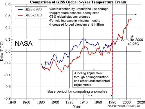
The revisionism that goes on with the so-called respected organizations that report surface temperature invalidates their work in my view.  For the those wondering what I mean,  it is this.  Because their charts are a matter of record,  we can see how they have on various occasions revised the charts.  The temperatures in the 1930tys have been lowered and  the more recent temperatures have been raised.  All of this is to give the illusion that the recent years are warmer and that the rate of increase is more dramatic.  Note the NASA (GISS) chart below.  The data as presented in 1980 are plotted in blue.  The data as presented in 2010 are in red.

Click here for more detail on these two charts.

CRU did something similar.  See chart below showing the revisions made between 2001 and 2010.

cbdakota