Category Archives: UAH Satellite Temps

Global Temperature Data Shows No Rise For 17 Years—Meets Warmist’s Criteria For Proof Of No Man-Made Forcing


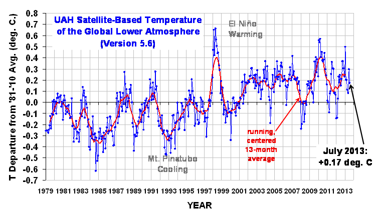
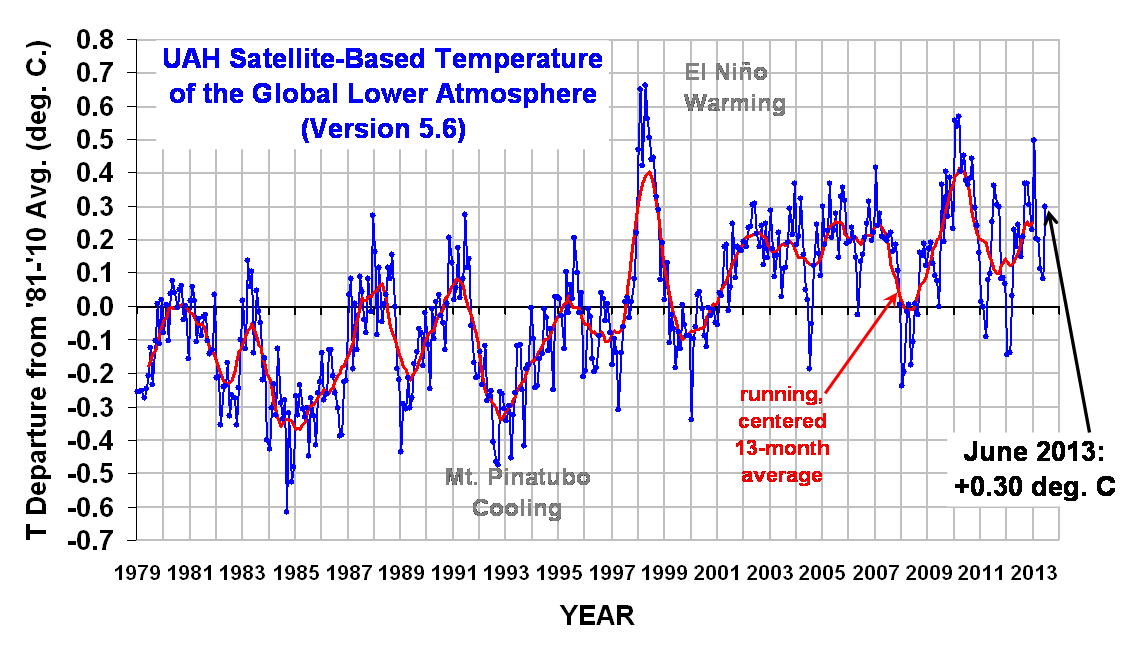
A guest posting on WUWT by Werner Brozek says that global temperature has not risen for 17 years.  The 17 years are significant in anyway you think about it, but Brozek makes the point that the warmists are on record as saying that it is sufficient time to determine if there is man-made forcing of global temperatures.  Looking at the satellite global temperature measurements by the Remote Sensing System(RSS) after 204 months (17 years) the slope of temperature anomaly is zero.   Look at this chart from the WoodForTrees org. below:

Continue reading

July Satellite Global Temperature Update


The UAH satellite program for measuring global temperatures reports the July anomaly was +0.17°C which is a drop of 0.12°C from last month’s report.  Dr Spencer points out that this reading is from two new satellites.  He says that the old version would have read a smaller positive temperature anomaly but he believes that is due to an uncorrected diurnal drift in satellite NOAA-18.  That satellite’s reading are not in the current version.

UAH_LT_1979_thru_July_2013_v5.6

cbdakota

June 13 Global Temperature Anomaly Update


The UAH satellite June 2013 global temperature anomaly increased 0.2°C over the May anomaly.  The Northern Hemisphere anomaly was up as would be expected as summer is underway and it is similar to the anomaly 12 months ago.   The big jump was in the Southern Hemisphere that seems odd in that it is winter there.   Remember,  what is significant is the long term trend.

satellitetempsjune13UAH_LT_1979_thru_June_2013_v5.6

YR     MON  GLOBAL  NH        SH     TROPICS

2012    1      -0.145   -0.088  -0.203    -0.245

2012    2      -0.140   -0.016  -0.263   -0.326

2012    3     +0.033  +0.064 +0.002   -0.238

2012    4     +0.230  +0.346 +0.114   -0.251

2012    5     +0.178  +0.338  +0.018  -0.102

2012    6     +0.244  +0.378  +0.111  -0.016

2012    7     +0.149  +0.263  +0.035  +0.146

2012    8     +0.210  +0.195  +0.225  +0.069

2012    9    +0.369   +0.376  +0.361  +0.174

2012   10 +0.367   +0.326   +0.409  +0.155

2012   11 +0.305   +0.319   +0.292  +0.209

012     12   +0.229   +0.153   +0.305  +0.199

2013    1   +0.497   +0.512     +0.481   +0.387

2013    2    +0.203  +0.372   +0.034  +0.195

2013    3   +0.200   +0.333   +0.068  +0.243

2013    4   +0.114    +0.128    +0.101    +0.165

2013    5   +0.083   +0.180    -0.015   +0.112

2013    6   +0.298   +0.337   +0.259  +0.221

Satellite Temperature Anomalies, °C 

cbdakota

Climate Models Epic Fail


Dr. Roy Spencer posted ‘EPIC FAIL: 73 Climate Models vs. Observations for Tropical Tropospheric Temperature” on his website.  The posting used,  “Courtesy of John Christy, a comparison between 73 CMIP5 models (archived at the KNMI Climate Explorer website) and observations for the tropical bulk tropospheric temperature (aka “MT”) since 1979.” That chart is shown below:     (Click chart for better view.)

christy1stchartCMIP5-73-models-vs-obs-20N-20S-MT

Continue reading

Upward Spike In Global Temperature In January


The UAH satellite temperature readings for January show a lower tropospheric temperature anomoly of +0/51C.   This  is a large increase.  Dr Spencer, co-manager of the  system,  says he has double checked the results and finds them to be real, as opposed to a measurement error.  He suggest that the reason for such a large spike may be due to “ a temporary increase in convective heat transfer from the ocean to the atmosphere.” The UAH chart is shown below:

UAH_LT_1979_thru_Jan_2013_v5.5

cbdakota

Global Temperature Anomaly For November Shows Slight Drop


The UAH satellite global temperature data for November has been published by Dr Spencer.  It shows a slight drop.   See chart below.

UAH_LT_1979_thru_Nov_2012_v5.5

Considering that the Sun’s current Solar Cycle is one of the least active in years and that the experts are predicting the next Cycle to be even less active, I am guessing that the global temperatures will be trending lower over the next several years.   Probably below his 0.0 reference line.  We will have to wait and see.

cbdakota

Global Temperature Anomaly Up in August


The UAH satellite measurement of the global temperature anomaly for the month of August was up slightly from July +0.28  to August +0.34C.   The running average since satellite temperature measurements began,  is about +0.2C.

cbd   

cbdakota

Global Temperature Update-March 2012


The global temperature bounced upward in March.   March anomaly is +0.11 C.  Below is the UAH satellite temperature anomaly record since the satellite program began.–Chart courtesy of Dr Spencer. (click on the chart for clarity)

Dr Spencer provides some background on these global temperature measurments:

Since 1979, NOAA satellites have been carrying instruments that measure the natural microwave thermal emissions from oxygen in the atmosphere. The signals that these microwave radiometers measure at different microwave frequencies are directly proportional to the temperature of different, deep layers of the atmosphere. Contrary to some reports, the satellite measurements are not calibrated in any way with the global surface-based thermometer records of temperature. They instead use their own on-board precision redundant platinum resistance thermometers calibrated to a laboratory reference standard before launch.

These UAH satellite temperatures are the “gold standard”.

The revisionism that goes on with the so-called respected organizations that report surface temperature invalidates their work in my view.  For the those wondering what I mean,  it is this.  Because their charts are a matter of record,  we can see how they have on various occasions revised the charts.  The temperatures in the 1930tys have been lowered and  the more recent temperatures have been raised.  All of this is to give the illusion that the recent years are warmer and that the rate of increase is more dramatic.  Note the NASA (GISS) chart below.  The data as presented in 1980 are plotted in blue.  The data as presented in 2010 are in red.

Click here for more detail on these two charts.

CRU did something similar.  See chart below showing the revisions made between 2001 and 2010.

cbdakota