Category Archives: Health

Realtime Maps of Global Pollutant Sources


The picture below shows in color the concentration of air pollution in North America.  The  lower US  seems to have three  notable pollution sources according to the color scale shown in the lower left of the photo. Roughly locating these three sources would be in California in the Western US, Chicago area in the Great  Lakes region, and Baltimore to Boston along the I 95 corridor. 

 Now for a look at Asia and the middle East.

According to these maps, the above one shows where most of the air pollution originates.

The following from the Science website is some information about these pictures.  While the text is from November last year, the picture map shows the situation in real time.  These are for July 16, 2017.

By Dennis NormileNov. 28, 2016 , 3:15 PM

China’s air is notoriously toxic: Each year, it contributes to the premature deaths of some 1.6 million people. Concerned about how such pollution was affecting his family, Beijing-based data scientist Yann Boquillod founded AirVisual Earth, an online air pollution map that uses data from satellites and more than 8000 monitoring stations to display global air pollution in real time. The AirVisual Earth interactive maps prevailing wind patterns and shows color-coded concentrations of PM2.5—airborne particulate matter less than 2.5 microns in diameter that can penetrate deep into the lungs. Users can zoom in, tilt, and spin the globe for better viewing. The air pollution visualization was crafted “so people really understand how bad it is,” says Boquillod, who hopes an informed citizenry will pressure governments and communities to clear the air. AirVisual also delivers 3-day air pollution forecasts for 6000 cities to smartphones, and it recently began selling low-cost monitors people can use to track indoor and outdoor air pollution. “People want to share that data,” Boquillod says.


The pictures are screen captures. You will have to go to the Science site link here to move around the globe.

I am not a fan of the 2.5micron particles stuff.  Another study suggest that there is no evidence for it being considered a vehicle for killing massive numbers of people.  See Junk Science links to see why I say that.  This is a good map for chasing black carbon and other aerosols.

cbdakota


“Climate Change Action” Least Favored Option In UN Poll Of Over 9 Million People.


 President Elect Donald Trump is expected to defund much of the man-made global warming activity because it’s a theory that is generally unsupported by actual measurements. Although you will continue to read that it is happening and it is going to be catastrophic and if he defunds this research, we will leave a dying planet to our children.  Perhaps, but the supporters of this theory do not seem to come up with anything better than computer forecasts of this upcoming doom. 

The media are also going to tell you that everyone but a few skeptics and President Trump want something done now and money is no object.  But do the people here in the US and across the world really feel that way?  Results from polls and studies show that global warming action is hardly the people choice.   Global warming is almost always the people’s last choice.  The UN polled some 9 million plus people from around the globe asking them what they wanted.  What they said was that they wanted; good education, good health care, jobs, honest government, affordable food, clean water and sanitary conditions, etc.  The final item on the list, #17 was “Action taken on climate change.”  That poll result can be seen by clicking here.

“Action taken on climate change” has a lot of champions all of which are financed by that movement.  “Scientists”, governments, NGO’s, and tyrant rulers of nations looking for ‘free” money from the developed nations don’t want the gravy train to come to a halt.   Think of the loss of income for those groups if the money is spent on the real needs of the globe’s people. 

Continue reading

Hysteria and DDT


The Pacific Research Institute has released a video entitled “Hysteria’s History: Why is Alarmism so Dangerous?-Part 4“. The video’s purpose is to expose people to the historical progression of environmental alarmism that has often resulted in poor and contradictory policy proposals” This video discusses the ban on DDT. DDT had been very successful in nearly eradicating malaria around the world. Following the ban, malaria deaths skyrocketed.

DDT sprayed indoors, where it can keep  mosquitos in check and have no effect on the local wild life is a responsible action.   But it took skeptics to point this out over and over again before the green movement reeled in their efforts to keep DDT banned.

Hopefully, we skeptics,  showing that the catastrophic global warming movement is more hysteria than facts, will eventually cause the greens to concede in this case as well.

cbdakota


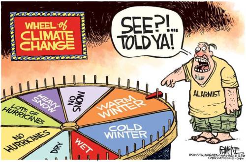
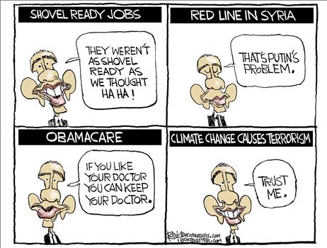
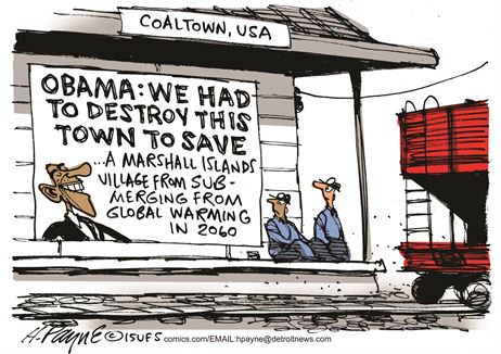
Year End Global Warming Cartoons


Year end cartoons  courtesy of TownHall.com

cartoonwheel-of-climatehttp://townhall.com/political-cartoons/2015/12/05/137270

cartoonbombintruckpayn_c13758220151220120100

cartoonstrustmecb120715dAPR20151204114706

cartoonworldpayn_c13727620151205120100

coaltowncartoonpayn_c13774320151229120100

cartoonwatchyourwalletcb121415dAPR20151214094510

Have a great 2016.  Happy New Year!!!

cbdakota


Can we trust the EPA? Part 2—Particulate Matter, 2.5 Microns Or Smaller


In the previous posting, it was noted that the Supreme Court stopped enforcement of an EPA regulation that reduced emissions of mercury (Hg) from coal-based power plants. In addition to Hg, the regulation was designated to reduce “Air Toxins”. In this case the toxins are particulate matter—2.5microns (PM2.5) or smaller in diameter.   For perspective, how big is a 2.5micron particle? 2.5 microns are equal to 0.00025 centimeters or 0.000099 inches. Yes, you are right, you can’t see them.

The EPA touts a study that says PM2.5 is dangerous, but they wont share all the secretscienceimagesdata with anyone. Thus, no other science body can confirm or deny the studies results. Secret Science. We are told we must take their word for it.

Continue reading

Bjorn Lomborg Says Global Warming Is A Poor Place To Spend $


Bjorn Lomborg, a Danish economist, joins the “consensus” supporting the theory of man-made global warming (AGW), but not catastrophic man-made global warming (CAGW). He is disliked intensely by the wamers but not because he doesn’t believe in CAGW. He gets this lack of love because he believes that the money spent in the name of global warming is largely misspent. He says the money would be better spent to reduce malnutrition, make immunizations available, better education, prevention of AIDs, providing electrical power to reduce air pollution, etc. These beliefs are laid out in the TED talk video below.

This a fascinating talk.  He shows how much improved Earth has become from 1900 to 2013 and projects changes to 2050.

Continue reading

“Area of Special Biological Significance” Stinking Up La Jolla Cove


The pitch by the locals is:  
La Jolla Cove is San Diego’s most desirable spot for kayaking, snorkeling and diving. The water is calm and ecologically protected, providing a safe home for colorful garibaldi, yellowtail, rays and even leopard sharks. Because the water is protected, surfboards, boogie boards and other floatation devices are not permitted.”  
The “ecologically protected” part has generated a stench that can be smelled a mile away.  It seems that cormorants and seagulls use a rocky area by the cove, now fenced off, to move their bowels.  The feces keep piling up and are creating a “gross everyday problem for the cove area” according to an editorial by the U-T San Diego paper. The city  says they can’t do anything because :”… complex environmental rules stemming for the cove’s designation as a state-protected “Area of Special Biological Significance” are preventing them from cleaning up the place”. Further the city officials say that: “… it could take two years to get various state agencies to OK cleaning procedures.”   Cleaning procedures?  To clean up poop?  Get a grip. 
 
Talk about unintended consequences. I sure that the people of the La Jolla Cove felt really good about themselves as they were showing all of California, if not the world, how caring they are. 
 
If you wish to read more, click:  Feathers flying over stench in La Jolla.
cbdakota

Fear of Synthetic Chemicals


Two recently published books are at opposite poles regarding the risks imposed by the addition of synthetic chemicals into our environment.  One book is “Legally Poisoned: How the Law Puts Us at Risk from Toxicants” by Carl Cranor.  The title speaks for its side in the argument.  The other book is “Scared to Death: How Chemophobia Threatens Public Health” a multi-author book edited by Jon Entine.

The arguments in Legally Poisoned center on the view that Americans are unwilling guinea pigs exposed to thousands of toxic synthetic chemicals and that more than 200 “toxicants” show up in the body when testing for these chemicals.   Continue reading

Nukes and Radiation Exposure


The internet is alive with questions and concerns about radiation poisoning that could result from the Japanese nukes that were damaged by the Tsunami.  So to put this into perspective, perhaps some background would be helpful.  Wikipedia discusses the relative exposure and dangers from release of radiation in the following:

The sievert (symbol: Sv) is the SI derived unit of dose equivalent radiation. It attempts to quantitatively evaluate the biological effects of ionizing radiation…. It is named after Rolf Sievert, a Swedish medical physicist…..

Most of you know how to read mSv but just a review for the uninitiated:  mSv=0.001Sv or 1X 10^-3 or stated as milli Sv.    Below you will see that eating a banana is said to dose a person with 0.0001 mSv.  That is equivalent to 0.0000001Sv.  If a lethal does of radiation is 10Sv,  you would have to eat something like 100 million bananas in one setting.

At the other end of the scale,  the lethal dose for a period of one day is 10Sv.

Single dose examples

 Eating one banana: 0.0001 mSv

Dental radiography: 0.005 mSv

Avg. dose within 16 km of TMI accident: 0.08 mSv; maximum dose: 1 mSv

Mammogram: 3 mSv

Brain CT scan: 0.8–5 mSv

Chest CT scan: 6–18 mSv

Gastrointestinal series X-ray investigation: 14 mSv

Yearly dose examples

Living near a nuclear power station: 0.0001–0.01 mSv/year

Living near a coal power station: 0.0003 mSv/year

Sleeping next to a human for 8 hours every night: 0.02 mSv/yr

Cosmic radiation (from sky) at sea level: 0.24 mSv/year

Terrestrial radiation (from ground): 0.28 mSv/year

Natural radiation in the human body: 0.40 mSv/year

Radiation from granite of the US Capitol building: 0.85 mSv/year

New York-Tokyo flights for airline crew: 9 mSv/year

Atmospheric sources (mostly radon): 2 mSv/year

Total average radiation dose for Americans: 6.2 mSv/year

Smoking 1.5 packs/day: 13-60 mSv/year

Current average limit for nuclear workers: 20 mSv/year

Lowest clearly carcinogenic level: 100 mSv/year

Elevated limit for workers during Fukushima emergency: 250 mSv/year

 Wiki makes clear that the severity of exposure is a function of time and amount.  The following shows the effect of high levels of radiation  exposure over a one day period  with the likely consequences:


Symptoms of acute radiation (within one day):

0 – 0.25 Sv (0 – 250 mSv): None


0.25 – 1 Sv (250 – 1000 mSv): Some people feel nausea and loss of appetite; bone marrow, lymph nodes, spleen damaged.


1 – 3 Sv (1000 – 3000 mSv): Mild to severe nausea, loss of appetite, infection; more severe bone marrow, lymph node, spleen damage; recovery probable, not assured.


3 – 6 Sv (3000 – 6000 mSv): Severe nausea, loss of appetite; hemorrhaging, infection, diarrhea, peeling of skin, sterility; death if untreated.

6 – 10 Sv (6000 – 10000 mSv): Above symptoms plus central nervous system impairment; death expected.


Above 10 Sv (10000 mSv): Incapacitation and death.


Another way of  illustrating this data (and more) can be seen by clicking here. The blog “xkcd” has a chart demonstrating in words and pictures the relative levels of radiation exposure from small everyday experiences to death dealing levels.  I recommend that you look at it because for many, it may be easier to  understand than trying to relate milliSvs to Svs.  The chart maker uses microSvs and those are 0.000001 Sv

Good reading

cbdakota