
Below is my reposting fr0m Coyotebog.com, the Warren Meyers essay on his take of the global climate change issue.
cbdakota
We continue our multi-part series on the theory of catastrophic man-made global warming by returning to our framework we introduced in the last chapter

In the introduction, we discussed how catastrophic man-made global warming theory was actually made up of two independent parts. In this section, we will discuss the first of these two parts, the greenhouse gas effect, which is the box in the upper left of our framework.
For those unfamiliar with exactly what the greenhouse effect is, I encourage you to check out this very short primer. Essentially, certain gasses in the atmosphere can absorb some of the heat the Earth is radiating into space, and re-radiate some of this heat back to Earth. These are called greenhouse gasses. Water vapor is a relatively strong greenhouse gas, while CO2 is actually a relatively weak greenhouse gas.
It may come as a surprise to those who only know of skeptics’ arguments from reading their opponents (rather than the skeptics themselves), but most prominent skeptics accept the theory of greenhouse gas warming. Of course there are exceptions, including a couple of trolls who like to get attention in the comments section of this and other blogs, and including a few prominent politicians and talk-show hosts. But there are also environmental alarmists on the other side who have signed petitions to ban dihydrogen monoxide. It is always tempting, but seldom intellectually rewarding, to judge a particular position by its least capable defenders.
There is simply too much evidence both from our and other planets (as well as simple experiments in a laboratory) to deny that greenhouse gasses in the atmosphere have a warming effect on planets, and that CO2 is such a greenhouse gas. What follows in the rest of this section represents something of a consensus of people on both sides of the debate.
To investigate the effect of CO2 on Earth’s temperature, we are going to use this chart:
On the X axis is the atmospheric concentration of CO2 in parts-per-million (ppm). Frequently, forecasts of CO2 warming are shown as a relationship over time. I prefer this view, because it separates the assumption of CO2 emissions rates from assumptions about the sensitivity of temperatures to CO2.
Note that the concentrations we are talking about are remarkably small. Currently the Earth is just over 400 ppm, which is 0.04%. Only one in 2500 molecules in air is CO2.
On the Y-axis we then have the incremental warming we might see, on average, across the surface of the Earth from increased concentrations of CO2. Unless I point it out explicitly, we will use Celsius throughout this and later chapters.
What we now want to do is graph the relationship between the concentrations of CO2 in the atmosphere and the temperature increase of the Earth. We will use 400 ppm and 0C increase as our starting points. For now (and we will come back to this assumption) we will look at just the direct effect of warming from the greenhouse gas effect of CO2 and leave out any other complicated, 2nd order interactions with the Earth and its climate.
The estimate I will use comes from Dr. Michael Mann and was first cited in the early IPCC reports. A quick note on the IPCC — the IPCC is a body that meets every 5 years or so under the auspices of the United Nations to try to summarize the current state of climate science. Many skeptics, including myself, would argue that the IPCC process is flawed and overly politicized, but as much as possible in this series I will try to use the IPCC position, making it explicit when I differ. But what follows is very much IPCC canon. In fact, I like using Michael Mann’s work here because, as author of the hockey stick, he is a vocal and prominent advocate on the alarmist end of the debate and certain not in the tank for the skeptic side.
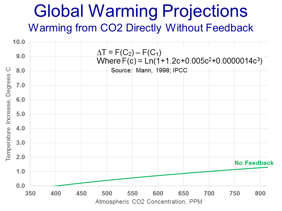
The relationship is shown in the equation at the top (where delta T is the temperature increase and c is the atmospheric concentration in ppm). I have graphed the equation in green because most of us do not have a good intuition for what this equation might look like.
The first thing you might note is that the line is curved, and represents a diminishing return relationship, which means that each incremental molecule of CO2 in the atmosphere has less warming effect than the last (see my short presentation on the greenhouse gas effect here). Thus a constant rate of growth in CO2 concentrations would yield a slowing growth rate in temperatures. This is a well-understood relationship, so much so that the sensitivity of temperature to CO2 is generally written not as degrees per ppm but as degrees per doubling of CO2 levels. This means that the increase from 400-800 ppm would be expected to have about the same impact on temperature as the increase from 800 to 1600 ppm.
Of course, without any sense of CO2 growth rates, it’s hard to relate this line to our lives. So as a next step, we will overly some CO2 forecasts for the atmospheric levels of CO2 by 2100. [As an aside, there is a group of skeptics that think that most CO2 increases are coming from warming itself, flipping the arrow of causality, rather than from man. There is some evidence for this proposition in ice core analysis, but I will leave it aside and for our purposes assume most CO2 increases in this century are coming from hydrocarbon combustion].
Though I think that their forecasts are exaggerated, I have taken the UN IPCC’s 4 most likely CO2 cases for the year 2100 and overlayed them on the chart below:
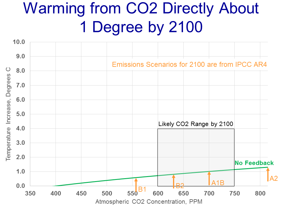
Taking the midpoint of these forecasts, we arrive at about 1C of warming between now and the end of the century.
So now, if you are paying attention, you may be ready to call bullsh*t on me. Coyote, you say, every catastrophic forecast I have ever seen in the media is for WAY more than 1C of warming! Bill McKibbon says its going to be 10 degrees of warming (and if you can’t trust Harvard journalism majors on scientific issues, who can you trust?) You are obviously lying, you evil denier.
Actually, not. Everything in this chapter has been pretty much canon in the global warming world. The direct, first order contribution of CO2 via the greenhouse effect is expected to be around a degree over the next century. So whence comes the catastrophe? As mentioned in the introduction, the catastrophe comes from a second, independent theory that the Earth’s climate system is dominated by strong positive feedbacks that multiply greenhouse warming many times into a catastrophe.
If you have never heard of this second theory, don’t be surprised. In many years of reading press articles on global warming, I can’t remember one that adequately explained the two-part nature of the theory that is embedded in most global warming forecasts and climate models. But, perhaps not coincidentally, it is this second theory with which we skeptics have the most issues. We will take this up in our next installment.
