Category Archives: Uncategorized

Governmental Dictates To Force Shutdown Of Gasoline/Diesel Fuel Vehicles And Force Use Of Electric Vehicles (EV) Is Misguided.


 On June 30, 2021, Robert Bryce provided testimony before the House Select Committee on the “climate crisis”.   Bryce points out that our electrical grid has become fragile in recent years, largely because of the actions by our state and local governments. 

Forcing the grid to accept wind and solar energy, energy that is renewable but not reliable, is taking its toll.   Bryce summarizes his view of the current policies as follows: 

Electrifying parts of our transportation system may result in incremental reductions in greenhouse gas emissions. But a look at history, as well as an analysis of the supply-chain issues involved in manufacturing EVs, the resource intensity of batteries, and the increasingly fragile state of our electric grid – which is being destabilized by bad policy at the state and national levels – shows that a headlong drive to convert our transportation systems to run on “green” electricity could cost taxpayers untold billions of dollars, increase greenhouse gas emissions, be bad for societal resilience, make the U.S. more dependent on commodity markets dominated by China, make us less able to respond to extreme weather events or attacks on our infrastructure, and impose regressive taxes on low and middle-income Americans in the form of higher electricity prices.”


Bryce’s testimony dealt with Affordability, Grid Fragility and Supply Chains.   This posting will only deal with Affordability.  The next posting will grapple with other two.  His testimony is some 14 pages long, all worth reading.  In the interest of your time however, I will attempt to abbreviate the testimony citing key points.

Affordability  

Bryce notes that while EV sales are increasing, they are only a fraction of the US vehicle population.    He says:

“But policymakers must be cautious. While that growth in EV sales is notable, EVs still account for less than 1% of the 276 million registered vehicles in the U.S. Of all the EVs on U.S. roads, about 42% of them are in California. By contrast, states like South Dakota, North Dakota, Montana, and Wyoming each have less than 1,000 registered EVs. Furthermore, in 2020, fewer than 300,000 EVs were sold in the U.S.  For comparison, Ford Motor Company sold nearly 800,000 F-series pickup trucks last year”.

Bryce notes that 42% of the EVs are in California making it the best place to sample the experiences and expectations.

“The history of EVs in California provides context for the rest of the country. In 1990, the California Air Resources Board passed a measure that required 10% of all auto sales in the state be zero-emission vehicles by 2003. But today, 31 years after California implemented the ZEV mandate, the state has nearly 15 million automobiles, and of that number, less than 900,000, or about 6%, have an electric plug. Over the past century, the history of the EV sector in California and the rest of the country can be summarized as lots of government push, but not enough consumer pull.”

Bryce examines current and future prices of EVs.  With respect to future prices, he turns to an expert:

“Policymakers must also be aware that future EV adoption rates depend heavily on the ability of automakers to continue cutting costs and improving the utility of EVs. Earlier this month, Jeremy Michalek of the Vehicle Electrification Group at Carnegie Mellon University, questioned the ability of the industry to continue slashing costs. In an article titled, “I’m an EV expert, and I’m skeptical about how quickly electric cars will go mainstream in the U.S.”

Michalek explained that: economies of scale drove early reductions in battery costs, but now they are all but exhausted, and we shouldn’t expect big factories or growing demand alone to make EV batteries much cheaper. Second, production process improvements have also driven cost reductions, but even a utopian production process can’t push battery prices below material costs. Third, prices can temporarily dip below costs when firms leverage subsidies, take temporary hits to establish a foothold in the market, or crosssubsidize to comply with regulation, but prices can’t stay below costs for long.

He concluded that we should, “remain skeptical about predictions of exactly how fast battery costs will drop and how quickly EVs will be adopted in the future.”  Michalek’s conclusion brings me to my first point: affordability.”

Bryce expands on EV affordability:

“In 2019, the National Bureau of Economic Research published a study that found the average household income of EV buyers was about $140,000. That’s twice the median household income in the U.S., which was nearly $69,000 in 2019. The average owner of a Tesla Model S has a household income of about $153,000”

“Wealthy EV buyers are being subsidized by low and middle-income consumers. In 2016, two academics at the University of California at Berkeley, Severin Borenstein and Lucas W. Davis published a paper that concluded the majority of the money being collected under federal programs aimed at promoting energy efficiency and alternative transportation was going to wealthy Americans. They found “the most extreme disparity is in the program aimed at electric vehicles, where we find that the top income quintile has received about 90% of all credits.” They continued saying that taxpayers who had adjusted gross incomes “in excess of $75,000 have received…about 90% of all credit dollars aimed at electric cars.”

Bryce used the June 9 report by the California Energy Commission (CEC) for the following comments:

“Low and middle-income ratepayers will also be forced to pay for the generation capacity and grid upgrades needed to accommodate electrification of transportation. The same CEC report found that by 2030, “electricity consumption from passenger EV charging could reach about 5,500 megawatts (MW) around midnight and 4,600 MW around 10 a.m. on a typical weekday, increasing electricity demand by up to 20–25 percent at those times.” To put that 5,000 MW or so of new generation capacity in perspective, it is roughly equal to the rated output of all of California’s existing geothermal and nuclear plants, combined. It must be noted here that the state is slated to close its last remaining nuclear plant, the Diablo Canyon Power Plant, by 2025. “The California grid will have difficulty providing electricity from midnight until the early morning hours because it is heavily dependent on solar energy to meet demand. Thus, it is highly likely that to meet the power demand needed to charge EVs, the state will have to deploy more natural gas-fired capacity. The timing of EV charging will have a big effect on greenhouse gas emissions. If the state has to rely on gas-fired generators to charge EVs at night, the climate benefits of widespread EV adoption may be negated.”

Bryce notes this about California energy prices:

In 2020, California’s electricity prices jumped by 7.5%, making it the biggest price increase of any state in the country last year and nearly seven times the increase that was seen in the United States as a whole. According to data from the Energy Information Administration, the all-sector price of electricity in California last year increased to 18.15 cents per kilowatt-hour, which means that Californians are now paying about 70% more for their electricity than the U.S. average all-sector rate of 10.66 cents per kWh.

Bryce paints a realistic picture of the future if we continue down the path set out by the Biden Administration and progressive States.  The lower- and middle-income families will be paying regressive taxes in the form of higher electricity prices. if we do not resist going down the progressives’ path that might be the least of our problems.

cbdakota

Global Temperature Continues To Cool.


I have been otherwise occupied for the past several weeks, but this is a quick note to keep you posted regarding Global Temperature.  The temperature anomaly  declined 0.09C in June making the global anomaly  -0.01C.

YEAR MO GLOBE NHEM. SHEM. TROPIC USA48 ARCTIC AUST
2020 01  0.42  0.44  0.40  0.52  0.57 -0.22  0.41
2020 02  0.59  0.74  0.45  0.63  0.17 -0.27  0.20
2020 03  0.35  0.42  0.27  0.53  0.81 -0.96 -0.04
2020 04  0.26  0.26  0.25  0.35 -0.70  0.63  0.78
2020 05  0.42  0.43  0.41  0.53  0.07  0.83 -0.20
2020 06  0.30  0.29  0.30  0.31  0.26  0.54  0.97
2020 07  0.31  0.31  0.31  0.28  0.44  0.27  0.26
2020 08  0.30  0.34  0.26  0.45  0.35  0.30  0.24
2020 09  0.40  0.41  0.39  0.29  0.69  0.24  0.64
2020 10  0.38  0.53  0.22  0.24  0.86  0.95 -0.01
2020 11  0.40  0.52  0.27  0.17  1.45  1.09  1.28
2020 12  0.15  0.08  0.22 -0.07  0.29  0.44  0.13
2021 01  0.12  0.34 -0.09 -0.08  0.36  0.49 -0.52
2021 02  0.20  0.32  0.08 -0.14 -0.65  0.07 -0.27
2021 03 -0.01  0.13 -0.14 -0.29  0.59 -0.78 -0.79
2021 04 -0.05  0.05 -0.15 -0.28 -0.02  0.02  0.29

Chart and table are from Dr Roy Spencer posting can be viewed by clicking here.


2021 05  0.08  0.14  0.03  0.06 -0.41 -0.04  0.02
2021 06 -0.01  0.30 -0.32 -0.14  1.44 +0.63 -0.76

Dr Roy Spencer comments on June’s anomalies as follows:

Despite the near-normal global average temperatures, the USA Lower 48 temperature anomaly of +1.44 deg. C was the warmest in the 43 year satellite record, ahead of +1.15 deg. C in 1988. In contrast, the Antarctic region (poleward of 60 S latitude) experienced its 2nd coldest June (-1.25 deg. C below the 30-year baseline), behind -1.34 deg. C in June, 2017.

The ENSO meter indicates that the la Nina has terminated. 

Climate Change Sanity

cbdakota

Climate Change Sanity

cbdakota

Net Zero Target is Facing Lack of Technology, Nations Not Ready and The Inflation It Will Cause.


See the source image

I get tired of this kind of scare tactic:

“Doing nothing also carries huge economic risks. Climate scientists warn of increased frequency of extreme weather conditions, which can disrupt food supplies and damage buildings and infrastructure, all with a fallout on the broader economy.

This comes from some set of unnamed “Climate scientists” who somehow are ordained with having foresight 50 years into the future.  These same Climate Scientists have been forecasting doom for 40 years.  Their forecasts have not come true.  What makes you think they will this time after you have been fooled year after year? The actual data do not support this alarm.

That quote is from the Bloomberg posting “The Climate-change Fight is adding to the Global Inflation Scare.”

Look what the Bloomberg posting has to say about inflation, that the technology is not there and that the nations are not ready:

Biden Tries To Hide $800 billion Global Warming Spending Under the Guise That It Is Infrastructure.


Green Leafed Trees

The infrastructure bill as described by the Democrats is a little bit infrastructure and a lot of Green New Deal.

The Republican bill as described by CNBC posting is:

The largest spending item in the latest GOP offer is $506 billion for roads, bridges and major infrastructure projects, up $91 billion from their offer last month. Other spending increases include $72 billion for water systems, $22 billion for ports and waterways, and $65 billion for broadband.

The GOP counteroffer totals $928 billion over eight years, following the president’s latest offer to Republicans of $1.7 trillion, which was $600 billion less than his original proposal.”

And what does the $1.7 trillion bill contain that the Republican bill does not, again according to the CNBC posting:

“Biden’s infrastructure proposal includes energy initiatives to combat climate change, including the creation of an “Energy Efficiency and Clean Electricity Standard,” a mandate that would require some U.S. electricity to come from zero-carbon sources such as wind and solar power.

Biden’s plan aims to retrofit millions of homes to boost energy efficiency, with efforts focused on low-income and minority communities. It would also fund research and development projects on technologies such as carbon capture and storage, hydrogen and offshore wind.”

That is the Green New Deal, not infrastructure.  Why is it that the Democrats pretend this money will be spent on infrastructure when it will be for the Green New Deal?   Because they know that the Green New Deal is not popular. 

The very recent poll of the people regarding the Green New Deal funding says this:

How much of your own money would you be willing to personally spend each month to reduce the impact of climate change?”

“The vast majority of voters were only willing to make very minimal financial sacrifices. 

About 35 percent said they wouldn’t be willing to spend anything, with another 15 percent saying they’d only sacrifice $1-$10. Another 6 percent were willing to give up $11-$20, while 5 percent said they’d sacrifice $21-$30. In all, a whopping 75 percent of respondents were not willing to pay more than $50 a month.”

There is a lot of virtue signaling and lack of information in the public in general about the climate change, but one thing they do know is its going to cost too much and they do not want to pay for it. 

The Democrats know this, so they want to disguise this and pretend it is infrastructure which is very popular.   

Can you just imagine how much climate change spending was in Biden’s original $2.3 trillion bill?

cbdakota

North Face Gets An Award–I’m Not Sure They Wanted It.


This priceless.  An oil and gas company from Texas put in an order for 400 North Face Jackets. Asking North Face, a Colorado company, to put the Texas company’s logo on the jackets.  North Face refused because oil and gas companies do not meet their brand standards.  Another ignorant “woke” US corporation virtue signaling .  

The oil and gas companies fired back at North Face.  The Colorado Oil and Gas Association did something appropriate.  This video will provide the details.

North Face should be very embarrassed. An Extraordinary Customer Award. Do you think they have learned anything? Probably not.

I suppose they could start making all their line out of linen, cotton, and may be paper. They certainly do not want to continue to use oil and gas derived products in view of those products not meeting their brand standards. But wait, don’t you have to use fossil fuel burning equipment to harvest and fabricate linen, cotton, paper, etc.?

There is no hope for them but to discontinue the business.

cbdakota

Secrets That Global Warming Alarmists Don’t Want You To Know. Part 4-False Attributions About What Global Warming Is Causing.


This is number 4 in this series about secrets that the alarmists do not want you to know.  The first one dealt with the fact that the alarmist computer climate models have been forecasting global warming temperatures that are far and away from the actual measured temperatures. Number two demonstrated that the actual rate of warming is not at all alarming. Number three looked at the warming bias the alarmists are putting into the computer models that are predicting global temperatures out to the year 2100.  This posting discusses the other arrow in the alarmist’s quiver. The alarmists use weather to frighten people, saying that global warming is putting the survival of life on earth in the balance.   This posting will prove that to be not true.     

The media feeds on “scientific” papers that report that global warming (aka climate change) causes something that wasn’t something before.  Mostly the reports are based on some extreme weather event (EWE).  However, many seem to find something significant based upon something insignificant.    If you can handle a 38 second video, it seems to illustrate the premise: Earth’s Axis Shifting Due to Climate Change (msn.com).   The reporter says climate change is moving the earth’s axis but not to worry.  However, she says since 1980 till now, 41 years, the length of a day has changed by a “few milliseconds”. That seems to be profound.  She did not enumerate the change, probably less than 10.  But I will make a guess that leaves us with simple math –41 milliseconds.    Over 41 years that is one millisecond per year. As there are 1000 milliseconds in one second, it would take 1000 years to make a one second change.  Oh my, lets spend trillions and trillions of dollars to prevent that from happening.  OK, let’s wait as the next glacial period happens, new glaciers will correct the Earth’s axis.  Then we will have to turn our clock back.

William Briggs has posted a look at the inappropriate ways the statistics are used to “confirm” that global warming is causing something.  Briggs also observes the following about these scary things that global warming can do:

Certain current weather events are said to be attributable to ‘climate change’. These events, some say, would not have appeared or would have been markedly different if the climate was in its ‘natural’ state. Curiously, events attributed to climate change are always ‘extreme’ or harmful; they are never beneficial. Nobody bothers to check whether in changed climates there will be an increase in pleasant summer afternoons, or better crop-growing weather. Researchers look only for the bad; it is therefore only the bad that will be reported. This demonstrates an irreparable confirmation bias in attribution studies.”

From Briggs Posting

“Claims made in so-called climate change event attribution studies suffer from gross over-certainties and cannot be trusted. The techniques used in these studies are in their infancy and do not warrant the trust put into them. These studies assume either (a) perfect forecasting models, or (b) known, uncertainty-free causes of climate change. Neither condition holds. Because of this, attribution claims are far too certain or are wrong. They should not be used in any policy decisions.

We can, however, guess what the climate would look like without man’s influence, but we’d never be able to independently check whether our guess is true. We can also model what the climate will look like under certain changes, but in order to trust these models they first have to demonstrate forecast skill. If they can’t, or they are inaccurate, they can’t be trusted, either. Lastly, we might pick a date and say all observations before it is ‘natural’ and all after are tainted by ‘climate change’. But this is not proof man caused the differences. It is mere assumption. So-called climate-change event attribution studies rely on all these kinds of guesses and claims. As such, they are either incorrect or are far too certain, as will be demonstrated.”

Several posting are available to disprove the alarmist’s attribution studies. 

Joseph D’Aleo posted “Climate Claim Rebuttals” updated 4/18/21. D’Aleo introduces the content by saying: 

Below are fact checks of the 13 most common climate claims such as those made in the recently released Fourth National Climate Assessment Report. For each claim, per the scientific method, a rebuttal is provided based on the most credible relevant empirical data. The authors of these reviews are all recognized experts in the relevant fields.

His first of the “common climate claims” is Warmest Ever Month or Year:

“The globe has experienced the warmest ever month or year – these claims are totally unsupported by any credible analysis of raw global surface temperature data and its availability. Such claims are politically driven fictions. etc,”  

He follows up with Heat Waves; Hurricanes; Tornados; Drought and Floods; Wildfires; Snow Falls; Sea level; Arctic, Antarctic, and Greenland Ice; Ocean Acidification; Carbon as Health Hazzard; Climate Change Endangering Food Supply; and the 97% Consensus.

The Global Warming Policy Foundation posted Indur M. Goklany’s “Impact of Climate Change Perception and Reality.

This a detailed debunking of attribution studies. Goklany’s examination is unique in that it covers extreme weather events (EWE) but also looks at the human impact attributions. Goklany has summarized the attributions in tabular format near the end of the document, so you do not have to read it all, although I think you should. The summary follows:

Goklany has debunked almost all the attributions.  He has also shown why CO2 from fossil fuels has make life on this planet now better than it ever has been.  Not worse, but better.

Two other excellent sources debunking these attributions are”Climate Extreme Claims”, posted by Acresearch ;  and “Extreme Weather in 2020” posted by Global Warming Policy Foundation).

I must include Roger Pielke jr. as he probably is the most effective conveyer of debunked attributions.   Forbes posted his “Three Rules for Accepting Climate ‘Event Attribution.”

The following is a lift from a recent blog by Dr. Roy Spencer.   He says:

Yes, more CO2 must produce some warming. But the amount of warming makes all the difference to global energy policies.

Seldom is the public ever informed of these glaring discrepancies between basic science and what politicians and pop-scientists tell us.

Why does it matter?

It matters because there is no Climate Crisis. There is no Climate Emergency.

Yes, irregular warming is occurring. Yes, it is at least partly due to human greenhouse gas emissions. But seldom are the benefits of a somewhat warmer climate system mentioned, or the benefits of more CO2 in the atmosphere (which is required for life on Earth to exist).

But if we waste trillions of dollars (that’s just here in the U.S. — meanwhile, China will always do what is in the best interests of China) then that is trillions of dollars not available for the real necessities of life.

Prosperity will suffer, and for no good reason.

Now take this and have your children read it.

cbdakota

PS–sorry, used a new system and ended up with some large dead spaces between paragraphs. Will try not to use it again.

cbdakota

The Gold Standard—UAH Satellite Temperature Measurement


February’s UAH global temperature anomaly is +0.20C. That is up 0.08Cfrom January’s +0.12C. The Northern Hemisphere temperature increased despite a major drop in the US contiguous 48 temperature of -0.66C. The Southern Hemisphere went up slightly.

The following chart and table detail the global temperature anomaly.

UAH Global Temperature Update for February 2021: +0.20 deg. C « Roy Spencer, PhD (drroyspencer.com).  

Various regional LT departures from the 30-year (1991-2020) average for the last 14 months are:

YEAR MO GLOBE NHEM. SHEM. TROPIC USA48 ARCTIC AUST
2020 01  0.42  0.44  0.41  0.52  0.57 -0.22  0.41
2020 02  0.59  0.74  0.45  0.63  0.17 -0.27  0.20
2020 03  0.35  0.42  0.28  0.53  0.81 -0.96 -0.04
2020 04  0.26  0.26  0.25  0.35 -0.70  0.63  0.78
2020 05  0.42  0.43  0.41  0.53  0.07  0.83 -0.20
2020 06  0.30  0.29  0.30  0.31  0.26  0.54  0.97
2020 07  0.31  0.31  0.31  0.28  0.44  0.26  0.26
2020 08  0.30  0.34  0.26  0.45  0.35  0.30  0.25
2020 09  0.40  0.41  0.39  0.29  0.69  0.24  0.64
2020 10  0.38  0.53  0.22  0.24  0.86  0.95 -0.01
2020 11  0.40  0.52  0.27  0.17  1.45  1.09  1.28
2020 12  0.15  0.08  0.22 -0.07  0.29  0.43  0.13
2021 01  0.12  0.34 -0.09 -0.08  0.36  0.49 -0.52
2021 02  0.20  0.32  0.08 -0.14 -0.66  0.07 -0.27

The satellite systems for measuring temperatures were pioneered by Roy Spencer and John Christy.  Their University of Alabama at Huntsville (UAH)  satellite began making measurements in 1979. The satellite does not measure temperature directly. It uses microwave sensing of oxygen calibrated to temperature.  Over time it has been joined by other satellites using similar equipment.  The others are  RSS, NOAA, and the University of Washington.  At one time they tracked one another but then they made a change. In my opinion, because their readings are warmer than UAH, they are now considered the “standard. Historically, UAH reports warming at +0.14C/decade and the others read +0.208C/decade.

Spencer explains the nature of the controversy about who is providing the most accurate set of temperatures:

“The only direct comparisons to satellite-based deep-layer temperatures are from radiosondes and global reanalysis datasets (which include all meteorological observations in a physically consistent fashion). What we will find is that RSS, NOAA, and UW have remaining errors in their datasets which they refuse to make adjustments for.

From late 1998 through 2004, there were two satellites operating: NOAA-14 with the last of the old MSU series of instruments on it, and NOAA-15 with the first new AMSU instrument on it. In the latter half of this overlap period there was considerable disagreement that developed between the two satellites. Since the older MSU was known to have a substantial measurement dependence on the physical temperature of the instrument (a problem fixed on the AMSU), and the NOAA-14 satellite carrying that MSU had drifted much farther in local observation time than any of the previous satellites, we chose to cut off the NOAA-14 processing when it started disagreeing substantially with AMSU. (Engineer James Shiue at NASA/Goddard once described the new AMSU as the “Cadillac” of well-calibrated microwave temperature sounders).

Despite the most obvious explanation that the NOAA-14 MSU was no longer usable, RSS, NOAA, and UW continue to use all of the NOAA-14 data through its entire lifetime and treat it as just as accurate as NOAA-15 AMSU data. Since NOAA-14 was warming significantly relative to NOAA-15, this puts a stronger warming trend into their satellite datasets, raising the temperature of all subsequent satellites’ measurements after about 2000.

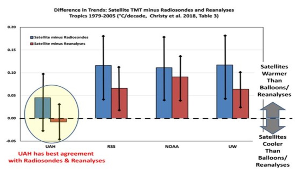
But rather than just asserting the new AMSU should be believed over the old (drifting) MSU, let’s look at some data. Since Scott Denning mentions weather balloon (radiosonde) data, let’s look at our published comparisons between the 4 satellite datasets and radiosondes (as well as global reanalysis datasets) and see who agrees with independent data the best:

Trend differences 1979-2005 between 4 satellite datasets and either radiosondes (blue) or reanalyses (red) for the MSU2/AMSU5 tropospheric channel in the tropics. The balloon trends are calculated from the subset of gripoints where the radiosonde stations are located, whereas the reanalyses contain complete coverage of the tropics. For direct comparisons of full versus station-only grids see the paper.

Clearly, the RSS, NOAA, and UW satellite datasets are the outliers when it comes to comparisons to radiosondes and reanalyses, having too much warming compared to independent data.

But you might ask, why do those 3 satellite datasets agree so well with each other? Mainly because UW and NOAA have largely followed the RSS lead… using NOAA-14 data even when its calibration was drifting and using similar strategies for diurnal drift adjustments. Thus, NOAA and UW are, to a first approximation, slightly altered versions of the RSS dataset.”

Thank you Roy for the explanation.  I will continue to treat the UAH data as the gold standard.

cbdakota

Solar Cells Are Not Able to Supply Daily Power Demand Alone


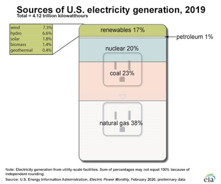
Our nation’s electricity is produced mainly by fossil fuels and nuclear energy.  The role played by renewables is relatively small, even though the public seems to believe it is greater.  This is probably because the media apparently wants the public to believe it is so.  The Chart 1 below is from the Energy Information Administration (eia), an arm of the Department of Energy:

                                                   CHART 1 

Wind and solar represent 9.1% of the sources of US electricity generation in 2019. 

The sources noted in the picture above feed their power output into systems called the grids.  These grids distribute the power to the users in their area. The grids do their utmost to be a source of uninterruptable electricity at a specific frequency.  This they do reliably. 

All of us have experienced a power loss at our home or business and you know how disruptive that is.  But most power losses we have experienced are almost always local disruptions, e.g.  wind, snow, lightning, power pole meets vehicle, transformer failure, etc. But not a grid failure.

The grids fine tunes their delivery of power, matching the increases and decreases of demand.  The grid operators dictate to the suppliers what is needed.  For example, the operators can use Nuclear and Coal based plants as a base load.  These two sources are predictable and steady suppliers but may not be able to quickly react to changes in demand.  The grid operator’s natural gas plants can adjust quickly to changes to prevent supply disruptions. Most businesses need electricity to be uninterrupted as downtime is costly.

Wind and solar are non-dispatchable because they are neither predictable nor steady suppliers of electricity. The wind driving the wind turbines can go from near gale force to calm very quickly.   Solar can do the same as cloud banks appear overhead.  The grid operator has no control over how much or how little the renewables are producing.  If renewables are supplying the grid, the operator must have backup capacity to prevent shutdown of the grid. By the way, grids are not capable of storage of electricity.

The following is from a posting by American Experiment titled “No State Imports More Electricity Than California” by Isaac Orr:

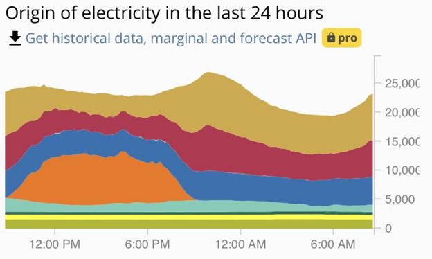
“The Chart 2 below is from Electricity Map, and it shows electricity generation by source on April 3, 2019 in California. The orange section represents solar, the blue hydroelectric, light blue, wind, green, nuclear, red natural gas, and the brown section is imported electricity.

                                                   Chart 2

As you can see, imports fall when it is sunny out, and increase again when the sun goes down. It just so happens that the sun was not shining when the demand for electricity in California was highest. California’s policies promoting renewables at the expense of dispatchable generation place it in an odd predicament, it must pay other states to take the excess electricity generated by renewables when their generation is high, and it must also pay other states for their power when renewable generation is low.”

From Chart 2, you can see solar cells negatives. 

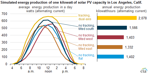
 Solar cell production is not at its maximum at sunrise nor sunset.  It peaks around noon when the sun is directly overhead. The eia Chart 3 below shows typical electricity production in Los Angeles.   Using the gold curve, that assumes that the solar cell has tracking, at 3pm, the watts are about 550 Watts and at 7pm it is at zero.  At the peak demand midpoint, say 5 pm, it can only produce about 250 watts.  (This would be the output of a single solar cell.  However, it represents the rest of the solar cells.  The change in watts is equivalent to the percent reduction the entire solar cell farm would experience.)

                                             Chart 3

The energy production Chart3 would suggest that a solar cell is not a major contributor during peak demand.  That matches the illustrated Chart 2.

  • The greens imagine pairing solar cells and wind turbines producing energy for a grid.  In this case, regardless of the capacity of the solar cells, the wind must be able to produce all the power to satisfy the capacity rating of the location. Every day, after the sun sets, the wind turbines would have to match demand.  Solar cells can never support the daily capacity rating of the location. So why have them?

I am not a proponent of either wind turbines or solar cells.  Earlier in this posting I outlined the fact that they are not dispatchable.   Industry could not function with an unreliable energy supply.  Nor would the public accept it.  Brown outs and black outs are inevitable without a backup. 

Power Engineering posted “Study Says Renewable Power Still Reliant on Backup from Natural Gas” by Wayne Barber.   In this posting he covers a study by the Massachusetts-based National Bureau of Economic Research that stated:

“We show that a 1 percent increase in the share of fast-reacting fossil generation capacity is associated with a 0.88% percent increase in renewable in the long run,” the NBER authors say in the report.

cbdakota

Adding Renewables (wind and solar) Increase Energy Poverty


The Green New Deal requires that solar and wind electricity production replace electricity produced by fossil fuels and nuclear reactors. The challenges that face those two “renewable” energy sources seem to make this impractical if not impossible. 

There is another issue, beyond the improbability of wind and solar replacing fossil fuels.  That is energy poverty.  Families must decide between food or electricity because they have limited income.  I had never come across a study that attempts to quantify the numbers of families that are in energy poverty until recently.  Nature Research Journal posted a study titled “Recognition of and Response to energy poverty in the United States” by Dominic Bednar and Tony Reames.  (click on underline and then page up until you reach the study.)

It begins by saying:

“Stark disparities exist in US energy burdens, the percentage of household income spent on energy bills. Urban and rural low-income households (defined as 80% of area median income or 150% federal poverty level) spend roughly three times as much of their income on energy cost as compared to non-low-income households (7.2% and 9% versus 2.3% and 3.1%, respectively)1,2. Moreover, low-income, African American, Latinx, multifamily and renter households are disproportionately impacted by high energy burdens1. Out of a total of 118.2 million US households, in 2015, the US Energy Information Administration (EIA) estimated that 17 million households received an energy disconnect/delivery stop notice and 25 million households had to forgo food and medicine to pay energy bills3.” 

Further on, they report that:

“However, after nearly fifty years of federal energy assistance, one in three US households (37 million), still experience energy poverty3”.

The Obama Administrations aims were to make the cost of electricity “skyrocket”.

Former President Obama goes on to say that the increased costs of his plan will be passed on to the utility customers.  He wants the customers to understand this and to know it is being done because he thinks it is necessary. 

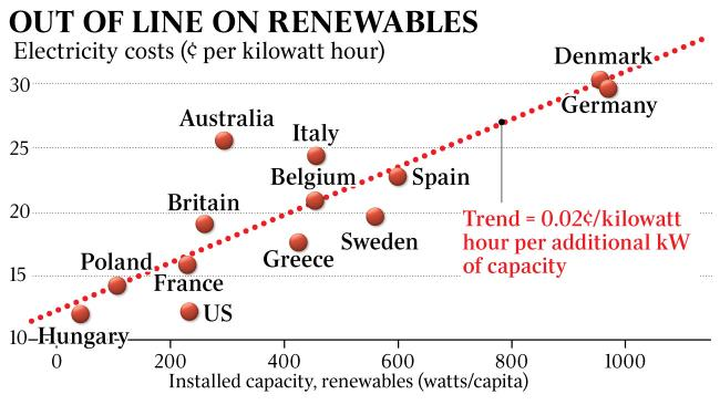
We agree that forcing out fossil fuels as the source of electrical energy and replacing fossil fuels using wind and solar renewable energy will cause the price of electricity to skyrocket.  The following chart shows what happens to the price of electricity in those nations that have begun replacing fossil fuels with renewables.   


Leading the EU nations in renewables is Germany and note that they have the highest cost of electricity.  There are already 37 million households suffering from energy poverty, the effect of doubling the price of electricity will be a calamity.

What is purposely unmentioned by the peddlers of wind and solar, is the fact that you really must keep the fossil fuel electrical producers running as back up. The wind does not always blow and the solar, on average, is never available for more than 12 hours and in fact cloudy or rainy or snowy days reduce the 12 hours sometimes to zero hours.

This often means that the fossil fuels facilities are never really replaced. They continue to operate to prevent loss (brownouts or blackouts) of electricity to the public, the hospitals, the schools, the manufacturing plants, etc.

cbdakota

Some Thoughts on How Mills’ Managed The Report


I hope you enjoyed the Mark Mills’ report “New Energy Economy: An Exercise in Magical Thinking” that I have serialized on my blog.   If you have not seen it you can click here to begin the 10 parts. He does an excellent job of demonstrating why the Paris Agreement is unworkable, and of course, the even less believable New Green Deal.  And he did it without once entering into the argument whether CO2 is a serious threat to the globe or not.  

Mills barely mentioned nuclear generation in the report except for several small insertions.  It is possible that fossil fuels powered electrical production might be employed to handle the swings in demand in the future with nuclear the backbone of power generation.  Currently the catastrophic greens reject any use of nukes. So he did not need nukes to make his argument.   

cbdakota