
Temperature readings from the various temperature-monitoring stations in the USA are sent to the data compilers at the U.S. Historical Climatological Network (USHCN). This data can be called the”raw “data. It has yet to be process through the 6 steps used to “adjust” the raw data. The adjustment process is:
- Survey for obvious outliers and the radically incorrect. Delete or correct as necessary.
- Time of observation adjustment.
- New measuring device adjustment .
- Homogenization adjustment to account for failure to record all the data from given monitoring stations and random stations movement.
- Lack of monitoring stations in remote areas, for example, where it is necessary to fill in calculated estimates of what the reading would be if there were devices.
- Adjustment for the “heat island” effect.
I have tried to summarize the process in the above. For a more detailed description of the process used by USHCN click here. The adjusted raw data is considered the US temperature.
The following chart shows the effect of the raw data adjustment.
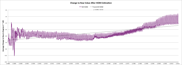
FIGUIRE 1: CHANGE TO RAW DATA AFTER HOMOGENIZATION ESTIMATIONThe Y-axis it “average change to raw in degrees C x100. The X-axis is years beginning in 1880 to the present.
Figure 1 is from work done by John Goetz in his posting on WUWT titled “Approximately 92% (or 99%) of USHCN surface temperature data consists of estimated values.” Goetz says: The homogenization estimate introduces a positive temperature trend of approximately 0.34C per century relative to USHCN raw data. That is not a lot.
The raw data plotted for the past ten years, it shown on the following chart”
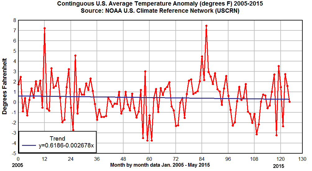 Figure 2 Raw temperature data plotted for the last ten years
This chart is a plot of the readings as they are reported from the temperature monitoring stations. The X-axis show the period from 2005 to the present. What seems obvious is that the US temperature has declined, albeit slightly, but declined rather than increased as the homogenized temperature for the same period on Figure 1.
Some pretty important skeptical scientists have said that some adjusting of the raw data is justified. Maybe so, but any adjusting that produces a contrary trend from that of the raw data is suspect in my mind.
How does the US compare with other nations with regard to the amount of manipulation given to the raw data? Well the follow charts were prepared by Goetz provide the answer:
| Country (or subdivision) | % ESTIMATED |
| Djibouti | 0.0 |
| Tromelin Island (France) | 0.0 |
| Qatar | 0.0 |
| Cocos Island (Australia) | 0.0 |
| Western Samoa/Samoa | 0.0 |
| Belarus | 0.0 |
| Kazakhstan | 0.0 |
| Argentine Base in Antarctica | 0.0 |
| Peoples Democratic Republic of Yemen | 0.4 |
| Moldova | 1.0 |
Figure 3 The 10 nations doing the least adjustment (ESTIMATION) to the raw temperature data
And then this chart:
| Country (or Subdivision) | % ESTIMATED |
| Barbados | 97.8 |
| Christmas Island (Australia) | 95.7 |
| Nuie (New Zealand) | 95.6 |
| Cyprus | 94.2 |
| South Georgia (U.K.) | 93.3 |
| Macau (Portugal) | 93.2 |
| UNITED STATES OF AMERICA | 92.5 |
| Bermuda | 92.3 |
| Bahamas | 92.2 |
| Cape Verde | 91.8 |
Figure 4 The 10 nations doing the most adjustment (ESTIMATION) to the raw temperture data
These charts show that the US is nearly the “best” in something that perhaps is a dubious exercise.
The next posting will deal with the profound disbelief of some skeptics about the validity of the reported global temperatures.
cbdakota
